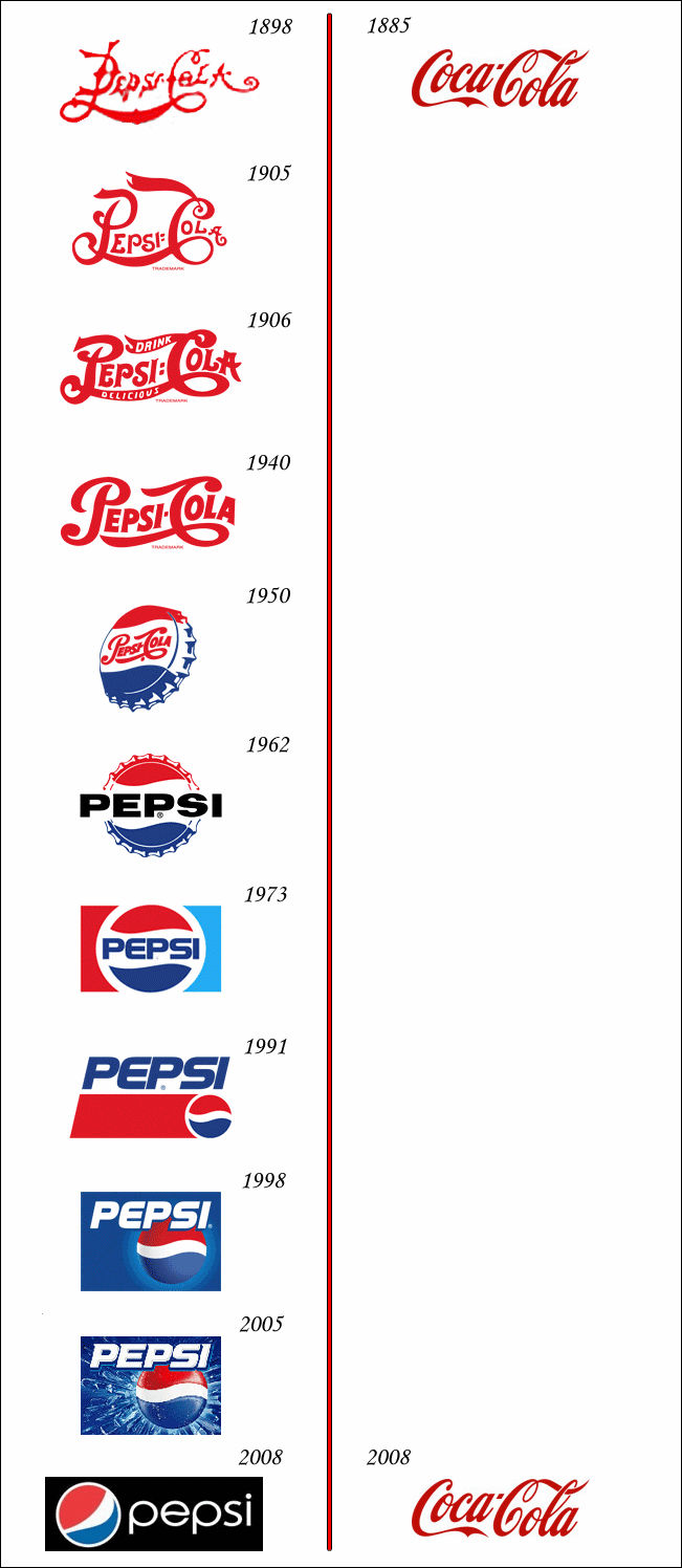
A diagram comparing Pepsi's and Coca-Cola's logo's transitions
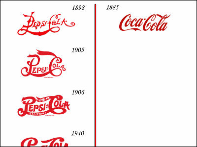
It is a figure that clearly shows the transition of the Pepsi and Coca-Cola logo changes. You can see clearly the difference between the Pepsi and Coca-Cola logos in the long history. Pepsi's logo is changing swiftly against the Coca-Cola logo that has not changed for over 100 years.
Details are as below.
Pepsi vs. Coke logo evolution
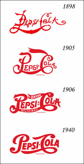
Pepsi logo from 1898 to 1940. Feeling old and simple.
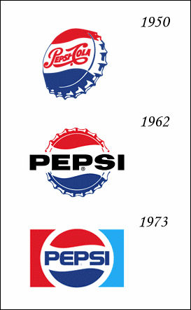
Pepsi logo from 1950 to 1973. It is slightly colorful with the blue color.
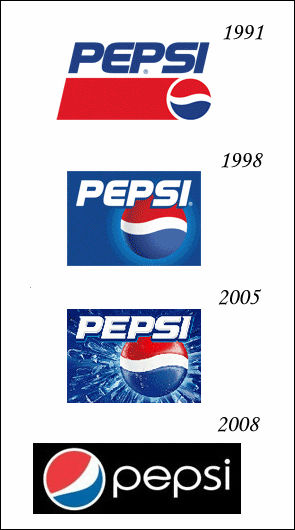
Pepsi logo from 1991 to 2008. It is a logo you see well.
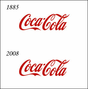
Compared to Pepsi, the Coca-Cola logo has not changed.
It will look something like this when you arrange everything.
Related Posts:


in Note, Posted by darkhorse_log