List of posters used in successive Olympics
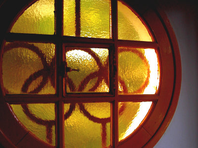
A list of posters from the 1896 Olympic Games. If you look at it in succession, you can see how a painting that was as detailed as a single painting became a simple and easy-to-understand illustration over time.
Details are as below.
Olympic Poster, Olympic Games Poster, Summer Games Poster
http://www.mapsofworld.com/olympic-trivia/olympic-poster.html
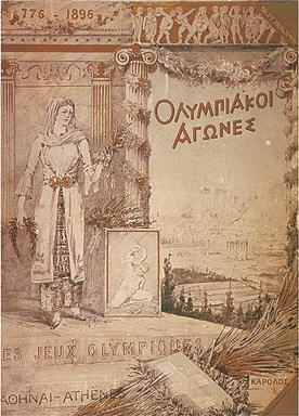
1896 Athens Olympics . It is not the poster but the cover of the official report.
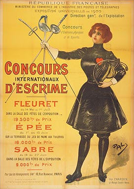
1900 Paris Olympics . A fencing poster, one of several made for each competition.
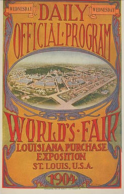
Poster for the 1904 St. Louis Olympics . It is a sign-like design.
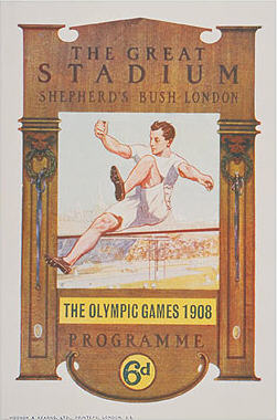
1908 London Olympics . A poster showing the stadium, depicting high jump players.
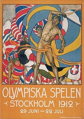
1912 Stockholm Olympics . Expressing the parade heading to the Olympics.
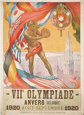
1920 Antwerp Olympic Games . The player who drew the discus was drawn.
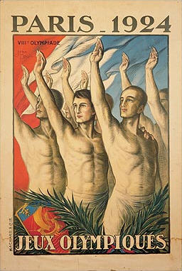
1924 Paris Olympics . Illustration of players taking an oath.
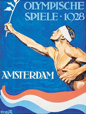
1928 Amsterdam Olympics . A runner running with a laurel, a symbol of victory. The three-colored line represents the Dutch flag, not toothpaste.
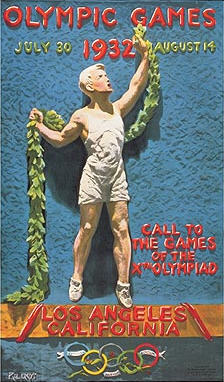
1932 Los Angeles Olympics . Express the Olympic winner.
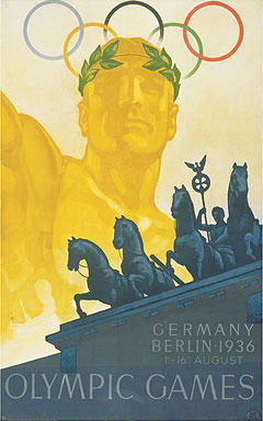
1936 Berlin Olympics . The carriage drawn from the Brandenburg Gate is on the poster.
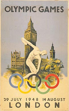
1948 London Olympics . Once again, a discus thrower appears.
1952 Helsinki Olympics . The figure depicts the long-distance runner Pavo Nurmi .
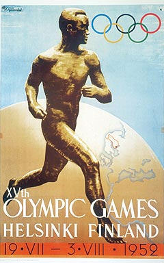
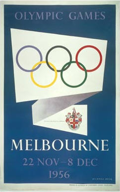
1956 Melbourne Olympics . A poster where no one appears after a long time.
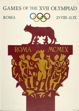
1960 Roman Olympics . From this point, the design will be like an illustration.
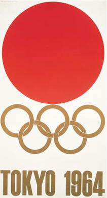
1964 Tokyo Olympics . The first official poster by Yusaku Kamekura.
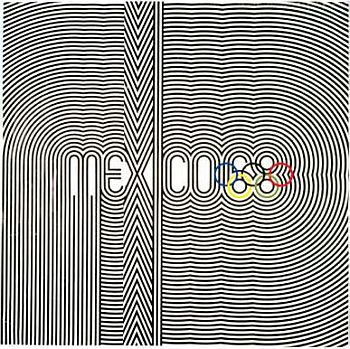
1968 Mexico City Olympics . A collaboration poster by three artists.
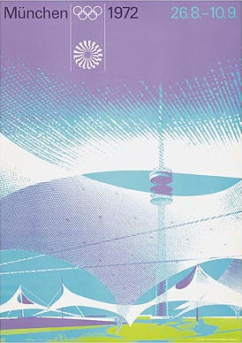
1972 Munich Olympics . A poster that expresses modern architecture with simple colors.
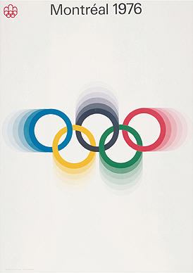
1976 Montreal Olympics . A poster that appeals to the Olympics. It's really easy to understand.
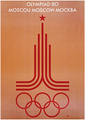
1980 Moscow Olympics . Designed with athletics lines.
1984 Los Angeles Olympics . The Olympic symbol is secretly drawn in the left corner.
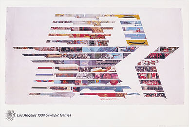
1988 Seoul Olympics . It seems to represent 'harmony and progress.'
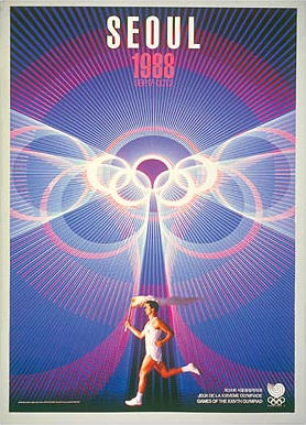
1992 Barcelona Olympics . There are people who are extremely simplified.
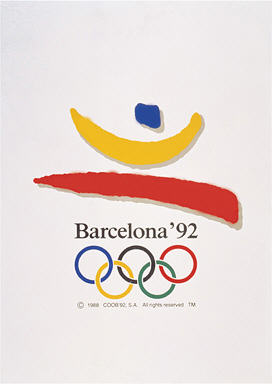
1996 Atlanta Olympics . A poster chosen by the International Olympic Committee Chair.
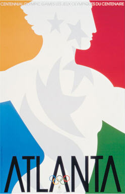
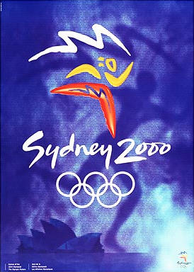
2000 Sydney Olympics . It depicts a simplified human being as in Barcelona.
Related Posts:
in Note, Posted by darkhorse_log
