


ダークな配色のウェブデザイン25例
ウェブサイトのデザインをするときに背景に黒や黒系統を持ってくるダーク系配色を採用するなら参考にしたいウェブサイトの事例を集めてみました。これをそのまま取り入れればいいものができあがるというわけではありませんが、使えるポイントを見つけ出したり、逆にマネしてはいけないところを見つけたりできるかも。
25 Dark and Amazing Website Designs | Vandelay Design Blog
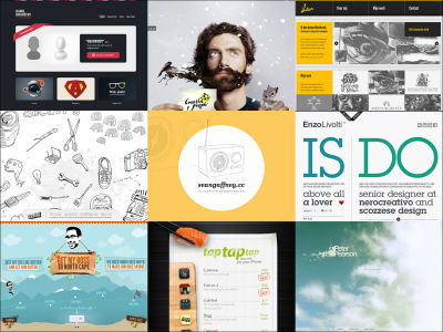
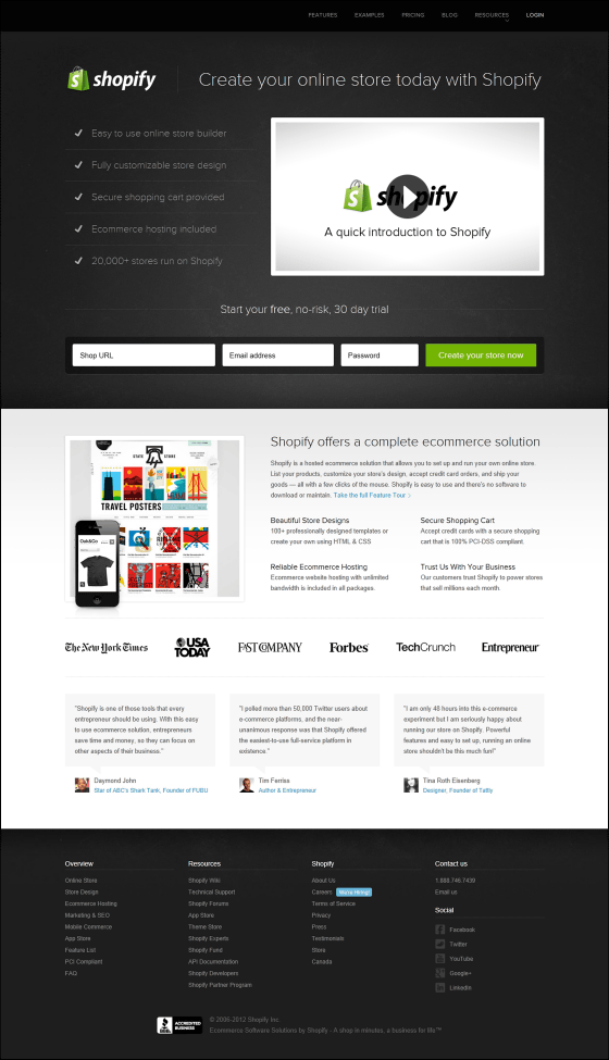
1:Shopify — Online Store Software & Hosted Ecommerce Solutions
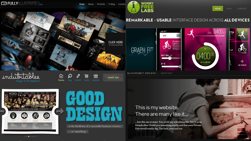
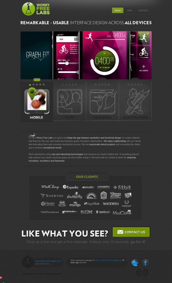
3:Worry Free Labs — Remarkable + Usable Interface Design Across All Devices
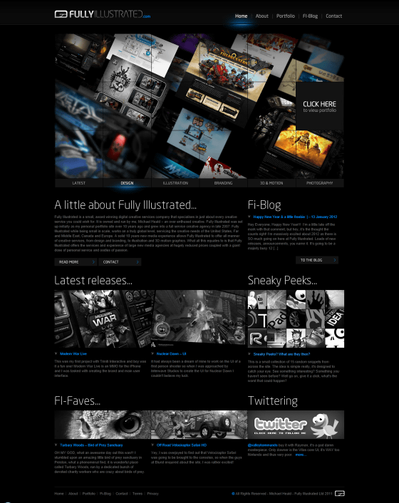
4:Fully Illustrated - The Portfolio of Michael Heald


7:Web Design Bath | Digital Agency | Moresoda

8:Skyclerk : Accounting, Bookkeeping, Customer Relationship Software, Small Business Software

9:The talent agency for digital creatives : Vitamin T


11:Digital Agency - Dubai, Bangalore, Cochin

12:Enlighten-my-mind | Quotes from creative thinkers | Home

13:Anders Højland Mikkelsen wants to be great

v
14:Kerry Edward Graphic Design


17:Don Q Rum


20:Ryan Hwang | Web Designer & Entrepreneur

21:Facebook Covers, Facebook Cover Photos • Fook Cover

22:Black Rabbit (Creative Spendidoriam)

23:INDUBITABLEE - Web design portfolio of Denise Chandler

24:Jet Cooper | User experience design agency in Toronto, Canada


・関連記事
ウェブデザインコンプレックスは克服できるか - GIGAZINE
ダーク系配色のデザインを採用しているサイトいろいろ - GIGAZINE
美しくてわかりやすいシングルページウェブデザインの例30 - GIGAZINE
ウェブデザイナー必見、教育機関のウェブデザインで特に秀逸なもの30選 - GIGAZINE
・関連コンテンツ