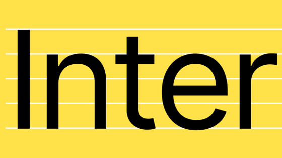
Until the font `` Inter '' made with 15 minutes free time is used in Mozilla and GitHub
The fonts used on your website are a very important factor that determines how easy it is to view and navigate. Web services and websites are cautious about the fonts they use because they can make
The birth of Inter
https://www.figma.com/blog/the-birth-of-inter/
Rasmus Andersson , a designer working at Figma , mainly used a font called Roboto , but originally Roboto was supposed to be used for headings etc., so it had a problem that it was very difficult to read when the character size became small . Andersson was investigating, 'Is there a font that is easy to read even for small letters?' That is why Inter was created.
Andersson had little experience in creating typography and only made a few hobbies as a hobby. Therefore, when I started the project, it seems that I thought sweetly that `` It will take about 1 year to create '', but it is actually a project of about 10 years to complete it over 5 years It turned out from.
Andersson mainly uses Latin characters, so the project started by creating Latin characters first. We started with the 200 most common Latin letters.
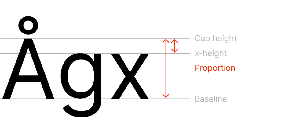
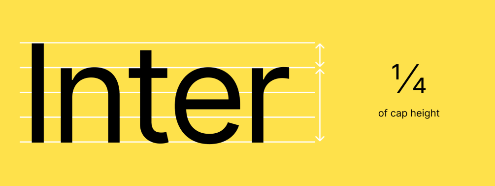
Inter is a dual license , because many Cyrillic and Greek letters are designed based on Roboto. According to Andersson, Roboto has a great ratio of lower-case x height “ X-height ” and upper-case reference line “ cap-height ”, and Inter follows this point.
This balance of uppercase and lowercase letters is similar to
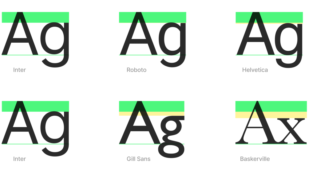
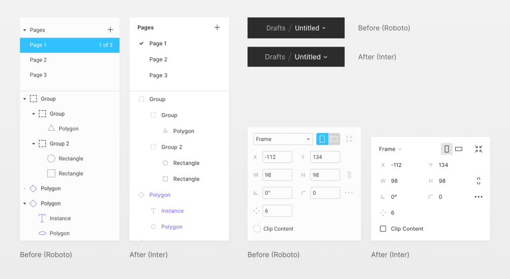
Inter and Roboto have the same space between the capital height and the X height, but the fonts such as Helvetica, Gill Sans, and Baskervill have slightly larger spaces.
On the other hand, Roboto has been redesigned in a more relaxed way because letters are condensed when forming words. In the figure below, the top is Inter and the bottom is Roboto. By having a margin, the visibility will increase even if the font size is small.

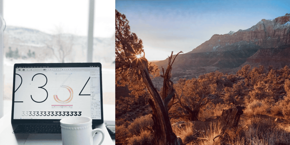
Inter was created 15 minutes after Andersson returned home from work, a free time such as a holiday or an hour before starting work. Andersson said, “When the lowercase“ n ”vertical line is too thick when viewed at a small size or at a low resolution,” he leaves a note and redesigns it when time is up ... I repeated the method of…. For Andersson, there was no stress at all and there was no anxiety. Andersson, who likes to travel, went to Zion National Park at the beginning of 2019, and at this time, he designed a small print.
Designing headline and body text is very different, and headline text is focused on the shape of the text itself, while text is important for space and line thickness. It is a balanced relationship with other characters. Andersson has already spent three years in Inter, but he says he plans to repeat this work for the next three years.
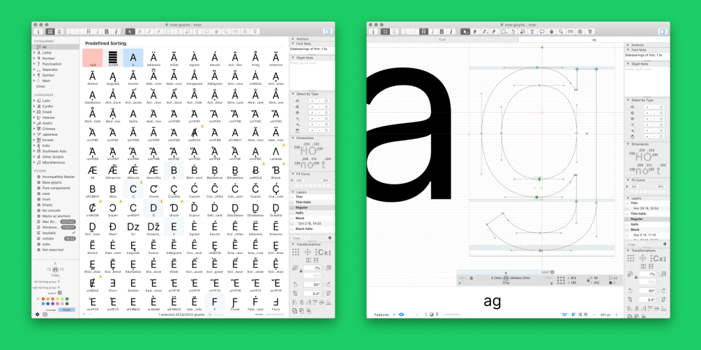
In more detail about font production, the initial creation was a Python-based editor called
Originally, Andersson, who started creating Inter as a personal project, didn't think Inter would be adopted by Figma. However, when a project to review Figma's UI was conducted in 2018, the team members evaluated that Inter was easy to read, so Inter was used in Figma's UI.
After that, Inter was also adopted by GitHub and Mozilla. Anders also said that Inter has been used in a huge display that Japanese advertising agencies display at intersections in Tokyo. Andersson did not know in advance where Inter was used because it was an open source font, and when GitHub and Mozilla adopted Inter, they first noticed it. Since I have not contacted GitHub or Mozilla, it seems to be a mystery where the two organizations knew Inter and how they decided to use Inter.
Related Posts:


in Design, Posted by darkhorse_log