'How to lie in a graph'

by
' Statistical charts ' such as graphs visually show the collected statistical data and help you understand the characteristics of the data and the relationship between the data. However, while it becomes easy to understand things that can not be understood with simple numerical lists, it is possible to 'twist the facts you want to convey' depending on how you handle them.
Excel Chart Lies-TechTV Articles-MrExcel Publishing
https://www.mrexcel.com/tech-tv/excel-chart-lies/
Want to spin your data? Five Ways to Lie with Charts
http://nautil.us/issue/19/illusions/five-ways-to-lie-with-charts
◆ Angle the viewpoint
The “Labor (labor)” shown in the dark blue area accounts for 30% of the entire 3D pie chart on the left and the 3D pie chart on the right. However, if you show the graph from an oblique perspective in 3D, the proportion of Labor in the right 3D pie chart looks more than 30%, due to the illusion .
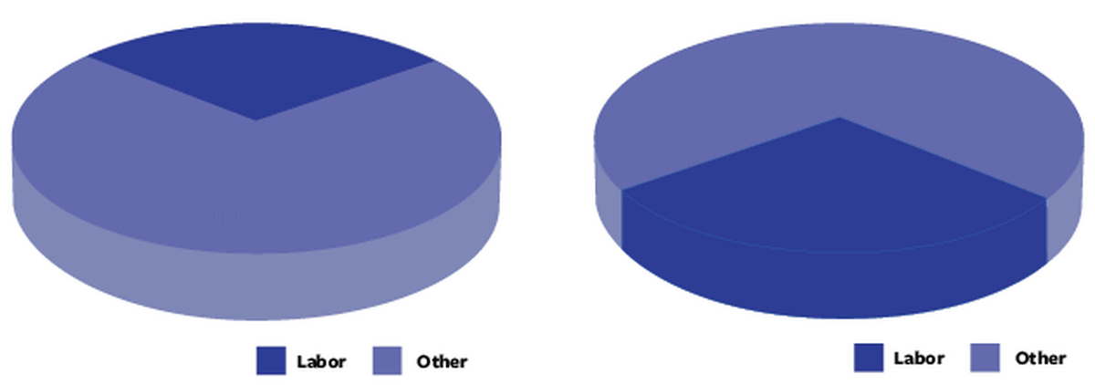
For the human eye, interpretation of the ratio from a three-dimensional viewpoint is high in difficulty, and when looking at a graph of a three-dimensional viewpoint, it is simply stated that 'the colored area indicates the size of the quantity' They tend to think about it.
◆ Cone graph and pyramid graph are evil
The classical fraudulent approach in graphs is to incorporate irrelevant information. The portion showing data in the left and right graphs is only 'height', and 'Admin (administrative expenses)' is about 30% of the whole. However, in the right-hand cone graph, “volume” seems to be related to the content of the data, and “management costs do not seem to be 30% of the whole”.
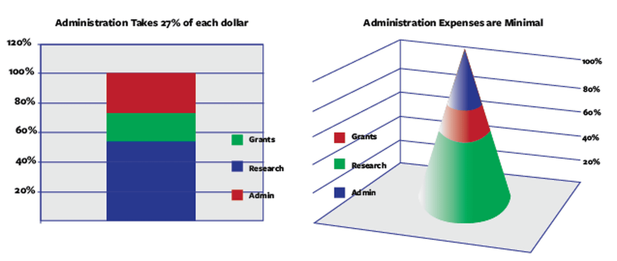
Mrcorn.com is commented that 'corn and pyramid graphs are purely evil and should never be forgiven. Please use them if you are the head of a non-profit organization who wants to mislead books.' The
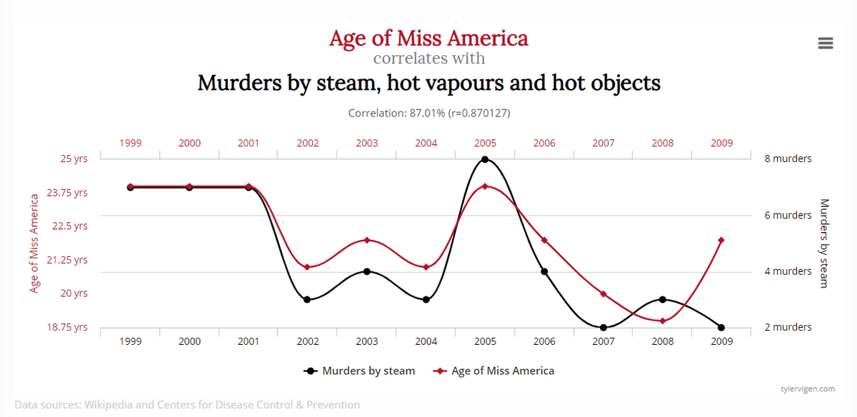
◆ People tend to assume that they are “related”
In the graph below, the red line shows 'Award at Miss America' and the black line shows 'Number of murders using hot objects such as steam'. There is nothing to do with these two data, but because the outlines of the graphs are similar, a person unconsciously thinks 'Is there really a correlation?'
◆ Hide in other graphs
The graph on the left clearly shows that marketing costs have tripled in three years. On the other hand, if you look at the stacked area graph on the right, the marketing cost is shown by the green area, and it is very difficult to understand that it has tripled in three years.
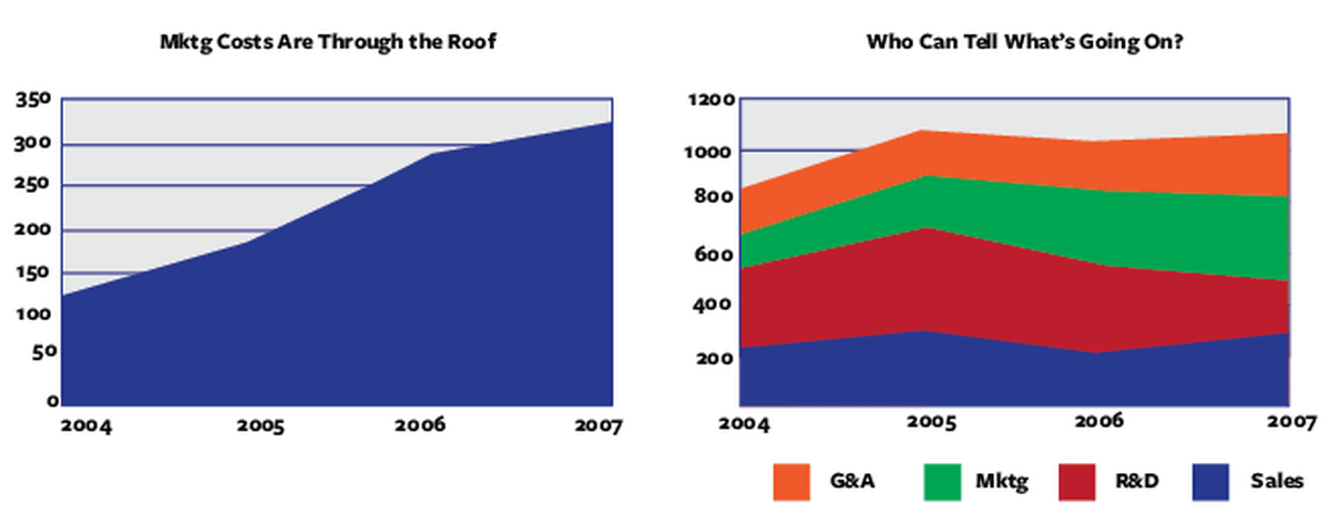
The area of the graph where the lower end and the upper end change simultaneously seems to be difficult to grasp the data because it is not a natural visual task for humans.
◆ skew the ratio of the vertical axis of the graph
The graph below is a graph that handles the same data on the left and right, but only the ratio of the vertical axis of the graph is different.

In the original data, the fluctuation of the value on the vertical axis is in the range of 4.5 to 4.7, and the graph on the left makes it easy to understand that there is almost no change in the number from month to month. On the other hand, despite the use of the same data, the graph on the right seems to have tremendous fluctuations from month to month. Just by manipulating the ratio of the vertical axis of the graph, the impression people receive from the graph changes dramatically.
◆ come find a convenient interpretation
This graph shows that the city's population has been halved in 40 years.
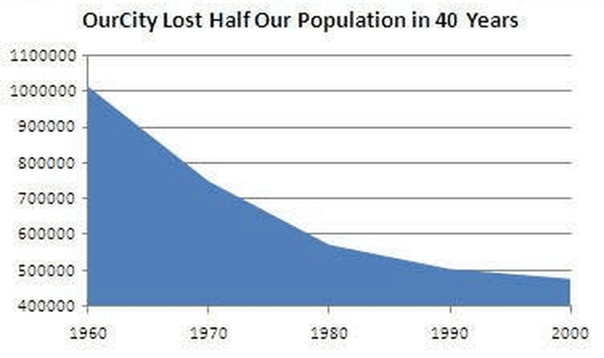
However, it is possible to change the presentation to 'the population decline rate is slowing down' as it is, with the fact that 'the population is decreasing'.
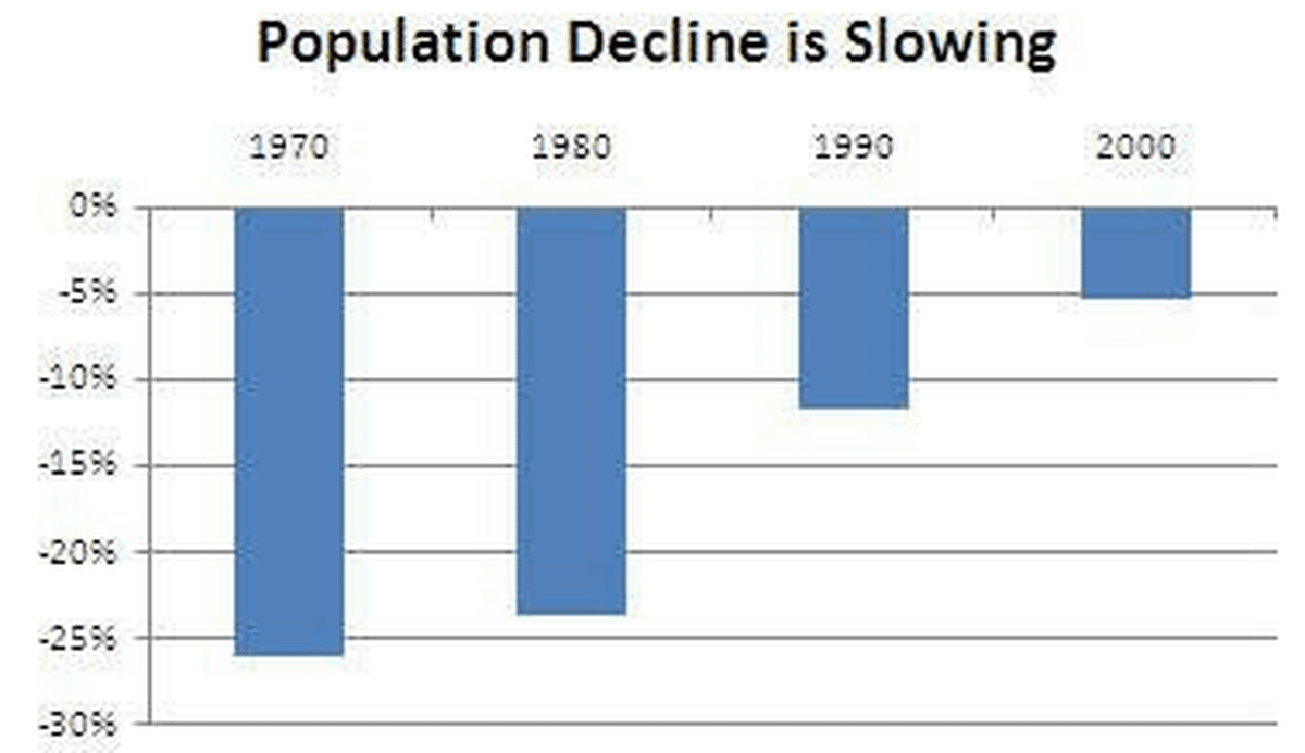
Even if it is based on one event, there are many facts that can be obtained from it. The facts highlighted by graphs are not necessarily the data that others really want to know.
Related Posts: