A movie "Material Design Motion" that you can see well what kind of law the "movement" of Google's material design complies with
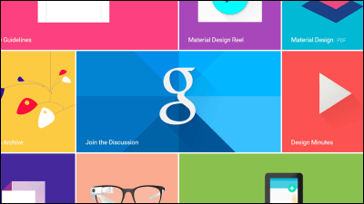
Google released in 2014 "Material design"Has become a unique design framework incorporating" material "and" real feeling "in addition to a simple" OS design "in addition to practicality. Although it is said that using animation to improve the quality of products by sticking to "movement", easy-to-understand movies are being published in what kind of law the "movement" of material design is based .
First of all, in what way does "material movement" "movement" differ from other applications and software design? You can understand the outline of commitment as crisp from the following movie.
Material Design Motion - YouTube
Material design is characterized by the feeling of "life" like ours alive in the real world.
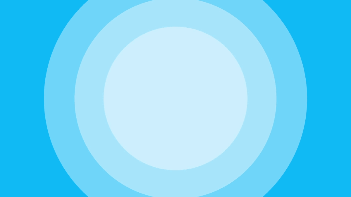
The reaction is good, natural, conscious.
And it moves with intention.

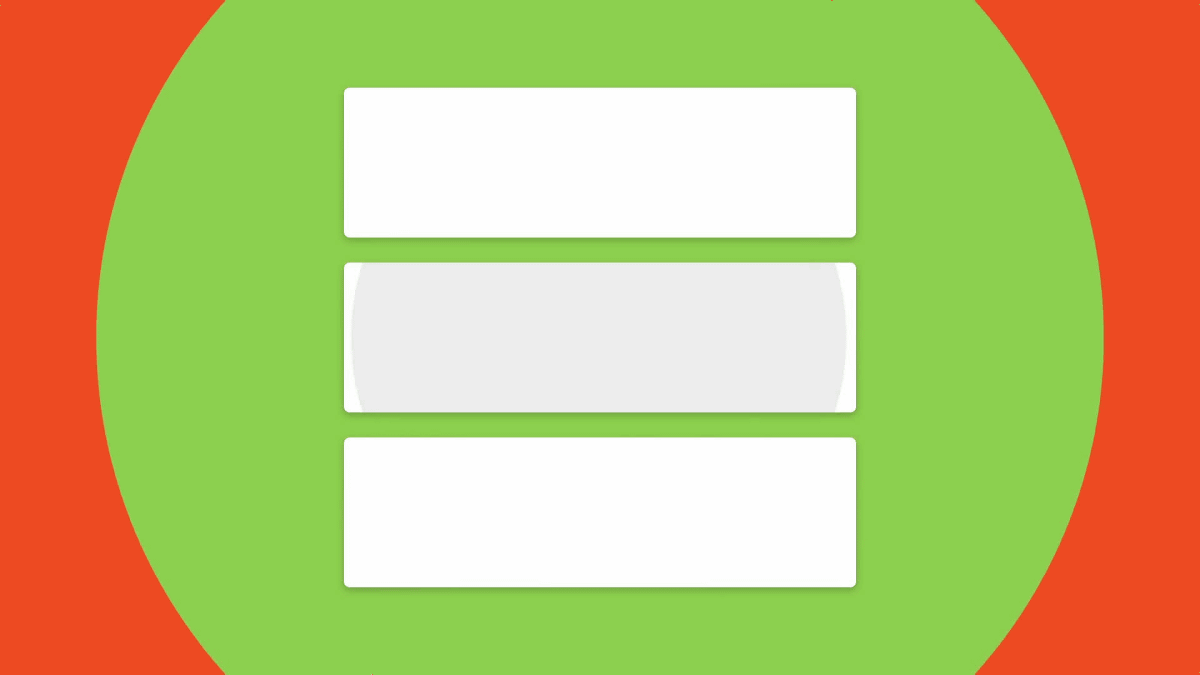
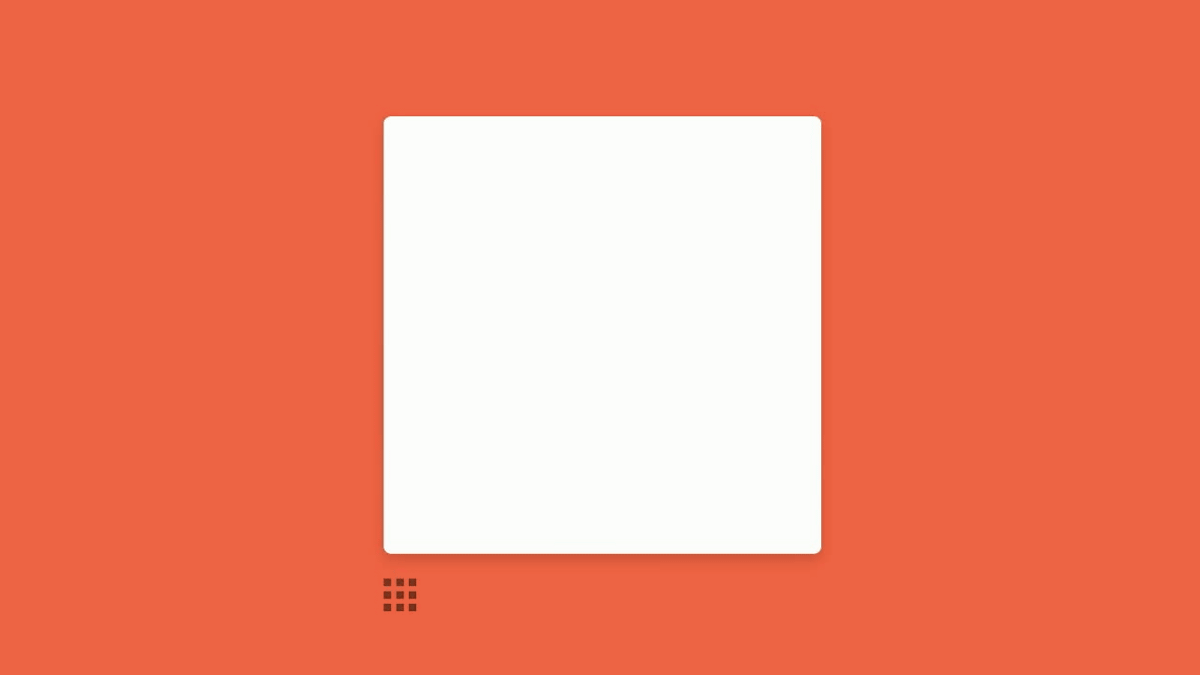
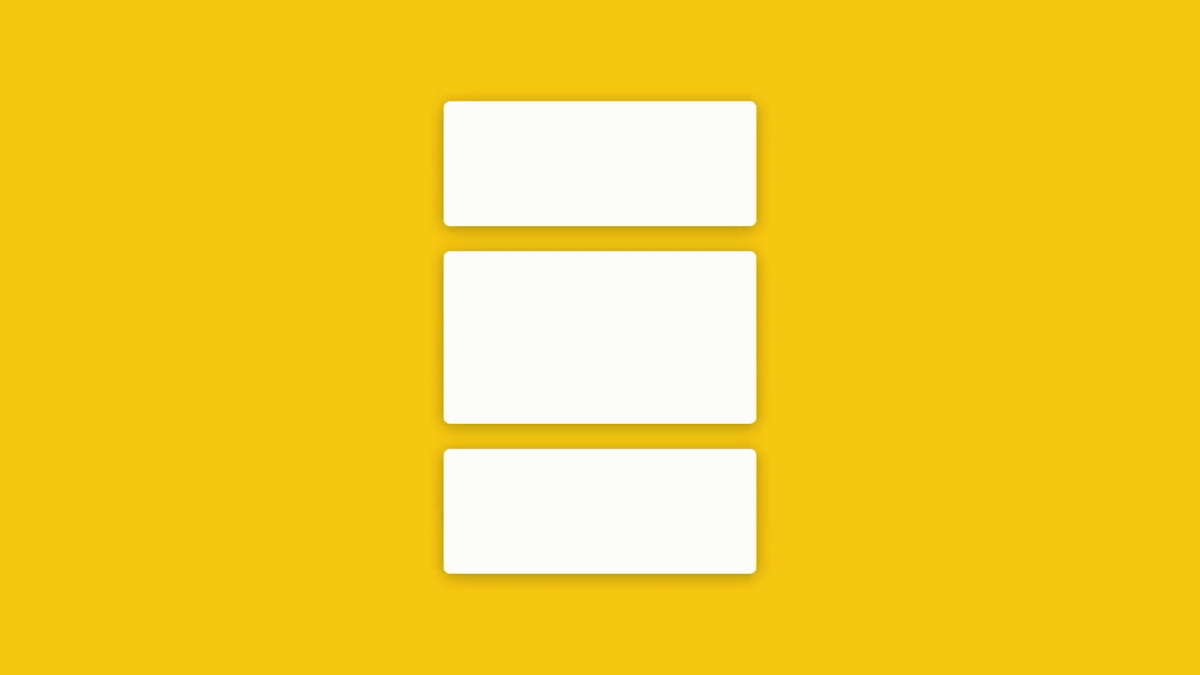
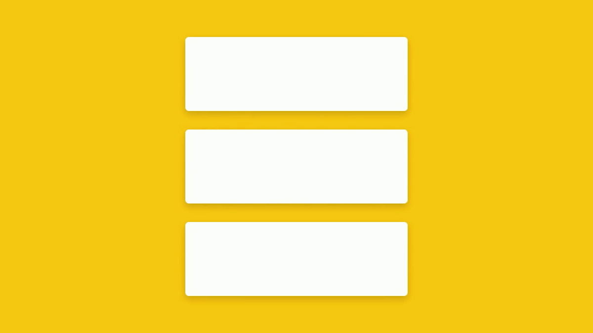
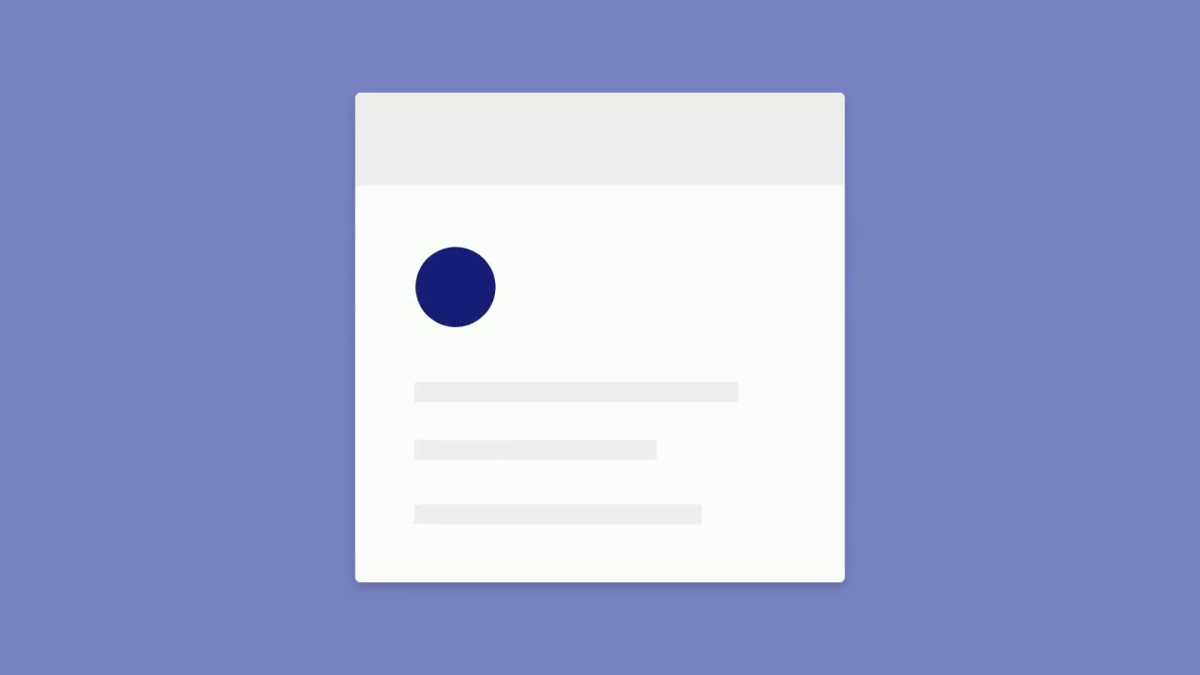
A card type design in the form of a smartphone screen ... ...
Change to another form while keeping design consistent. In this way, the object responds to animation and creates energy.
Because reaction is fast, we will not let the user wait.

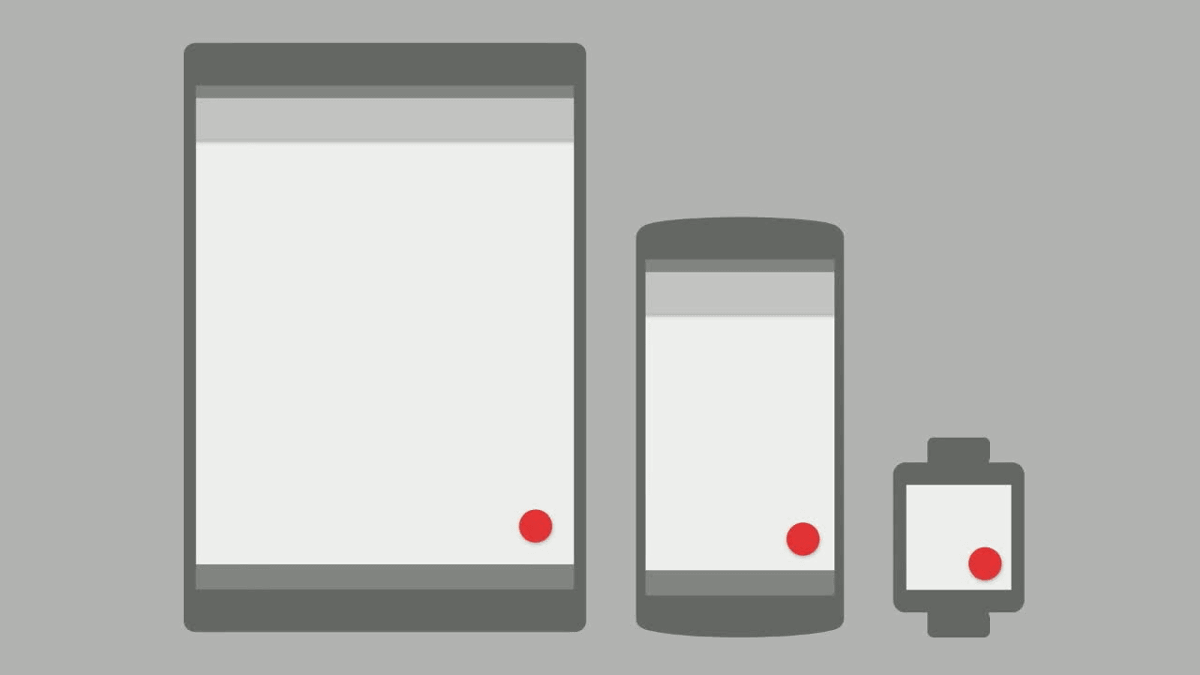
In addition, although the distance required for "motion" varies depending on the screen size, in material design, the object moves at a speed suitable for each terminal. For example, if the icon moves, the movement on the tablet that is larger than the smart watch with the smaller screen size is faster on the same screen.
I place much emphasis on "how long it takes time to take action" rather than "how fast it is".
Also, the movement of the object reflects the law of the real world. When rolling balls are uphill, the speed becomes slow ... ...

Speed up when you go down the slope.

Even when the ball slides on the rings, the appearance of the ball falling is a tranquil movement ......
In the second half, as you go up the ring, the speed gradually decreases, a movement that makes you feel gravity is built in naturally.
Also, it is a characteristic that objects move independently while interfering with surrounding objects, not objects themselves.

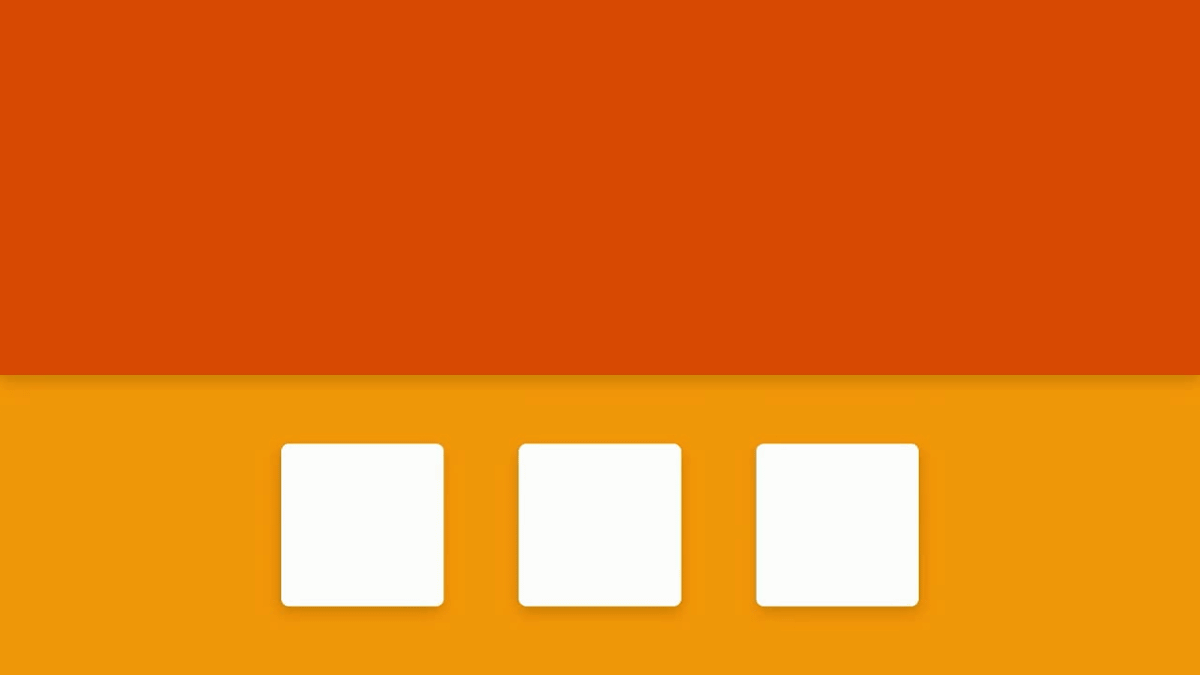
One card out of three cards is pushed away from the other card and displayed large ...
I will stick together as a single card.
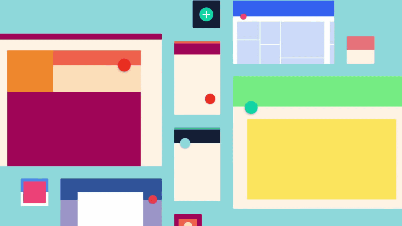
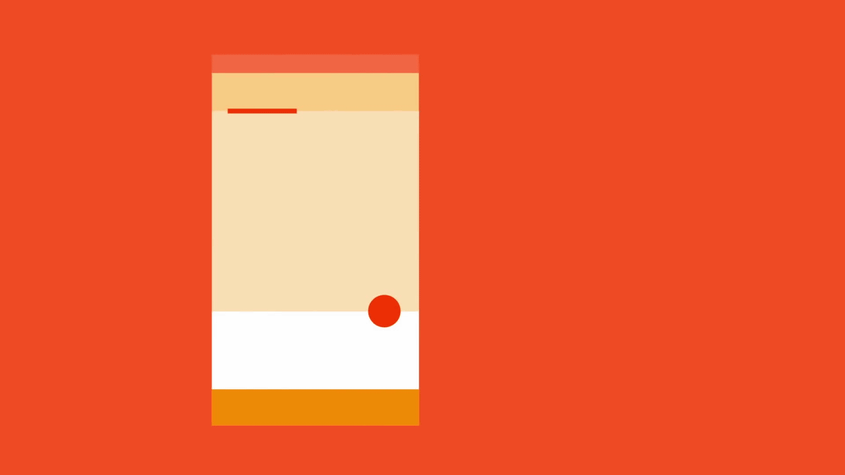
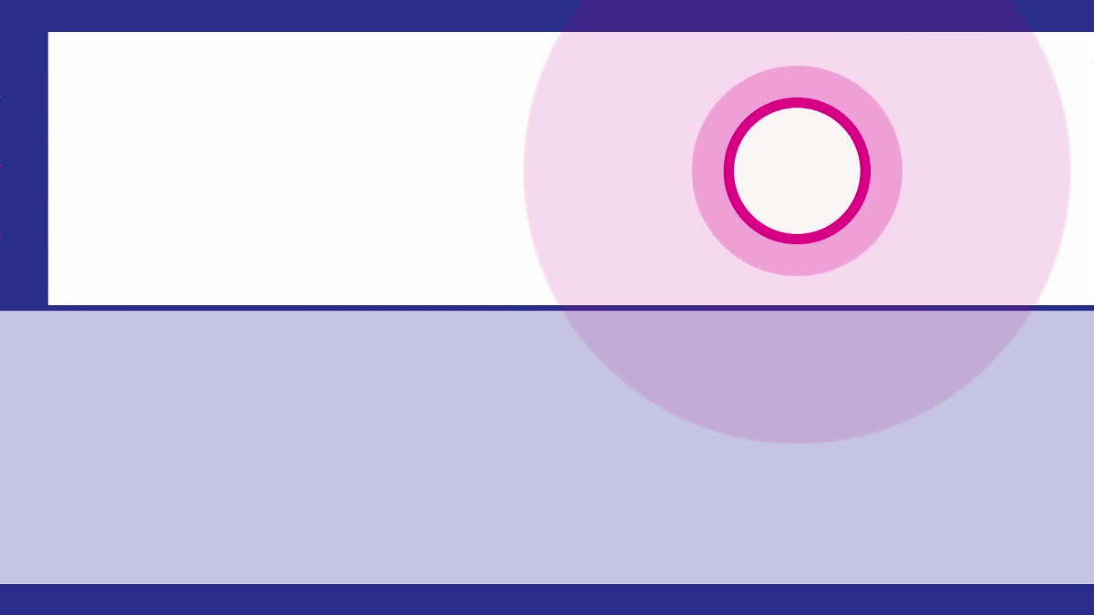
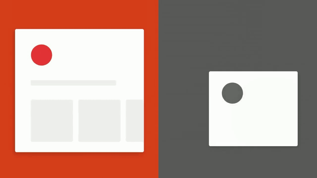
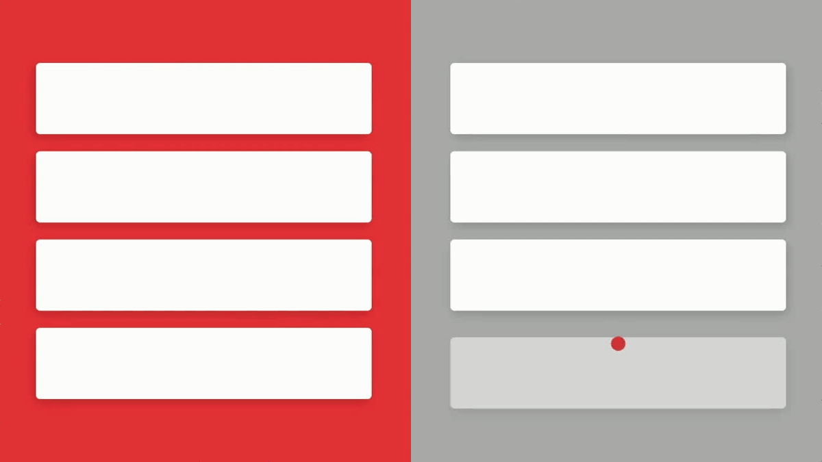
By combining these movements, it is possible to guide the user to the correct viewpoint and show the correct operation method. The red circle in the figure below is where avatars such as SNS are displayed.
Even if the display on the screen changes, somewhere is designed somewhere due to appearance and 'movement' at a glance ...
Even if the screen changes, the user will not get lost.
Even if you try to slide with your fingers, there are parts that have little movement ... ....
Because there are some parts that move greatly, users can recognize what they can do before taking action.
It is the "movement" of material design, giving users quick, clear, integrated experience.
The following movies are explained in more detail using case examples.
Discover the expanded Material Design motion guidelines - Google I / O 2016 - YouTube
It is John Schlemer who makes commentary.
"Movement" in material design is not a superficial thing like "finishing" of an application or software, but related to the root of the user experience. Of course there are parts involved in finishing work of the product, but it is mainly to teach the focusing part and where it is important, predict the next movements and reduce the sense of "waiting" for the user .
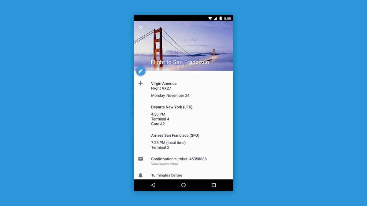
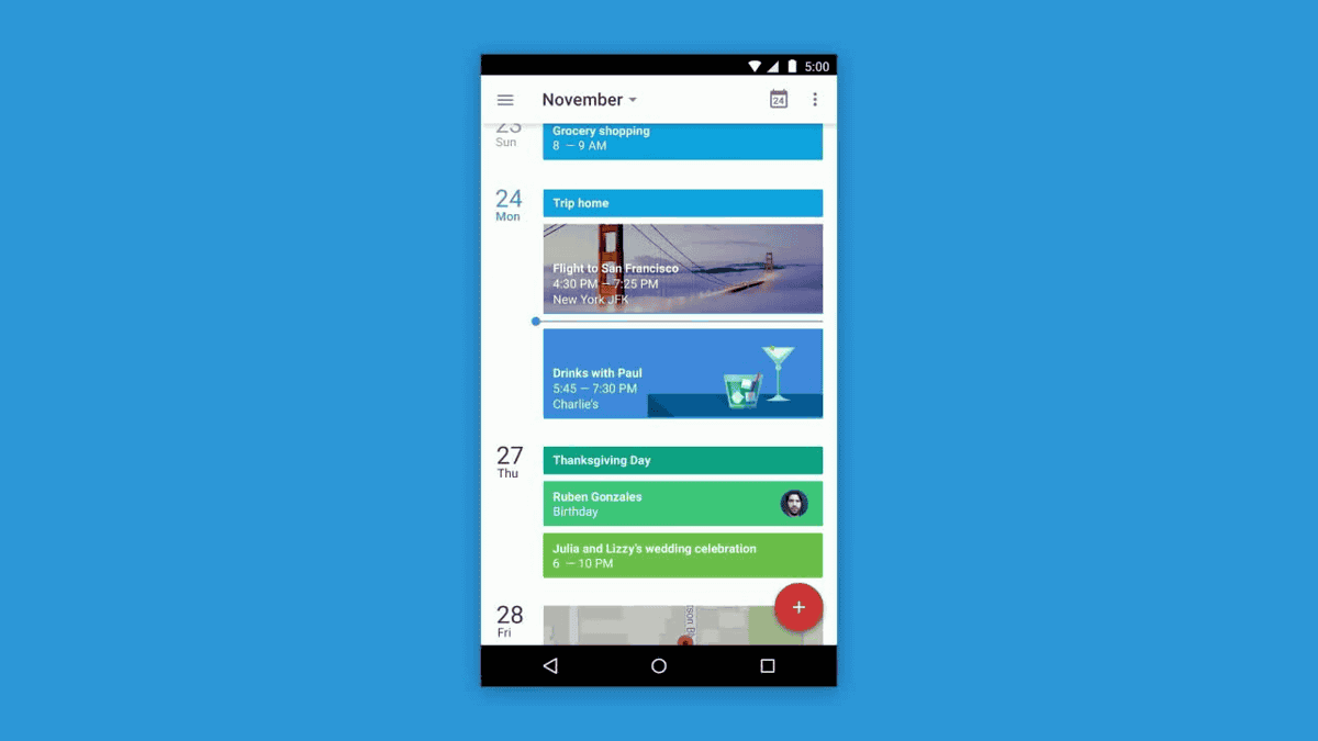
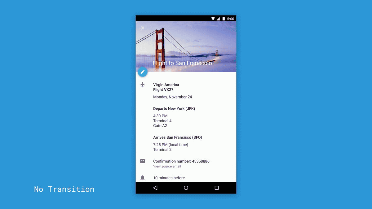
Take, for example, Google Calendar as an example. When I tap a photo displayed on November 24, the image responds with a ripple spreading on the water surface.
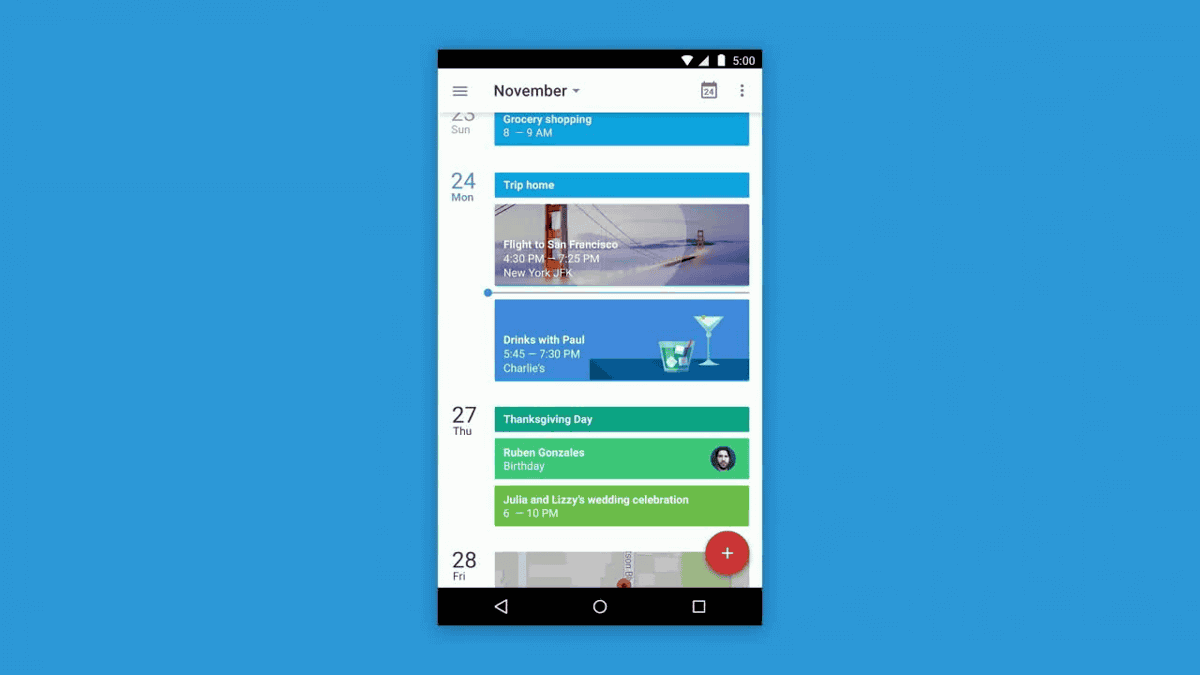
Pushing off other cards, the event will be displayed full screen.
At this time, the image is displayed first ... ....
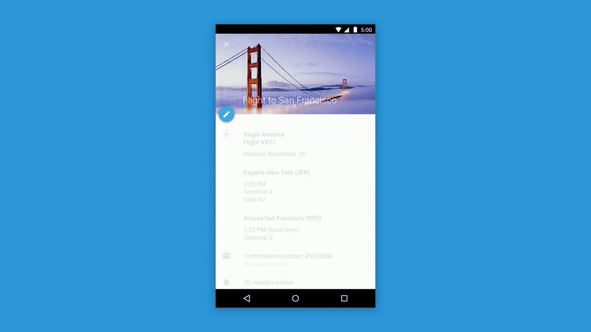
Details and edit buttons are displayed after the image.
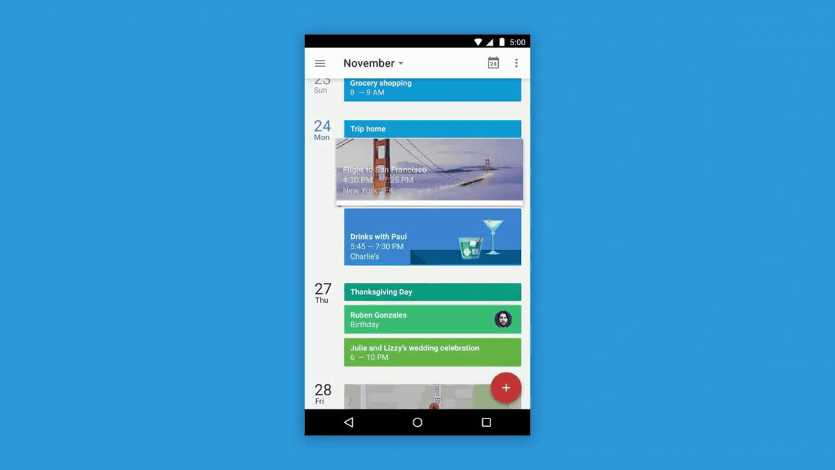
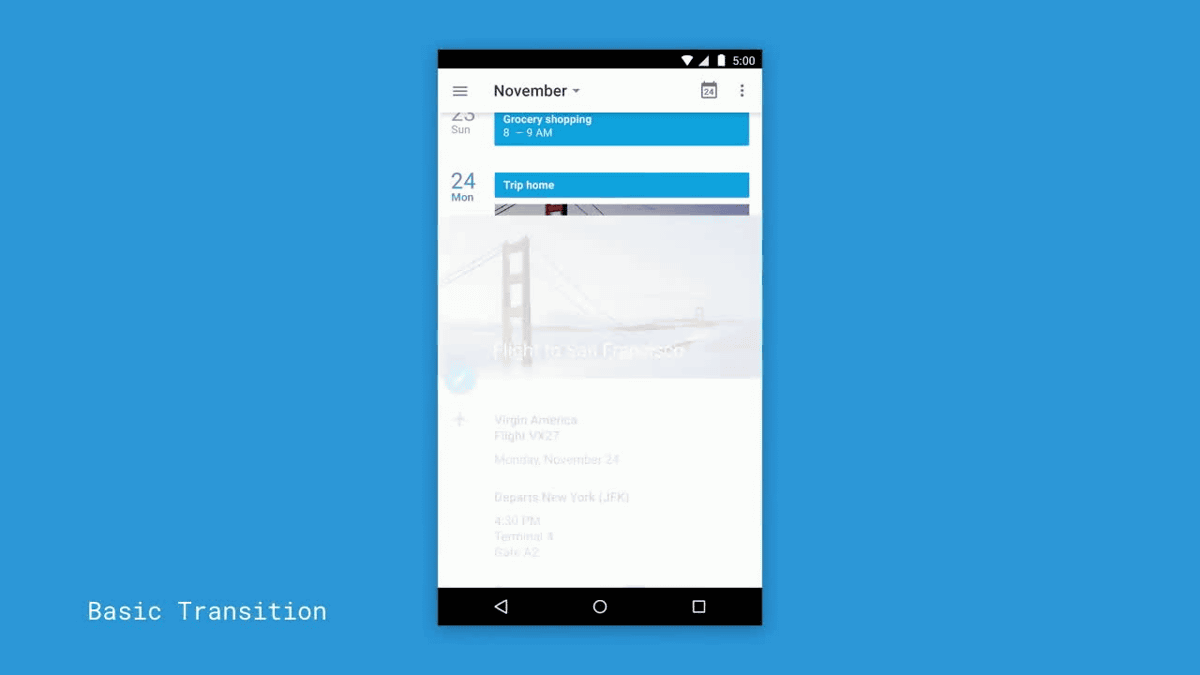
On the other hand, if there is no "movement" on the screen transition, tap on the image ......
The loading screen will be displayed suddenly.
Then, images and event contents were displayed suddenly. With this, I do not know at all what the screen is changing from where to where and what will be displayed from now.
Also, let's look at some common type transition methods. Tap on the image ......

Another screen came out from the bottom of the screen.
The image and the event contents are displayed. Although it is somewhat better than when there is no "movement", the flow is not integrated, so it is not possible to predict the next movement nor to have a connection to the front and rear screens .

"Movement" in material design follows the four rules of "goodness of reaction", "what is natural" "movement like consciousness" and "having intention".

First of all, with regard to the first law, "goodness of reaction", material design immediately displays shadowy on the part touched, and tell me that "Hereafter will react" I will.
Also, touch the menu button ......
A card with contents written immediately appeared. Do not let users wait.
In the case of past applications, there was a time lag from when the user touched and displayed the result, but in the case of the material design, it takes an action with quick action without putting extra time on the display.
This is because "display time considering screen size" is not the "actual speed" but the display speed of each terminal is adjusted to the measure. A smart watch with small movement and fine is not a problem even if the actual speed is slower than the tablet that needs big movements.
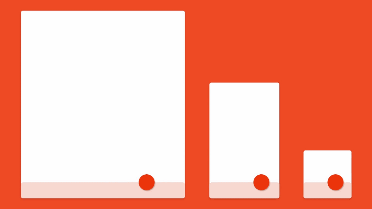
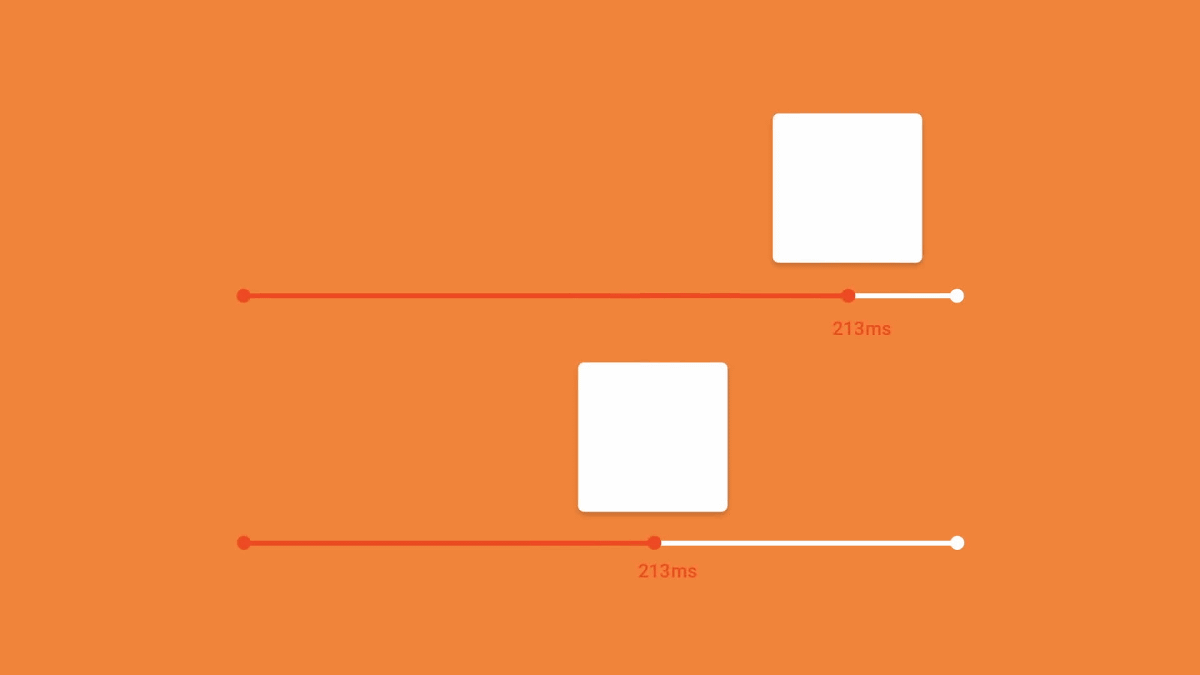
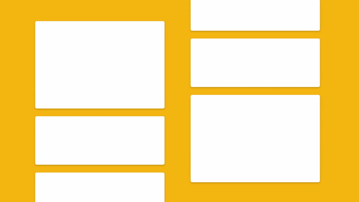
It is also important to display objects straight and smoothly. The following four cards are displayed with flow, one by one, in order from the top. The time it takes to display each card is 20 to 25 milliseconds and it is as fast as chasing completely with eyes.
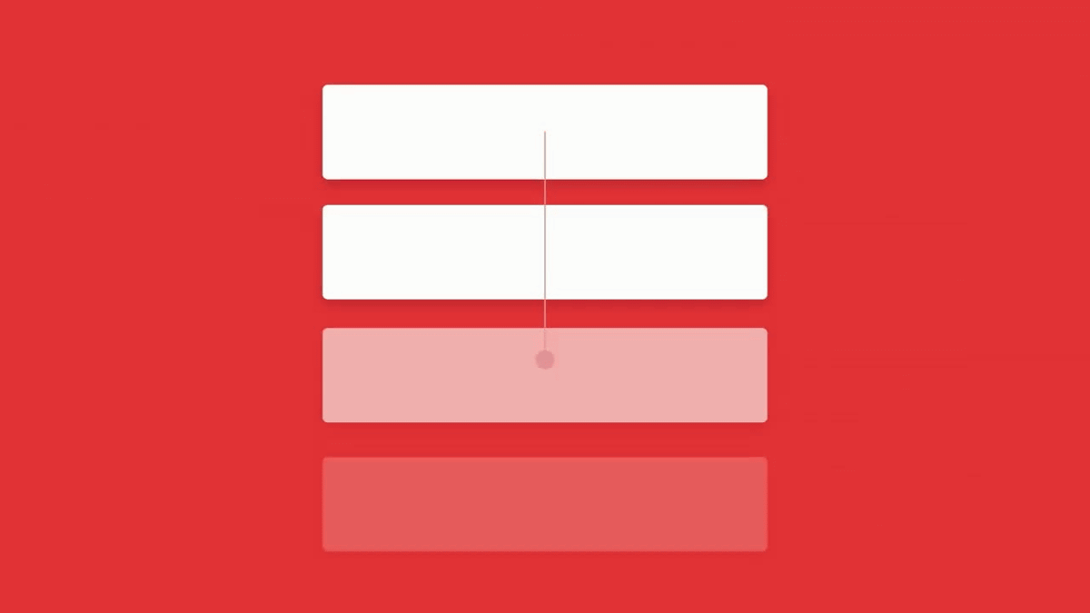
On the other hand, the four cards on the right have no flow, and are displayed one by one step by step. In this case, the user has to wait until the screen is completely displayed.
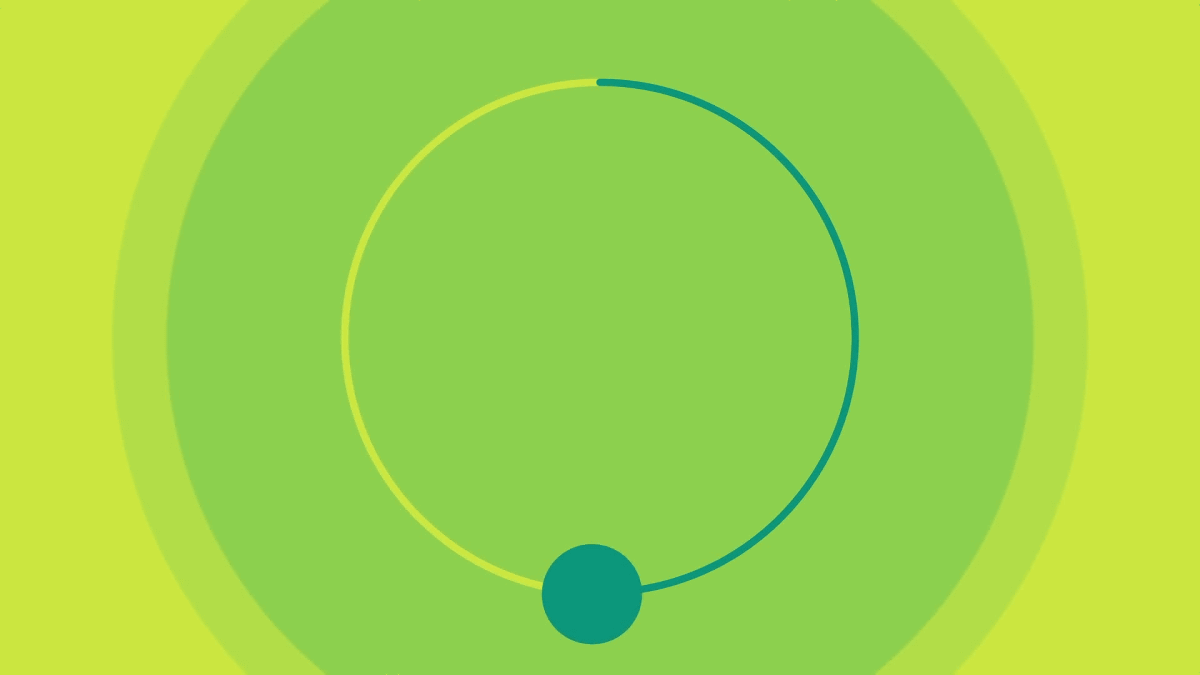
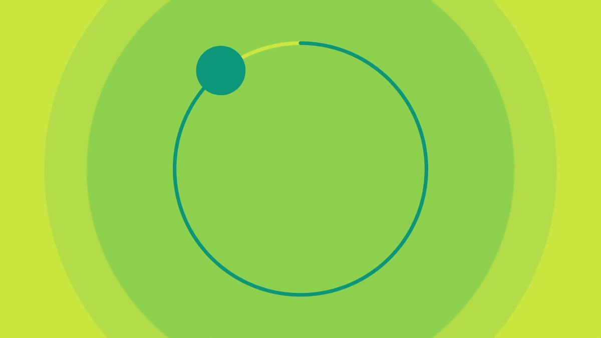
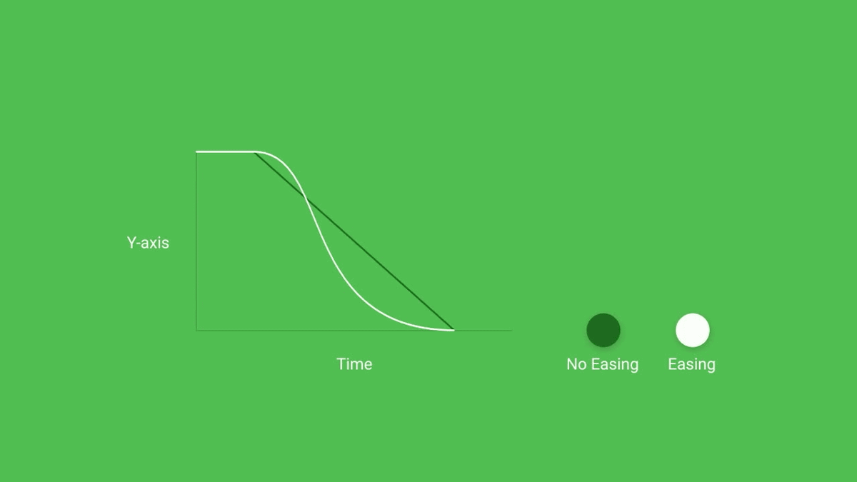
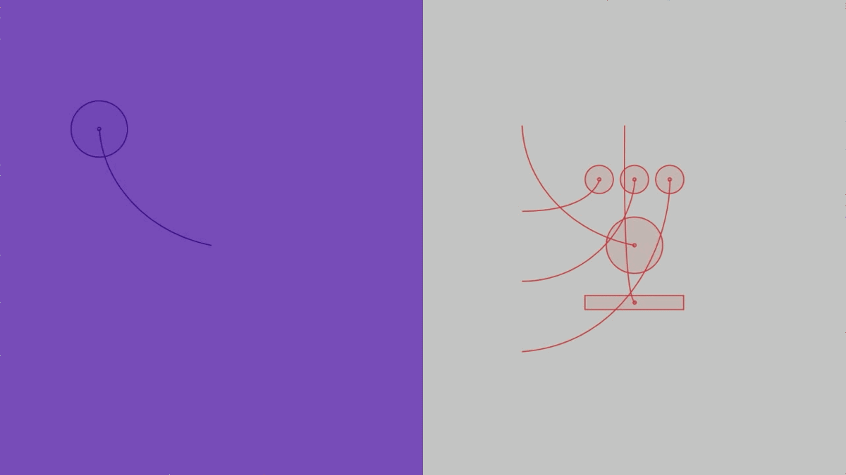
The second law of "movement" in material design is "to be natural." In other words, it is a movement that follows the law of the real world.
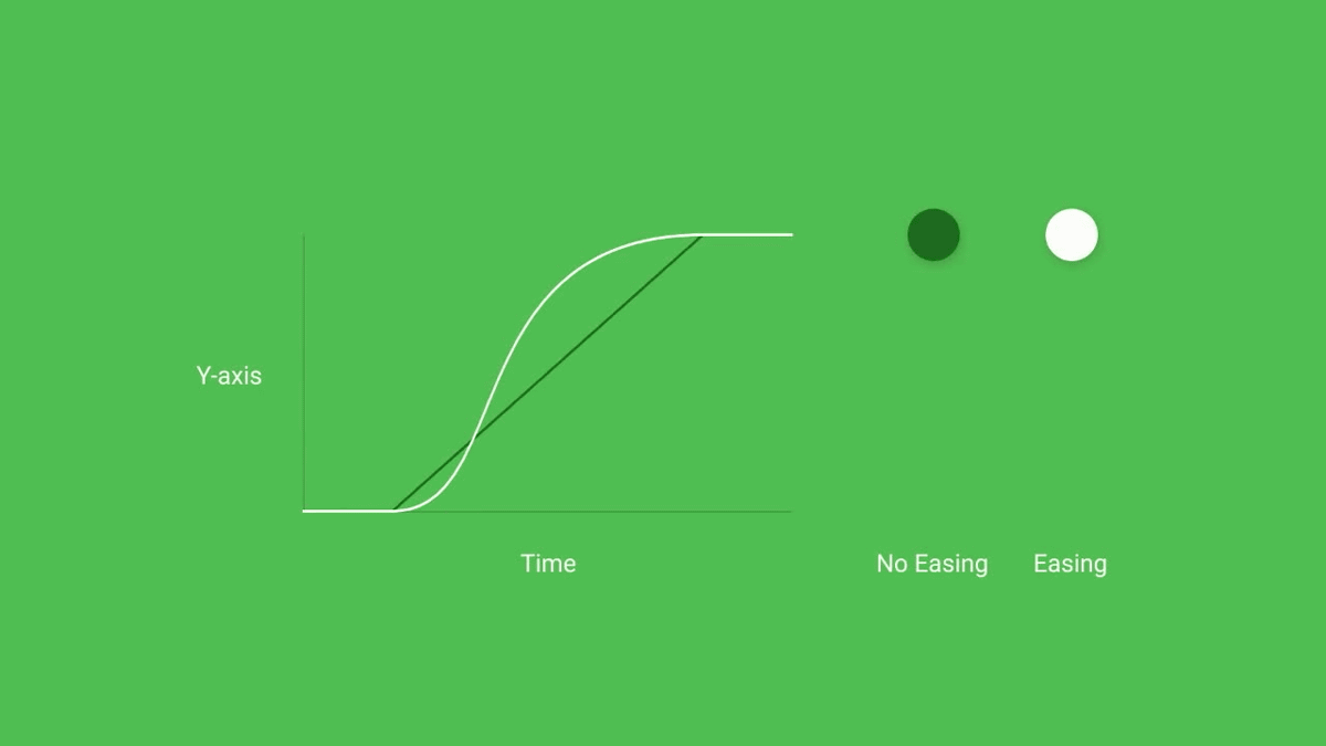
Since it takes a movement reflecting gravity, friction, thrust, etc., the speed when the ball falls is not constant, there is a speed change such that it gradually becomes faster as it falls, and the end gets slower slowly.
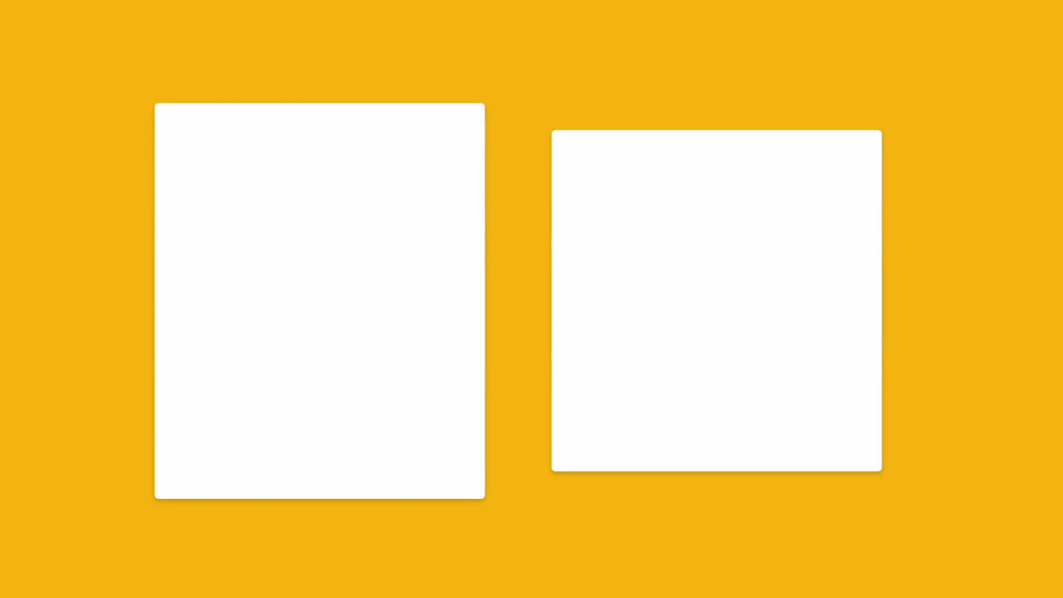
Also, when the ball jumps up, the graph draws another curve.
For this reason, the movement that the balls gather at the center from the outside and stops in a single row and the movement that the ball that was in one row moves away from the screen moves to the outside of the screen, Each way is different.
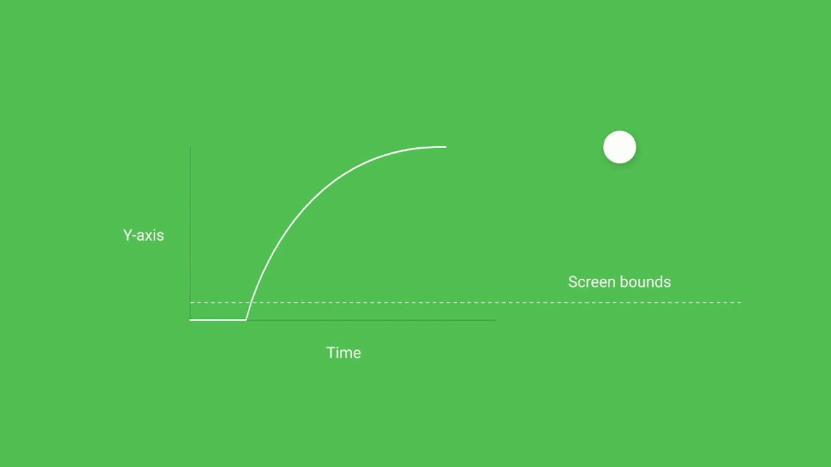
Also, the movement that draws a curve also appears frequently in material design.
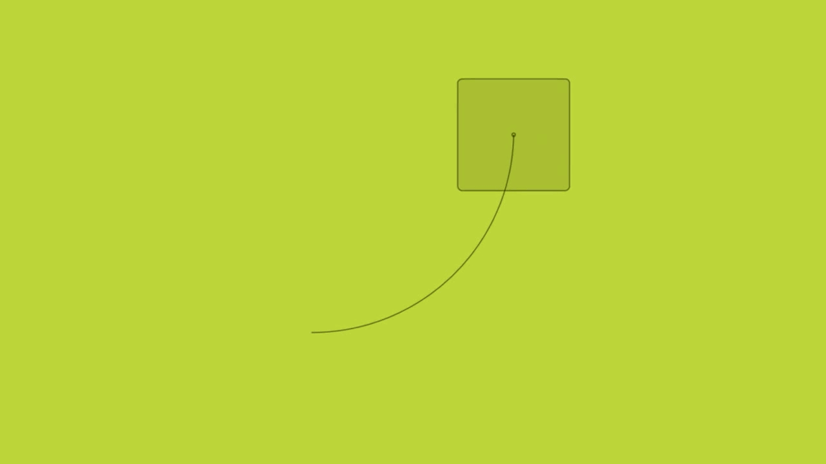
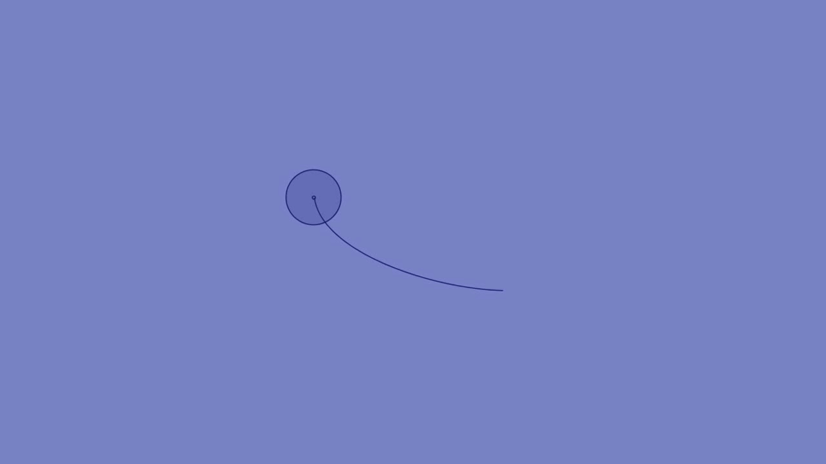
For example, when you tap a small icon to enlarge it. Looking closely at the movement of the center of the icon ......
I draw curves like this. By drawing a curve, it becomes a natural movement closer to a living thing from a robot-like one in which movement gets caught.
Also, the movement of material design is also conscious. What this means is that the object recognizes the existence of other objects in front, behind, above, below, inside, etc of you.
It moves while interfering with other objects, and finally shows what "the most important thing on the screen is" by looking and movement.
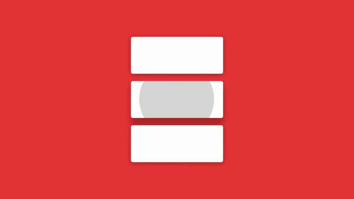
Of the three side by side cards, the middle card ......
By pushing another card and enlarging it, it shows that you are the most important.
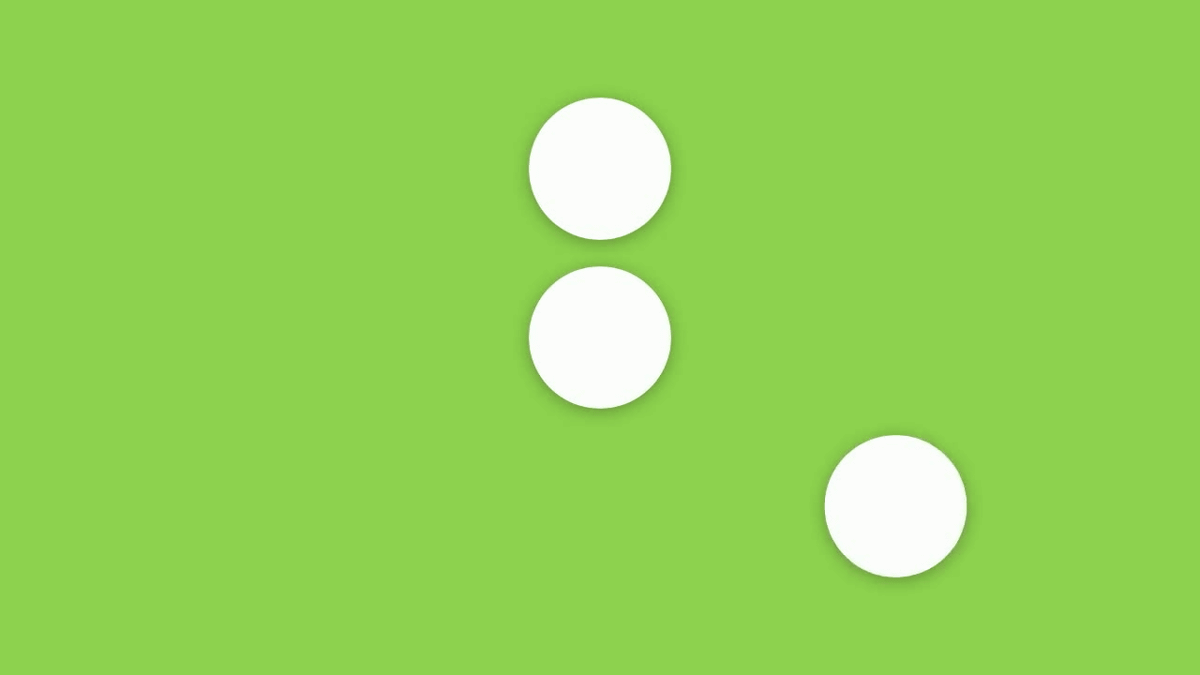
Also, in the state that small balls are lining around a large ball ... ...
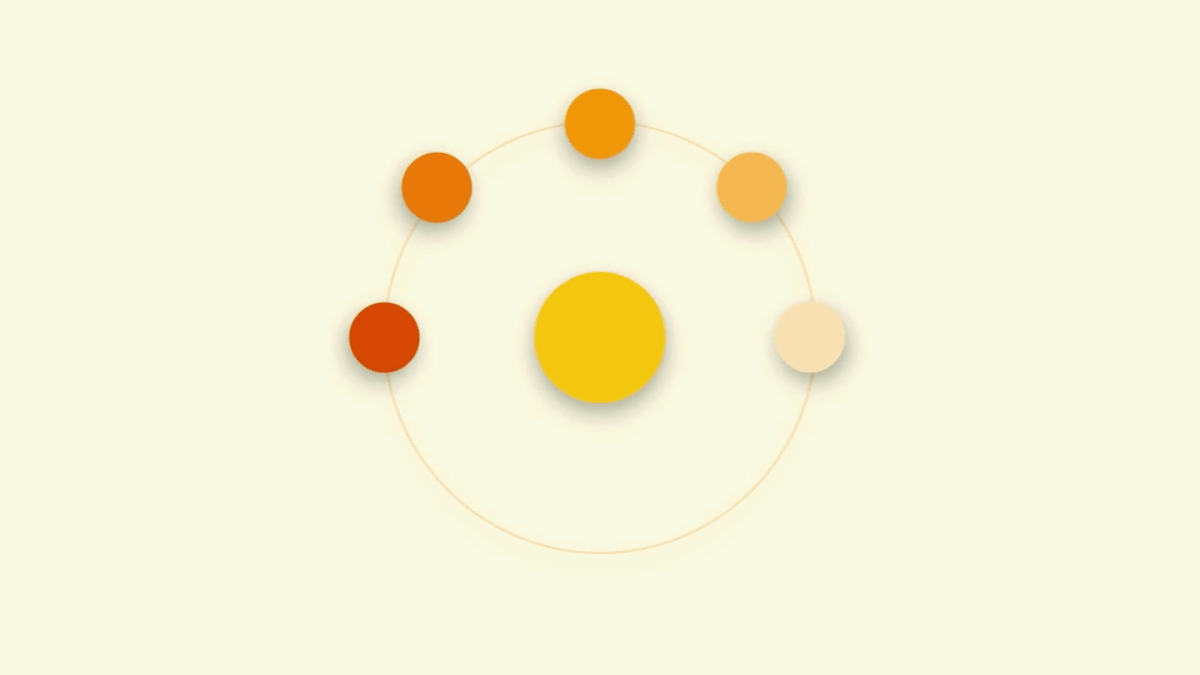
The ball in the middle approaches the ball around and absorbs.
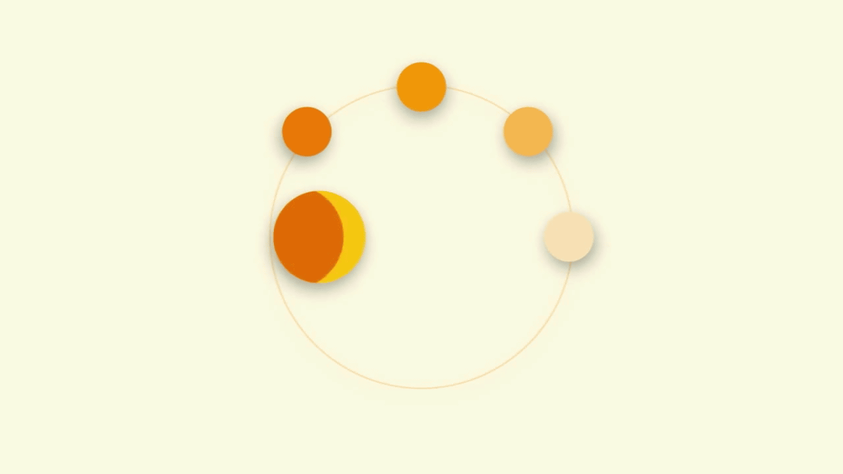
If you let go of one ball, you move to the next ball and absorb the next ball, move it repeatedly and move. It looks like the UI also performs complicated movements as if you understood "what you should do".

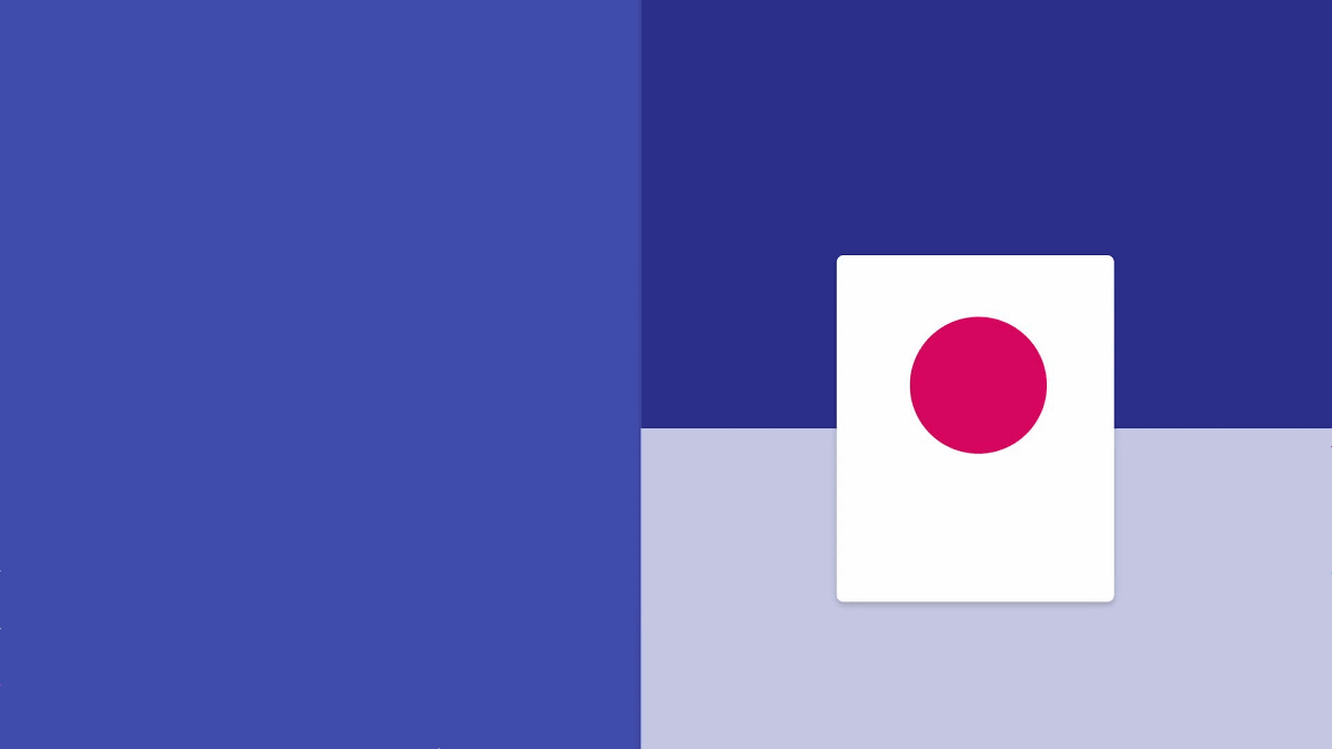
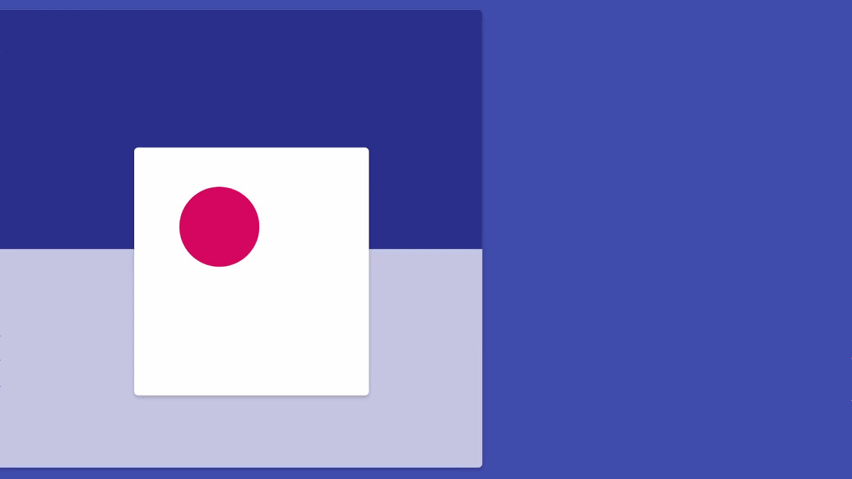
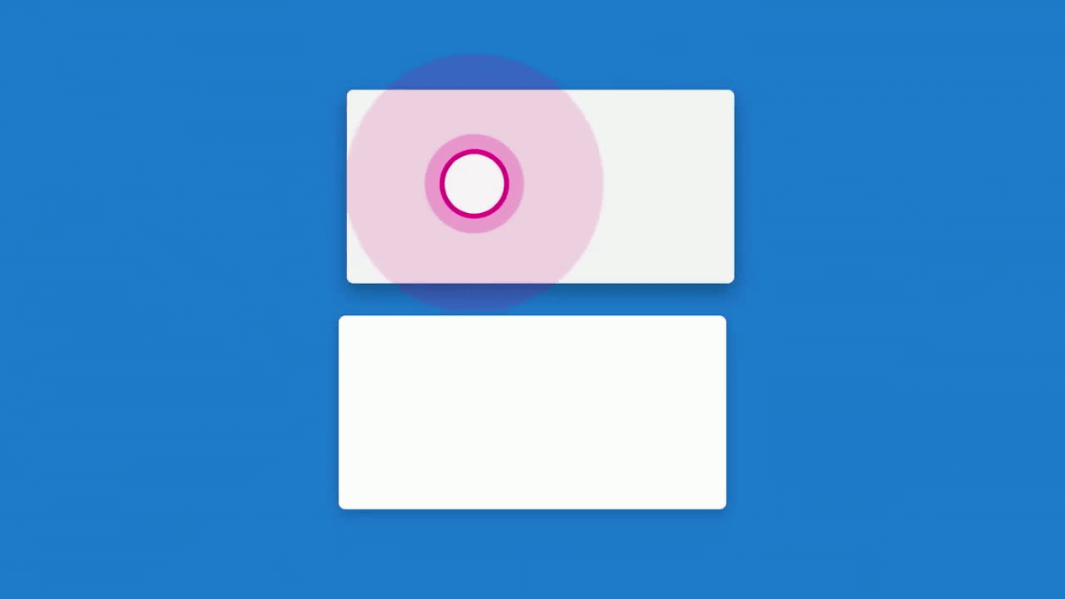
And finally it means "It is an intentional move". "Movement" in material design is intentional with purpose all and leads correctly so that the user does not get lost.
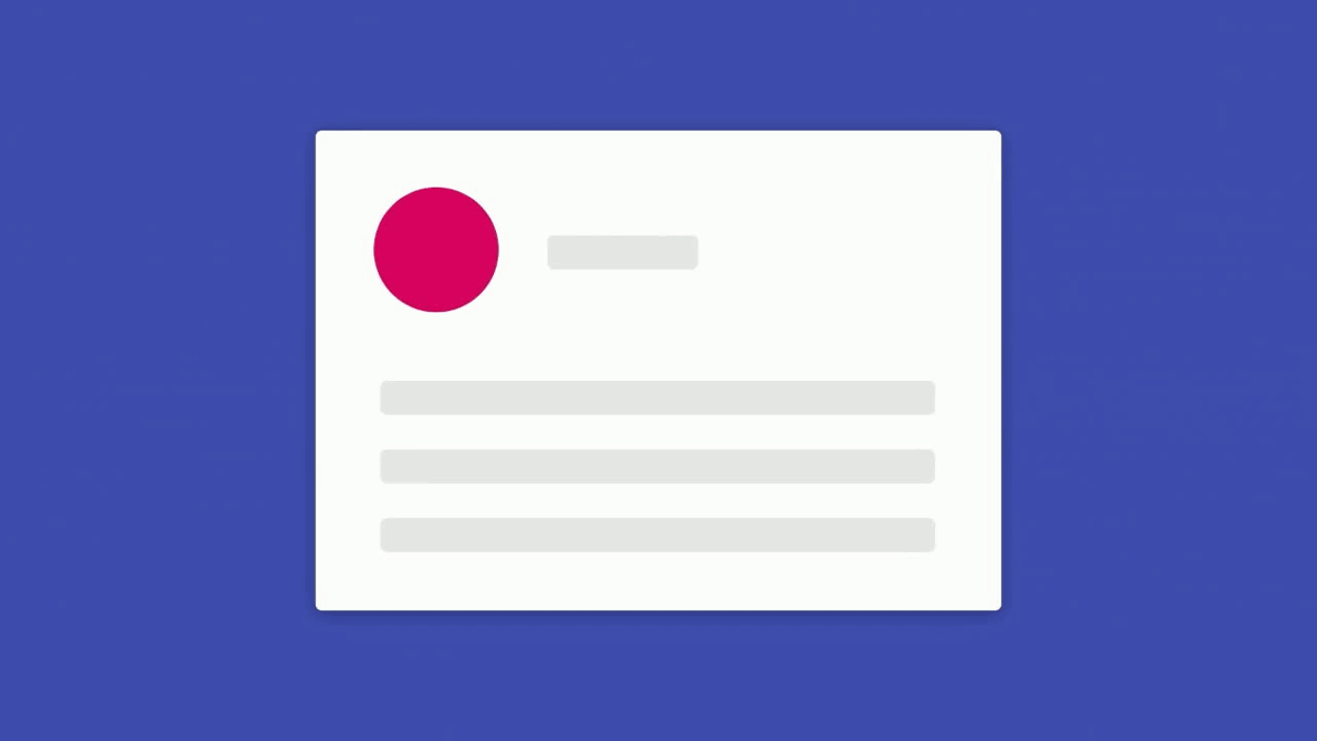
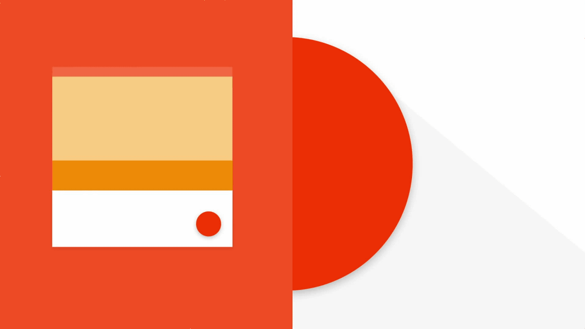
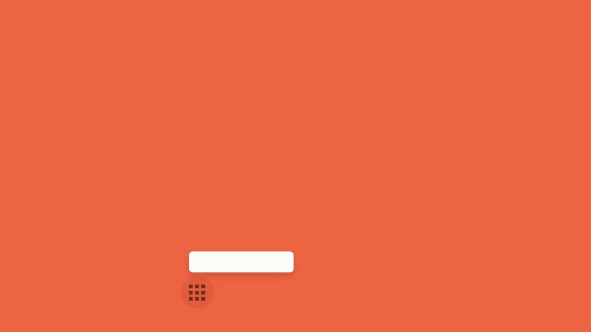
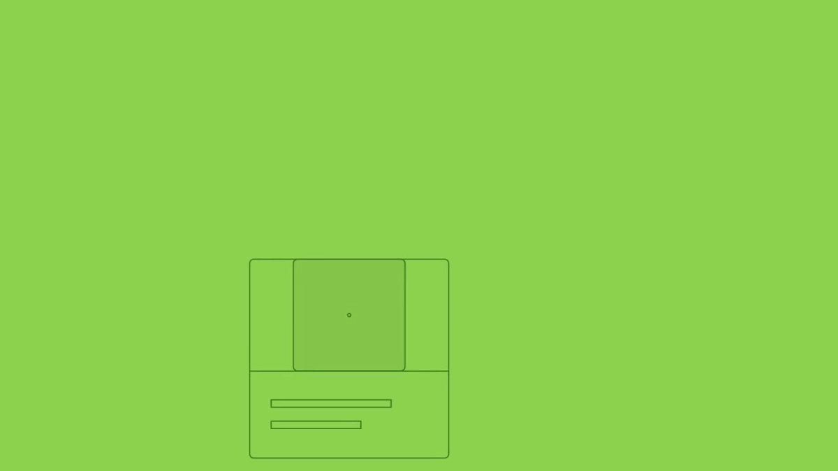
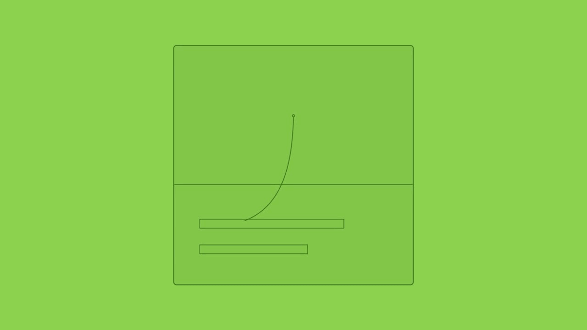
For example, a display with a small card shape ......
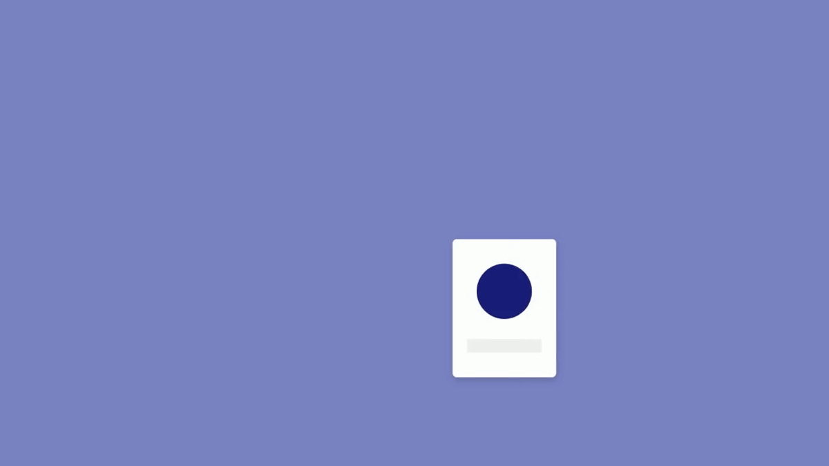
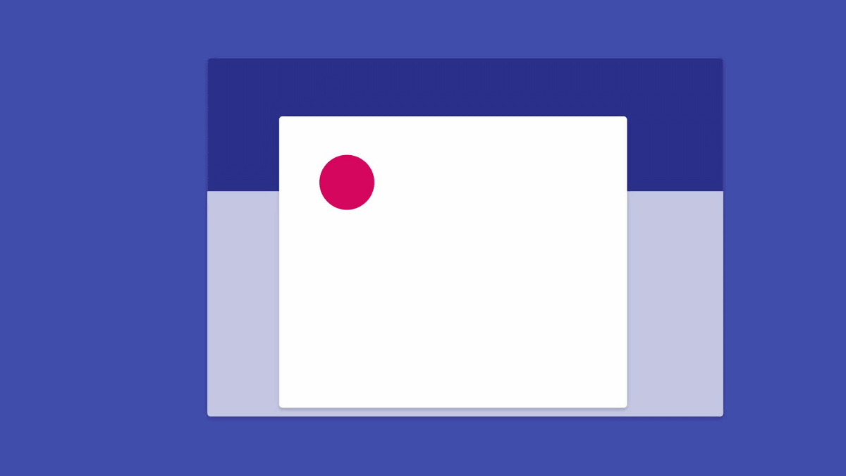
Assume that it is enlarged. The blue part is the part where the avatar is placed, and even if the screen display changes suddenly, since the avatar is displayed, the user is not surprised by changes in the screen and does not get lost.
It makes visualization of how the screen changes, centering on the movement of avatar.
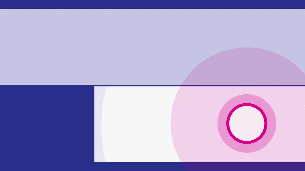
At this time, when there are multiple things indicating movement, it becomes difficult to understand, but by narrowing the movement to be gazed to one avatar, the transition of the screen is displayed naturally and clearly.
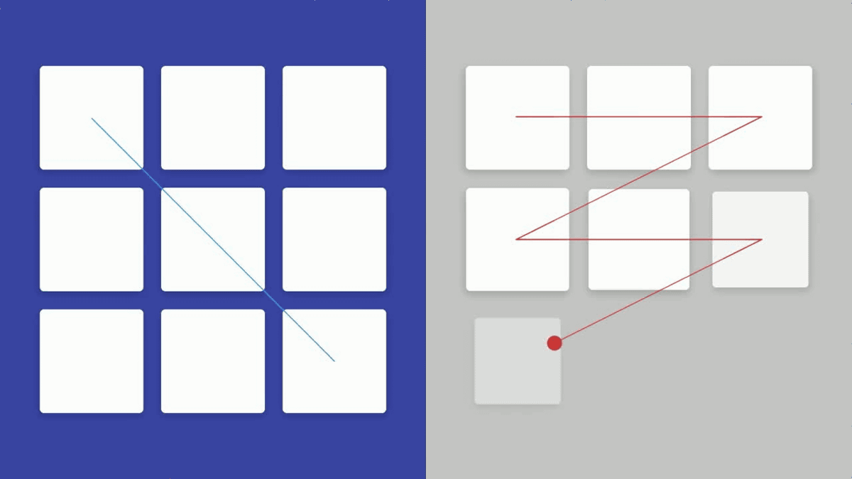
When there are two or more grids, it is displayed to flow from the upper left to the lower right.
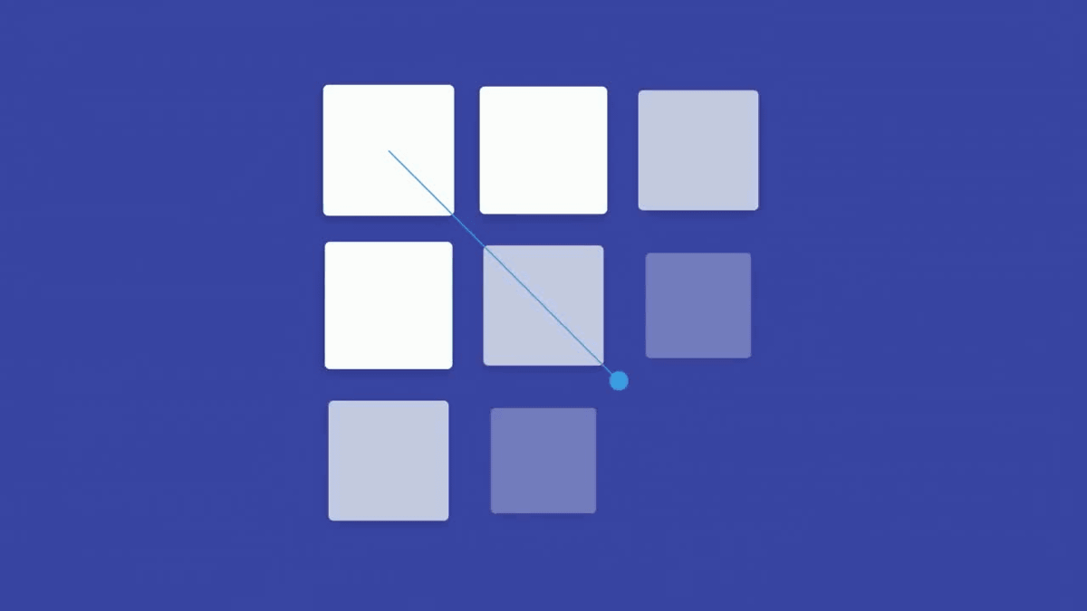
It seems that we can not recommend it because movements from zigzag display to starting point to goal are inconsistent and take time.
Furthermore, it is also important to foretell that "action will take place from now" before action takes place. Even if one card slides it has resistance ... ...
If the other moves smoothly without resistance, it is possible for the user to sense that "the one who moves smoothly can take an action" before completing the sliding motion.
Specific examples utilizing the four rules can also be confirmed from the following articles.
Material motion - Motion - Google design guidelines
https://www.google.com/design/spec/motion/material-motion.html#material-motion-how-does-material-move
In addition, as for the movie related to "movement" of the above material designGoogle I / O 2016Those published as part of. In addition, you can check design related event schedule at Google I / O 2016 from the following article.
I / O 2016: Our Definitive Guide to Design - Google Design - Medium
https://medium.com/google-design/i-o-2016-our-definitive-guide-to-design-4d64d2db7150#.rlngb16gj
Related Posts: