Color Correction Practice Procedure Guide to Correct Color of Photos as Appearance
When shooting pictures with digital cameras or smartphones, it often happens that you are bothered by the difference in color feeling between the real and the photos. This is a problem caused by the difference between the human eye and the camera's mechanism, but it is also possible to approximate the correct color by making corrections using image editing software such as Adobe Photoshop. Site by former NASA officials "Planet LabsIn the blog entry "A Hands-On Guide to Color Correction"Is released to the public.
A Hands-On Guide to Color Correction
https://www.planet.com/pulse/color-correction/
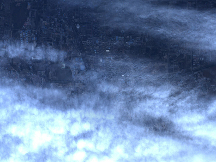
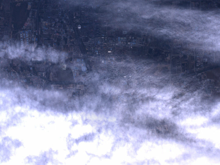
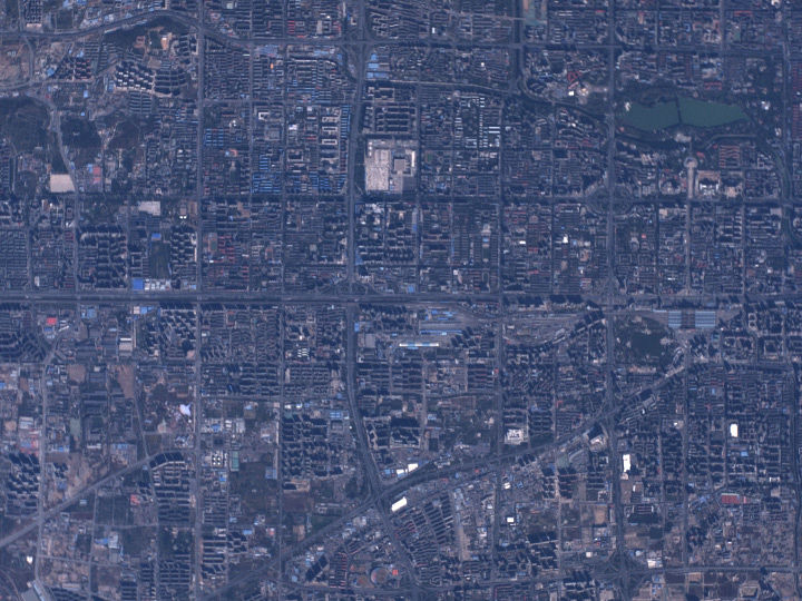
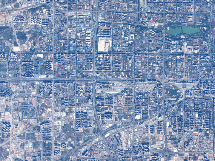
Published a blog entryRobert SimonExplains the procedure of creating an image that is close to the actual appearance by adding corrections to the photographs of the ground surface taken from artificial satellites. First, the original image is Kore. It is an image taken of the city area of Beijing from 100 km of outer space from the Earth's surface, but it is a bluish picture overall due to the influence of the atmosphere.

And the image which correction is completed is kore. On the whole, the original color is restored, you can see that it is corrected to natural color such as road color, soil color, trees green.

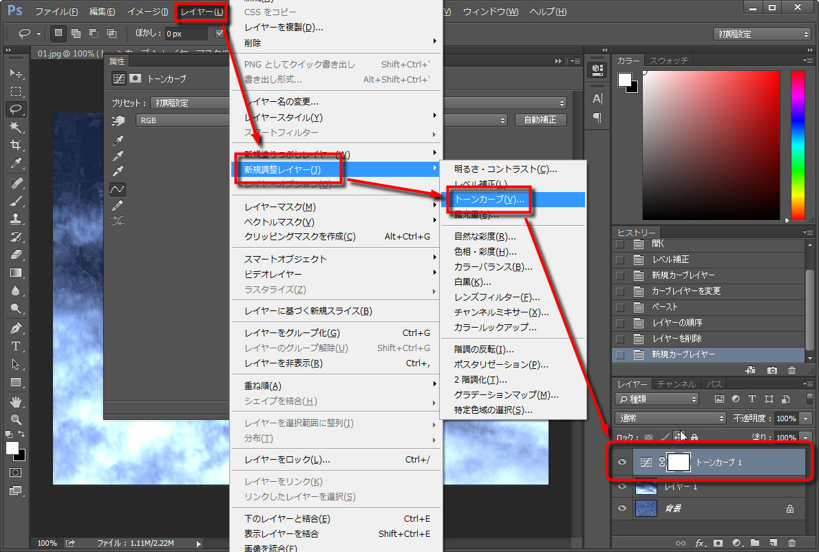
◆ Correction procedure
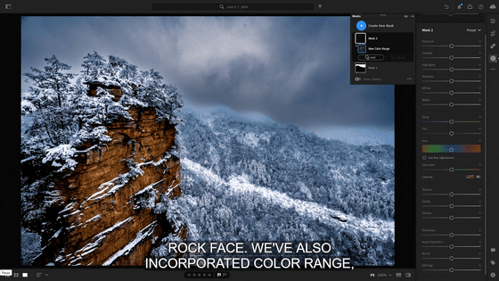
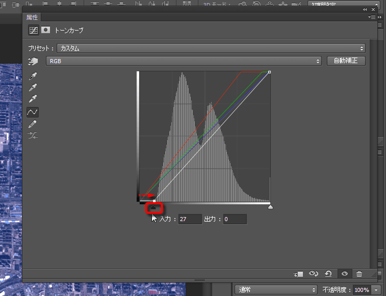
First, open the image with image editing software such as Photoshop. Simon says that Photoshop is recommended, but other image editing software such as GIMP is OK. For Photoshop, go to "Image" → "Color Correction" → "Level Correction" to display the level correction window. Then rewrite the numerical value shown in the image below to "16" or a multiple of 16 and adjust the level.

In addition, although we have to pay attention here, since the content shown in this procedure is the procedure for correcting the actual satellite image, if you are using an image that is not original in this article When loading in Photoshop, different parameters may be displayed. In particular, since it is said that the original satellite image is recorded at a depth of 12 bits, it seems that the number of bits differs from the image generally used on the PC in general. For that reason, it is good to have it read aloud from the viewpoint of "Proceed with such a procedure or way of thinking" as a whole.
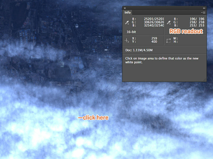
After adjusting the level of the image, I will find the reference white part next. In the original image there was no white that seemed to be the standard, so Simon picked up the following picture of clouds from another picture taken in the same environment. Originally it is said that the snow right after it fell is the best material, but clouds like the following will also be a material that can be used enough as a white point. Especially,A cloud of state that is not saturated white (skipping white)It is still better if there is. Copy this prepared photo and paste it as a layer on the image you want to correct.
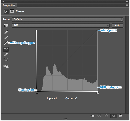
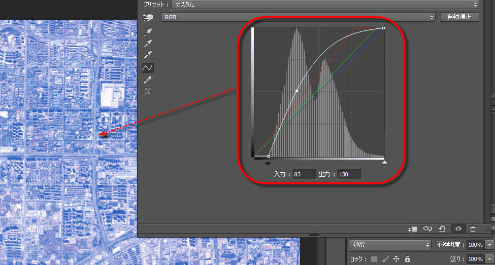
Next, go to "Layer" → "New Adjustment Layer" → "Tone Curve" to create a tone curve adjustment layer. By doing this, it is possible to correct the color tone while keeping the original image, and there is the merit that you can turn on / off the correction you added with just one click.
When creating the adjustment layer, the window "Properties" ("Japanese", "attribute") is displayed. Next we use the white eyedropper (eyedropper) at the third from the top of the eyedropper icon lined on the left of this window. By clicking the white part of the cloud while activating this icon, give the command "Please consider this part as white and adjust the whole color tone".
So click on the white part of the cloud. At this time, if you select a portion that is white-out, you can not correct it as you want, so it is a point to pick a portion that is not saturated. And you need to choose the part of the ground where the color is not transparent.
An image of the state where Simon actually designates white is kore. Compared to the one above, the bias which was bluish overall was coming off and the appearance of the ground approached the natural coloration.
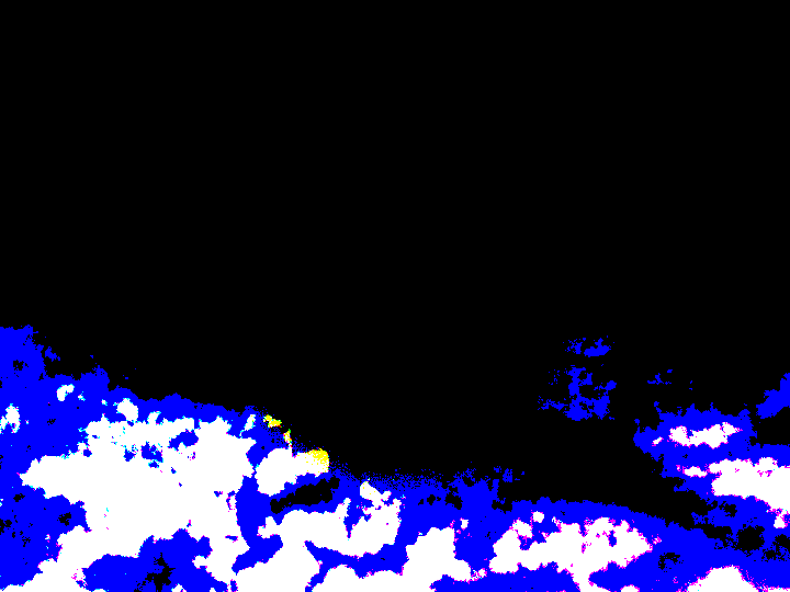
It is also possible to display saturated parts and check them. If you press "Alt" while the eyedropper is active and "Option" key on Mac, the screen is highlighted as shown below. When all RGB are saturated, it is displayed in white, and the part where B is saturated is displayed in blue.
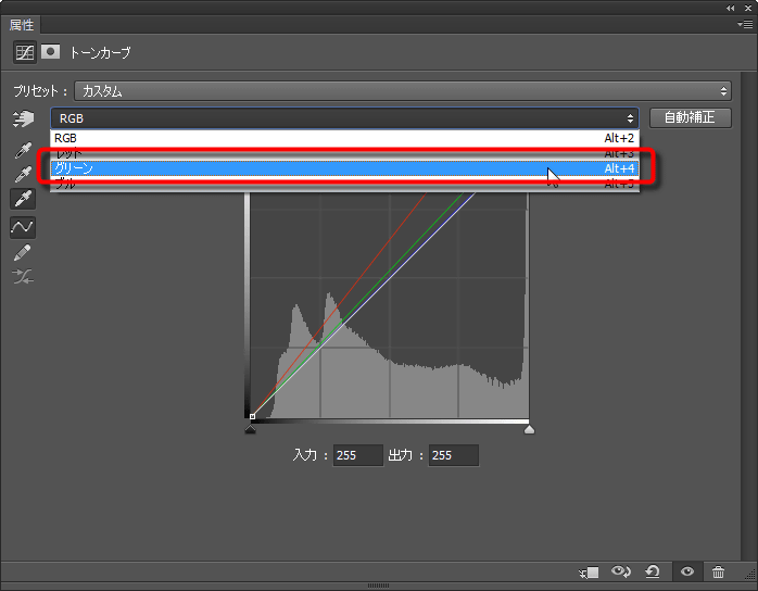
It is also possible to pursue color at this stage. For example, when you think "I want to weaken the green a little bit more", you can select "Green" in the "Attributes" window and adjust the tone curve freely by touching it with the mouse.
If you can adjust to a satisfying color, you will have it disappear in the image with clouds you used for setting. However, it is OK to just turn off the display of the layer, not delete it with "Del". Then ...

It got bluish even from the original image, and it was corrected to a color close to nature.
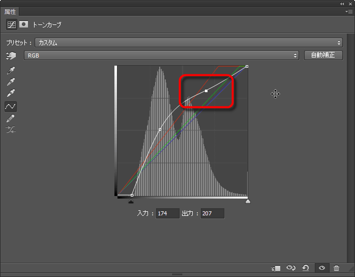
Next to the color tone, adjust the overall brightness and contrast. First move the triangle in the lower right corner of the tone curve to the right and move it to the point where the peak of the histogram rises. This is a setting to make the black part blacker with the setting "I will make it here" black black ". By doing this, the range from the bright part to the dark part of the whole image expands, and it can be corrected to a sharp image with high contrast as a whole.
When black is decided, the next is adjustment of the overall brightness. Click on the white line of the tone curve to create a point and drag with the mouse to move it to draw an upward arch. Then, the brightness of the whole image got bigger and lifted. Adjust the curve while looking at the change, set it to a state that is not too bright, not too dark.
If you try to lift the dark area too much, the bright part may be lifted too much and it may turn white. In such a case, it is also recommended to make another point and to keep the brakes so that the bright part does not rise too much.
In this way, the image after correcting the brightness and the contrast is kore. It has come close to the real color considerably, but there are parts that can be compensated a little more. What should be considered at this time is "the influence of the atmosphere". When light passes through the atmosphere, the blue color that is shorter than the long wavelength red is strongly diffused, so the color intensity will be unbalanced.
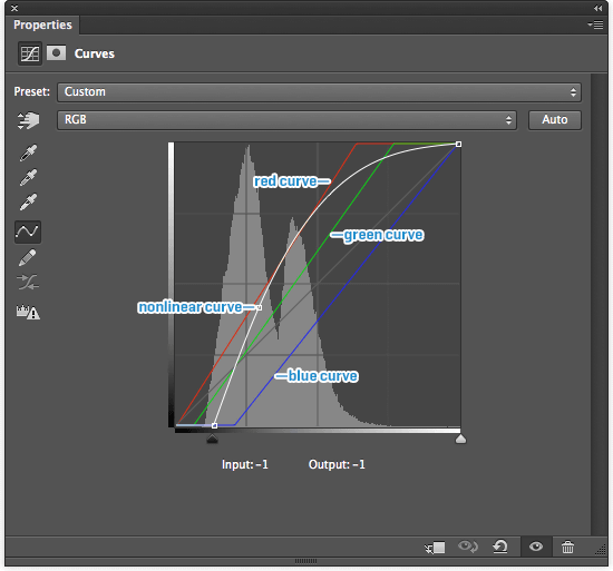
In order to correct this, Simon coordinates three colors of RGB individually. The finally set tone curve has become as follows. Then, the image whose correction is completed ... ....
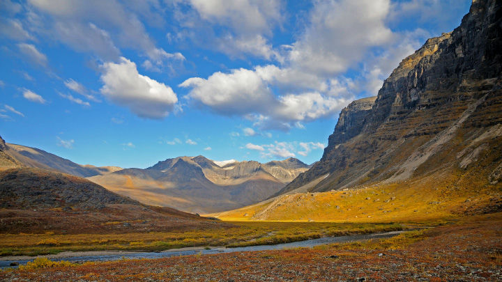
This image seen at the beginning. You can see that it is finished in a very natural hue. In fact, in addition to the tone curve above, we are also doing a correction to make the color rich by slightly saturating.
In this procedure, a slight special material called an image from a satellite is used, but the way of thinking can also be applied to ordinary photographs. Just set the white to white, set the black and white with a tone curve, lift the overall brightness and the quality of the photo will improve greatly. Afterwards it is better if you apply little power to color with saturation etc. Based on the method introduced here, since my own methodology should be visible while touching several images, it seems to be said that performing a number anyhow can be a shortcut for improvement.
Related Posts: