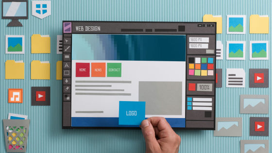
30 psychological strategies to dramatically increase conversion rate

ByTim Franklin Photography
Nick Kolenda, who works as a market research analyst, is a specialist of SEO and PPC, and is doing psychology, introduced from the point of view of psychology30 psychological strategies to dramatically increase conversion rate"Is released to the public. There is a strategy to become "fearful ... ..." from "Humuhum, I see." It is content that should be known as a user who does not have advertisement operation or SEO knowledge as a service user.
Conversion Optimization: An Enormous List of Psychological Tactics
http://www.nickkolenda.com/conversion-optimization-psychology/
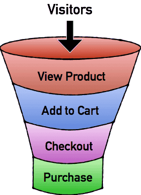
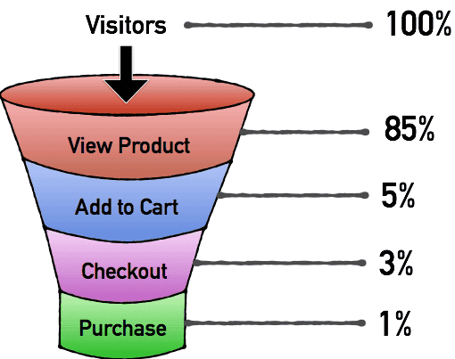
In preparation for seeing the strategy of 30, we divide the services we operate into separate CTAs and create a funnel section. For example, in the case of the EC site, "View Product", "Add to Cart", "Check Out", "Purchase", and so on.
Next, calculate the conversion rate for each CTA, see which CTA needs improvement most, and refer to 30 strategies starting from the next.
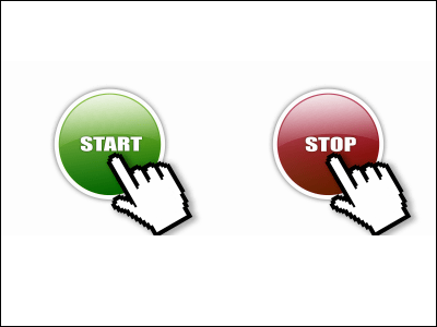
◆ Click
If you are comparing a conversion to a funnel, clicks are at the entrance of the funnel. The bigger the entrance to the funnel, the more CTA's conversion rate will follow.
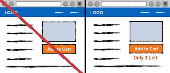
· 01: Button color is color with contrast
In ancient times when we were hunting, our ancestors had taken the method of searching for the existence of prey and attacker from the traces left on trees and the ground, but how to distinguish traces , The difference in contrast with the surrounding color. To distinguish foreign objects from contrast is also potentially provided to modern humans, and the stronger the contrast, the more attention can be drawn.
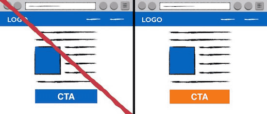
In the image below, it indicates that the button you want to click is made red different from the surroundings, which enhances the contrast, indicating that the conversion rate has increased by 21%. According to Mr. Kolenda, by making the contrast stronger, the action of clicking becomes easier for the user to enter the spirit.

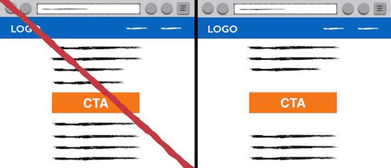
· 02: Increase margin
Contrast can be increased by increasing the margin. As mentioned above, increasing the contrast increases the conversion rate.
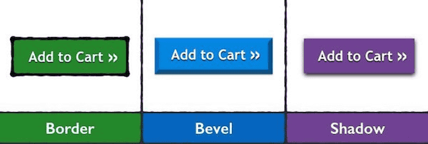
· 03: Use thick frame · bevel · shadow
There is a site which makes the button bigger only to make it stand out, but it is NG. Instead of making it big, make it oblong by making it a thick frame, oblique angle or shadow. These minor design changes give the buttons a depth, making it easier to click.
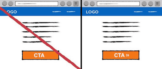
· 04: Insert arrow
Point to make it easier to click to put an arrow like a picture button to potentially tell you that clicking here will proceed.
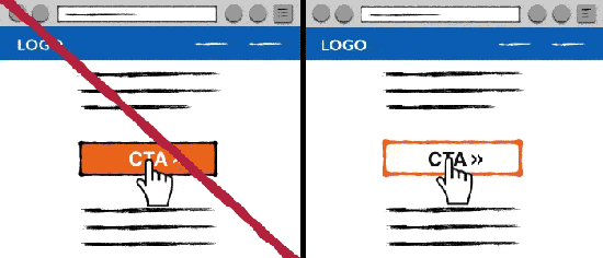
· 05: Show changes when mouse over
If there is any change in the button you want to click on the mouseover, clicking becomes easier.
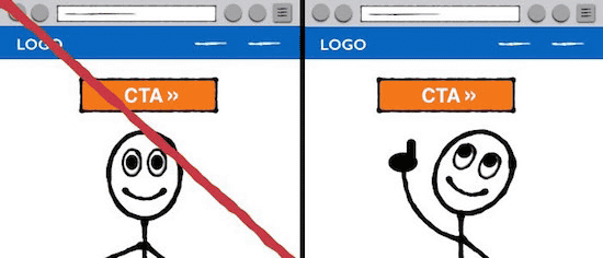
· 06: Staring at the button
Humans sometimes direct attention to someone's line of sight. If everyone is looking in the same direction, it will be anxious what is following that. Using this, it is good to display images with the line of sight turned to the button you want to click.
· 07: Multiple buttons installed
By installing multiple buttons, it is possible to draw user's attention. If you set the buttons on the top right and bottom of the page, the possibility of missing both will be low. Also, although I was not interested in the moment when I opened the page, some users are more interested in reading downwards and want to click buttons. Furthermore, in a study by social psychologist Robert Zians, people know that they feel an impulsive affinity for repeated things, and by installing multiple buttons it becomes easy to click.

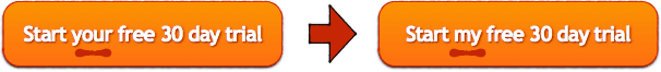
· 08: Use first person
Just by changing the text of the button to the first person's name, "not starting" 30 days free experience of "you", but "starting a free trial of" I "for 30 days"Conversion rate increased by 90%There is an example. From the point of view of psychology, it seems that actions are caused by superimposing oneself, and the impulse to behavior naturally comes about.
· 09: Change the color of the same button
If there is an irritating change in the environment where you are, you may find that you are closely related to that stimulusDiscovereddoing. Familiarity is potentially generated even if the parties do not notice changes in the environment. In other words, if you first set the button to "blue" and change the button to "orange" when the page scrolls, the user will be familiar with the button due to the potential reaction inside of you and click on it It will be easier.

· 10: Force selection to click or not
For example, suppose that when you are walking down the road, free drinks are dealt forward. You decide to ignore that it is a delicious story, but I will ignore it, but when I say "How about a free drink?", I can not ignore and cause an action to "refuse" I need it.
However, sometimes "free drinks are distributed as" a delicious story "," I thought it was bad "and" Refusing it would be bad ", and eventually I will receive a free drink as recommended. This trick is also used for CTA. When offering a free trial, you should force "Yes" or "No" instead of "Send an invitation email with letting you enter your email and name." People think about the profits gained by refusing when refusing an offer. In other words, if you declare that there is not any profit even if you refuse it, it will be difficult to decline the offer.
◆ Account creation
After breaking through "click on button", waiting next is an "account creation" procedure necessary for subscribing to blogs and applying for a free trial.
· 11: double opt-in
In order to raise the conversion rate in account creation, make creation method a little more difficult, not simple. In account creation, there is a method called "single opt-in" to display the form directly, or "double opt-in" to display the form after clicking some button. At first glance, a single opt-in who does not take time and effort seems to raise the conversion rate more than a double opt-in requiring a two-step action, but according to Mr. Kolenda, double opt-in is more effective.
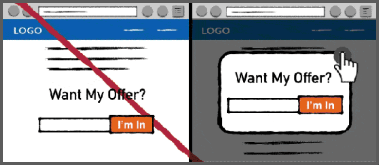
Normally, the user is not aware of the next step when clicking the first button. Users clicking on the first button and noticing that there is one more step is said to make the interest that was originally embraced stronger. When reaching the second step, the user hugs the dilemma "Please let me register early", which will strengthen the user's interest. The state of the user at this time is "Cognitive dissonance", Motivation to resolve dissonance rises. So it's not a single opt-in, but double opt-in is effective.
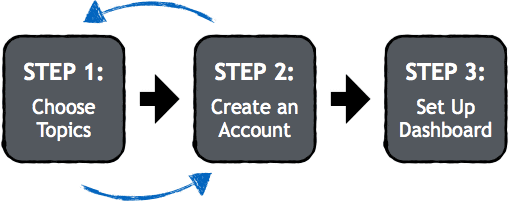
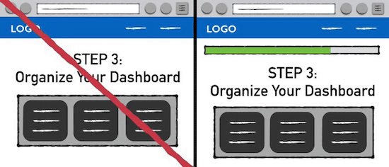
· 12: Specific progress
For example, when registering in the subscription service, it is common to proceed like "Step 1: Create account", "Step 2: Select topic", "Step 3: Set up dashboard" as shown in the image below.

However, changing the step 2 and step 1 will increase the conversion rate. For some reason, "choosing a topic" is more appealing to the user's interest than "creating account (personal information input)" and because there is little sense of exploitation of information. Also, if you give up in step 2, you can make me think that all the work we have done so far will be useless.
· 13: NG credit card information input with free trial
If you mandate credit card information in a free trial, users tend not to sign up. However, it is also true that some people think that it is difficult for users to upgrade to paid members unless credit card information is entered.

Totango's investigation(PDF)Then, if credit card input is mandatory, although it is true that many users shift from free trial to paid members, it turns out that few users start free trials in the first place. On the other hand, if credit card input is unnecessary, many users applied for a free trial, consequently the conversion rate increased. Although it appeared also in the item of "click", enlarging the frontage of the funnel is the basis for increasing the conversion rate.
· 14: Display the progress status of account registration
Psychological experiment using coffee shop stamp card(PDF), With two types of stamp cards "one free for stamps and ten for stamps" and "one free for stamps, 12 for one stamp, but the first two are stamped" which one gets a repeater As a result of investigation, it turned out that the latter acquire the repeater.
Despite the fact that both cards need 10 stamps, 12 stamp cards were able to obtain repeaters, clearly indicating the progress of the stamp from the beginning as "clear 2 out of 12" It was because it was. So to create an account, you should clearly state the progress such as "Profile creation is 23% complete", "2 steps out of 5 steps completed", "3 out of 10 answered" and so on.
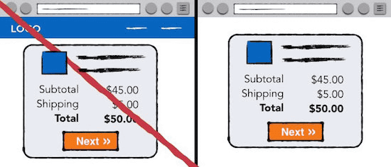
◆ Add to Cart
In case of EC site, CTA called "put in cart" before purchase is mandatory. Also, if there are multiple paid plans in other services, you need to have one of them selected by the user.
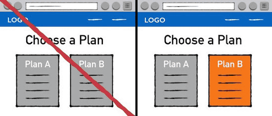
· 15: Emphasis on contrast
If there are two paying plans, we will clearly highlight the contrast of those who want to choose. If there are two choices, the eye gazes naturally to the one with conspicuous visuals, and there is a tendency to look for long. There is also a tendency to choose one of the two choices that has been seen for a long time. Together, if you emphasize the contrast of the options you want to make and make it stand out more than other options, it will make it easier to choose naturally.
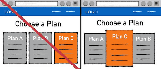
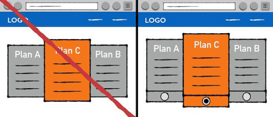
· 16: The plan you want to pick up is in the middle
When multiple items are lined up, the one that attracts the most attention is located in the middle. In other words, if you put the plan you want to pick the most in the middle, the conversion rate will rise.
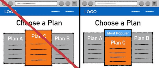
· 17: Make the plan you'd like to pick "the most popular"
The propaganda "most popular" is a magical word that attracts customer attention in every business field. This is based on social behavior that human beings are easy to pass by opinion of many people, and by placing it in the plan that is "most popular", the user can select nature and easy walking path (plan to be selected) I will begin to advance.
· 18: Make default options
The conversion rate will improve if you put a default check in the plan which you want most to choose. The default setting allows you to lower the decision hurdle or make that option the "most popular" option. It seems like a brute force method, but as a user this strategy should be known.
· 19: Function addition is subtractive method
If the service you are managing can be customized, you should use a method to let users delete unnecessary items from all functions, rather than letting users add functionality. As mentioned in "Creating default options", the default is extremely powerful. By default all the functions are added, it seems that users will lose their ability to remove the function.

· 20: Present "Which one will you choose"
Decision making for purchasing follows the process of "1: buy or not to buy" "2: which to buy" "3: how to buy". However, when multiple options are presented earlier, people skip to "choose whether to buy or not to buy" and proceed to "Which one to buy (which one to buy)" Thing. This psychological effect is used for conversions.
For example, many EC sites display the catalog on the top page ... ...
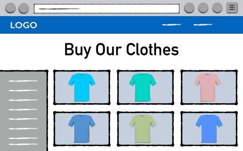
Ask a question on "Do you want clothing for men and women?" Instead of a catalog on the top page, letting you choose gender.
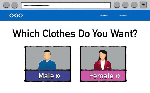
Next is to ask "What type of clothing do you want?"
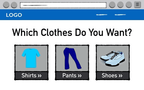
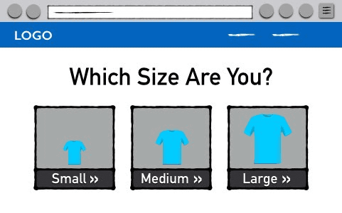
In addition, if you ask "What is the size?", The user seems to be able to purchase more easily from the process "buy or not to buy" to "which one to buy".
· 21: Make a mental interaction
Making spiritual connections with product images and users is a method used also in advertising strategies. For example, users can more easily sympathize images with a spoon attached to the right even with images containing serial images.
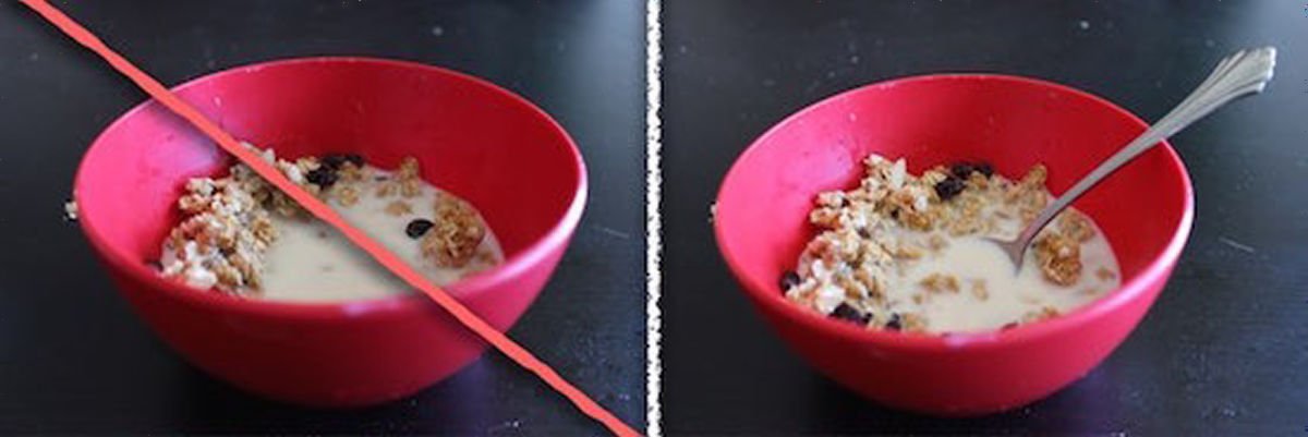
If it is an image of a shoe, the composition becomes like a user wears, the interaction becomes stronger.
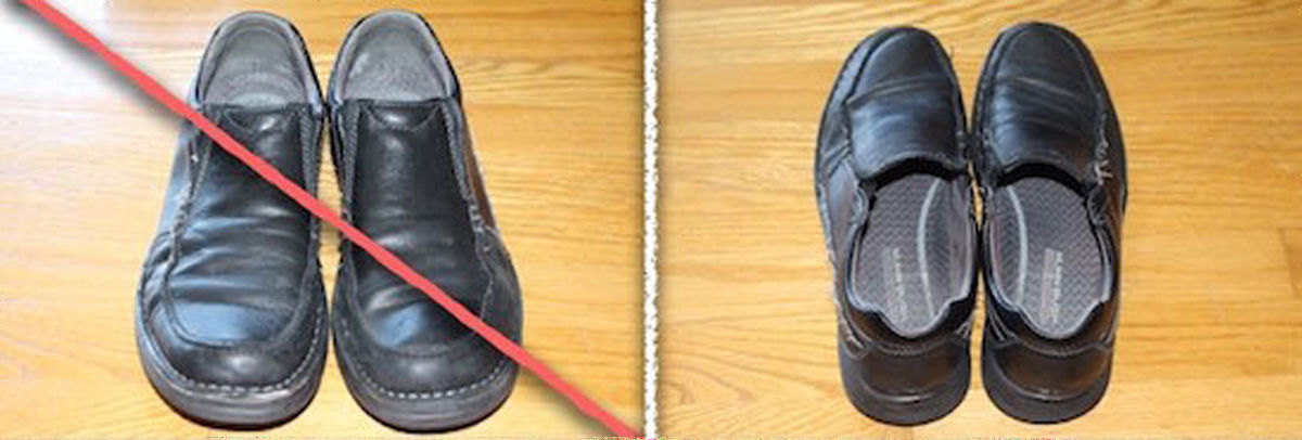
If you eat food, it is better to take it out of the bag. By doing this, it is possible to increase the mental stimulation given to the user. The user has sympathy with the product, making it easier to purchase.
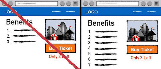
· 22: Specify remaining time and remaining number
This method is quite famous and it is used in many businesses. It is clear that purchasing motivation will increase simply by specifying the remaining time until the end of the sale and the remaining number of items.
· 23: Lengthen product description
Since the length of item description will also depend on the characteristics of the product, it is difficult to say "this is the best" unconditionally. However, it seems that conversion rate will rise as long as it is a boring item as long as you write a lot of features and lengthen product description.
◆ Check out
When the user puts the product in the cart, leaving is "checkout" only, but please do not be discouraged. In a survey among the users who put products in the cartLeave 68.5% without purchasingI know that it is.
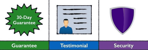
· 24: Use a picture that looks like it for security
Even when purchasing good quality products, people suffer mental pains when they pay money. This spiritual pain is thought to be caused by cognitive dissonance that "I want a product but I do not want to pay the money", and in order to remove it, "justify purchase" "justify not to purchase" There is a way called. To eliminate this spiritual pain, it is effective to paste an image that seems to have the following security to the purchase screen. With peace of mind, users can justify purchase.
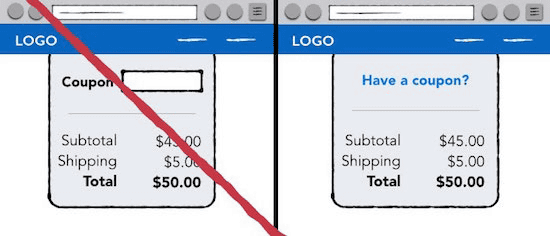
· 25: Coupon number input is quietly
Even if the price of the product to be purchased is legitimate, if there are people who can buy it cheaper than yourself, the user may stop purchasing. In order to prevent this, do not display the entry field of the coupon number and ask it to ask "Do you have a coupon?"
· 26: Remove link from checkout screen
If the landing page contains site navigationTrend toward lower conversion ratethere is. If there is a link on the checkout screen, if the user clicks the link, there is not much to come back. Once you remove the link, it is straight to the purchase completion.
· 27: Retarget users leaving checkout
There are users who leave the checkout no matter what whatsoever the operation is doing. Humans are forgetful creatures, and those who left it will soon forget about checking out. Ali is reminding the existence of products using Google AdWords, Facebok advertisements, and e-mail in order to bring back those users.
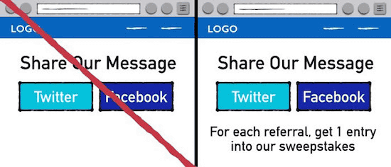
◆ Shared by SNS
While the number of users using SNS is increasing explosively, the action "sharing" is very important for conversions and there is no way to not use this.
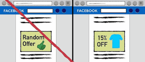
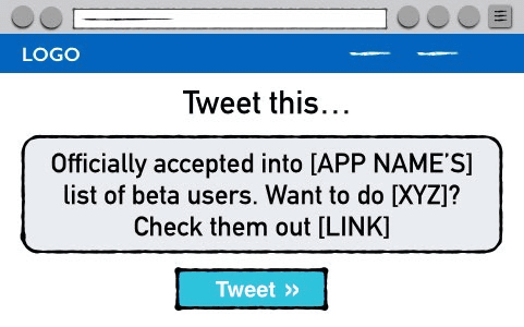
· 28: If you share me ......
Dropbox developed a campaign called "16 GB free gift when inviting friends" and explodedly increased the number of users. In the same way, we will show users the price to be shared by SNS, such as "Distributing discount codes", "Present one paid function" etc.
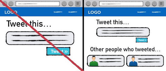
· 29: Show other users' posts and tweets
Posting or tweeting about a specific product or service with SNS is an act that risks users as well. In order to cross the hurdle of risk, it is good to show that "There are many other users who post and tweet", and it is good to rest assured.
· 30: cool messages and products to share
SNS users tend to share content that makes their timeline look good. Content that looks smart, interesting, heart-warming is easy to share. So, you should also create content to consider posting these elements.
Related Posts:

in Note, Posted by darkhorse_log