Why the "hamburger icon" of the menu display button is not good?
The "three" mark icon often used in mobile terminal UI such as smartphone is called "hamburger" icon in the USA because it looks like a hamburger. Although it is a hamburger that gradually penetrated, when viewed from the viewpoint of superiority or inferiority of UI design, the opinion that "it is inferior ugly eradication" is given. As to why hamburgers are not good,James ArcherHe explains theoretically based on the data analysis result.
The Hamburger Menu Does not Work - Deep Design
http://deep.design/the-hamburger-menu/
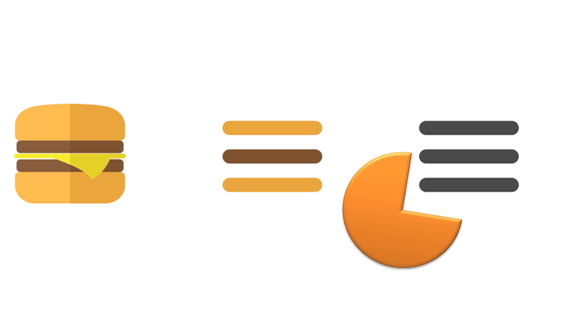
"Hamburger" was surrounded by a red circle in the image below. It is a widely popular icon not only in the mobile terminal UI but also in the desktop UI, you can mainly display other additional information such as menu by clicking.

◆ Unkind
Regarding popular hamburgers, Mr. Archer insists that "It should not be used because it is inferior as a UI design." One of the reasons is pointed out the disadvantage that information is hidden, "Even if something can be obtained by clicking on it, what is obtained is not clear before clicking".
The designer thinks that hamburger has a merit of hamburger from the beginning even though the hamburger is displaying the path about the information that the user wants next, "It has the advantage that the user can urge the user to select the information desired by clicking on it" Because you do not know what you get, the user should have no motivation to click, which is unkind by this.
Mr. Archer cited as an example to explain its unkindness appeared in the 1990'sMandarina DuckIt is a movie that introduces the UI of the homepage of.
Mystery Meat Navigation's Archtype - YouTube
The design that the menu is not displayed unless the mouse cursor hits the moving cube was a technical challenge, but because it was not popular from the user, it was to disappear immediately.
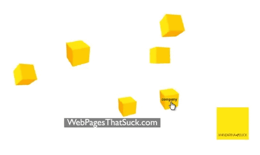
This is a good example that the beauty that a designer thinks does not necessarily match the convenience that the user thinks, Archer thinks that this relationship is the same for hamburgers as well.
Troublesome
Moreover, it is also a problem about requesting the user's action at the beginning that "information will not be displayed unless clicked". For example, on the expressway to the airport, the distance to the airport, the lane, the display of the road condition, etc. appearing in the field of view one after another, will disappear but the driver is unconsciously recognizable and effective. However, it should be clear how much troublesome it would be if the system was not displayed unless the user clicked on the information. Hamburger said that it contains such troubles.
◆ "Scent" does not do
Mr. Archer truncates that he does not understand the user's psychology about the hamburger belief designers' idea that "users should act voluntarily to display information when asking for information."
When the user wants options (additional information), he does not understand clearly what he / she is actually seeking, but he / she is dependent on something like "fragrance" close to what he wants . For example, for a user who is interested in a certain service, information on "charge" is additional information that the user desires unconsciously, and finds information on "scent" such as "charge", "price", "fee" and the like I will.
In this regard, hamburgers quietly placed to hide in the corner of the website are not tasteless, contrary to their name, so they can not encourage users to click for additional information, Archer said thinking about.
◆ Hamburger failure example
A typical mobile phone application of Facebook is one that used hamburgers. Nevertheless, Facebook no longer uses hamburgers as navigation icons. The information that the hamburger was playing now is all arranged as a tab bar at the bottom of the screen.
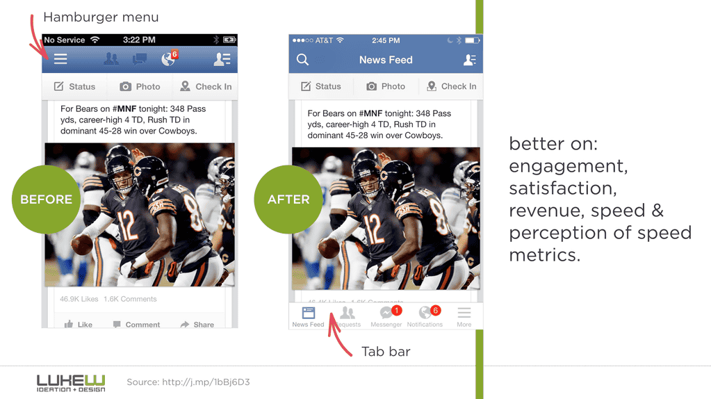
This is based on Google's Luke Robblewsky's "Obvious Always WinsConsideration at. I switched to the toggle menu called "TOP" on the tabs "FOLLOWING", "TOP" and "RECENT" that were on the left side of the screen, but the engagement (click count here) drastically decreased. From this example, we can infer the disadvantage of hamburgers hiding information.
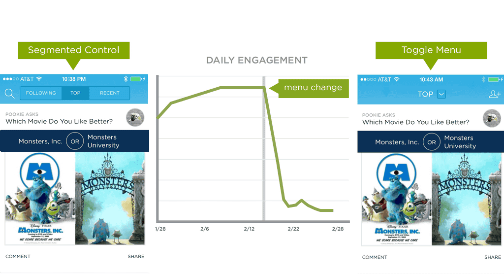
An example in which the engagement rate drastically decreased when changing from "Tab Menu Style" to "Navigation Drawer" also with all the menus written.
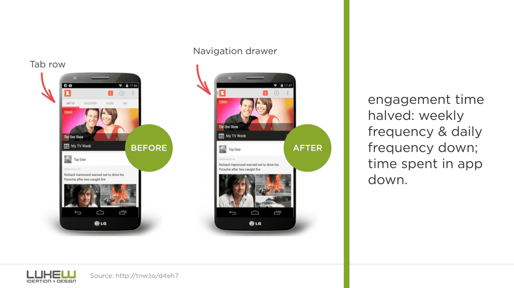
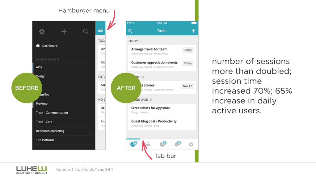
On the contrary, when you stopped hamburgers and put the information on the tab bar at the bottom, the access rate increased by 70% and the staying time increased by 65%.
Netsuke is the desktop site of NBC NEWS. It is a site that can also be said to be a pioneer in incorporating the UI layout for mobile terminals into the desktop site in the layout with the hamburger menu displayed on the upper left of the screen.
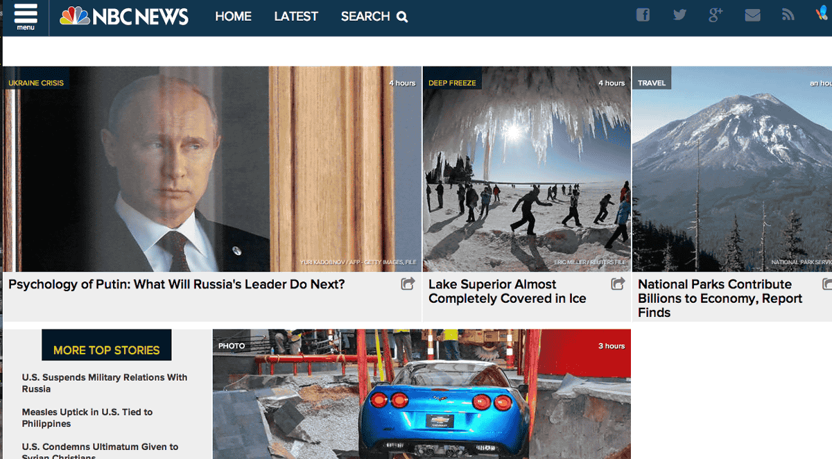
NBC NEWS hamburger was not noticed, it was not clicked at all by the user. So NBC NEWS will leave a strategy to show how to use the hamburger as a leverage, but this will not be clicked on.
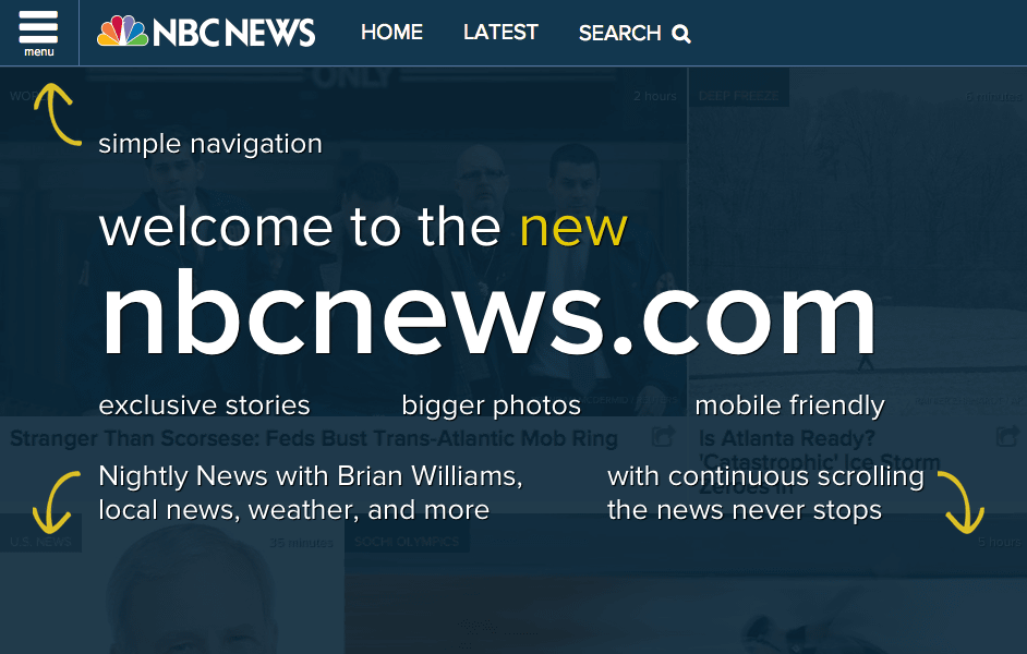
In addition, it turns out that the hamburger is yellow and made to stand out.
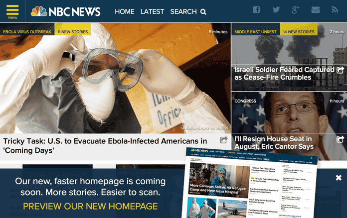
And this is the current site layout. The absence of the appearance of a hamburger seems to tell the value as its UI.
◆ Hamburgers
As an advantage of hamburgers, Mr. Archer is superior in terms of design, such as being able to make the design simple and beautiful, "space-saving" of making space for placing other information in the screen for mobile with limited screen size I admit that it is. However, against designers' excuses that "users will understand how to use hamburgers in a matter of time", he says, "Really good design takes less time to get citizenship" .
For example, in the case where it is used as a specialist such as software used by a medical professional, the hand of omitting / consolidating information with a hamburger to save waste is ant. But except for these exceptions, Archer believes that hamburgers should not be used.
So, Mr. Archer introduces some examples on what kind of design is good as a dish burger.
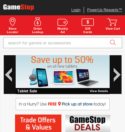
· Icon + Text
this isGameStopDesign of mobile site. Instead of using the menu bar, I adopt the design that displays "icon and text" in combination at the top of the screen. Compared to hamburgers, although they are inferior in space-saving properties, they are said to be superior to hamburgers in that they have an easy-to-understand and "fragrance" and also maintain a certain design.
In addition, Mr. Archer says that user-friendly pages can be realized without relying on hamburgers by reconsidering the site design itself in the first place. It is worth considering whether it is possible to improve usability by placing "escape route" in place such as "return button", "home button", etc. instead of including all the information on one page.
·Priority
This is the desktop site of McDonald's, the original hamburger shop. Instead of a hamburger, a tab bar menu that allows you to display various information is adopted.
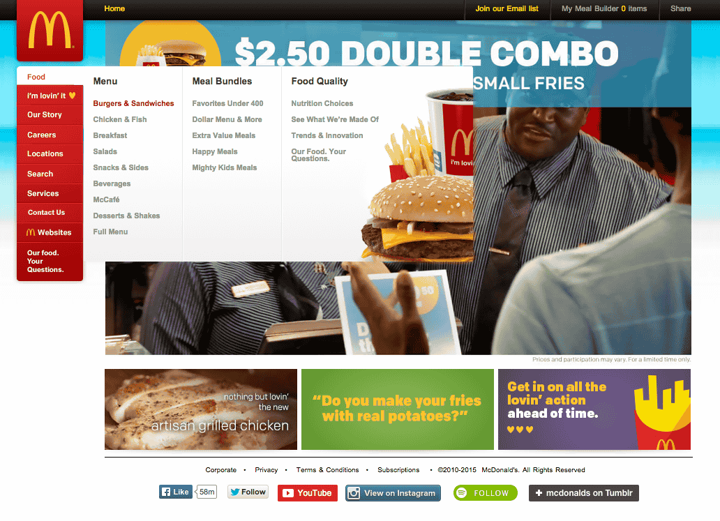
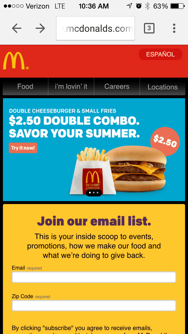
Meanwhile, McDonald 's mobile site looks something like this. There is neither a tab bar menu nor a hamburger menu. Among the menus displayed in the list on the desktop site, tabs with high priority, such as "Food" "I'm lovin'it", are tabbed, and other information can be displayed by scrolling So the placement has been changed.
Instead of relying on a hamburger menu easily, it is said that it is also effective to examine what information the user is asking for and arrange the layout with priority priorities.
Related Posts: