A thorough study on manga and animated logos made from what kind of fonts "Robotteppu! Books to thoroughly study the logo of manga, animation, Ranobet"
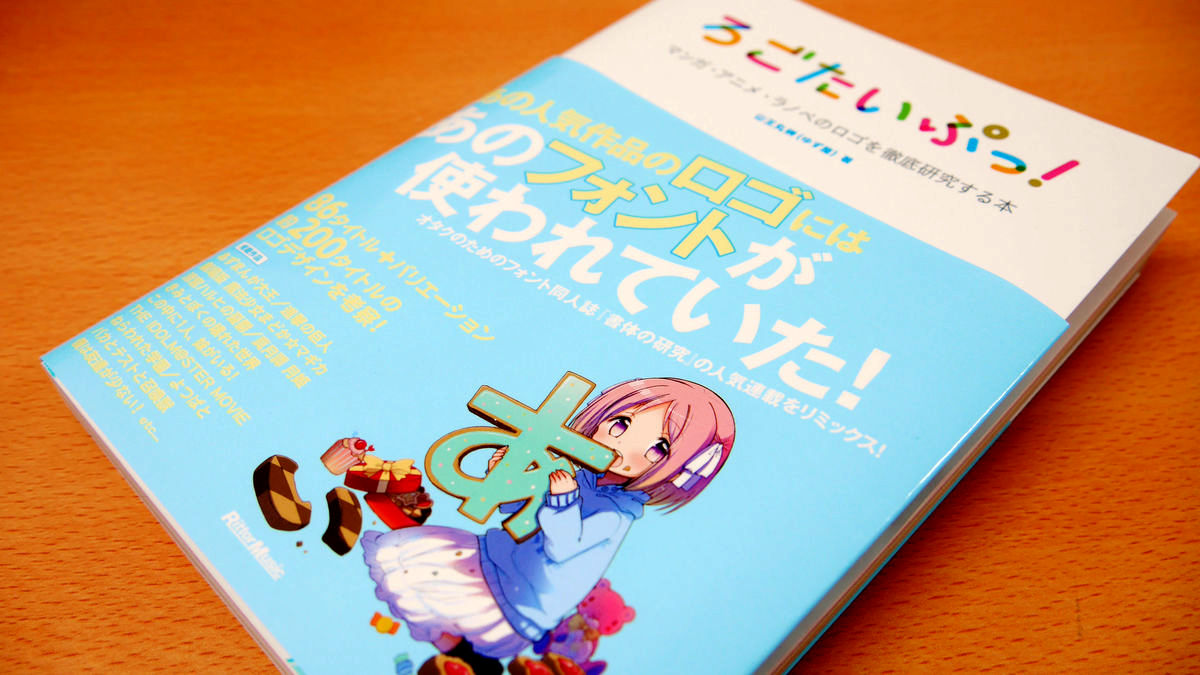
"Manga, animation, lanobe etc"Logotype(Logo) ", thoroughly examine fonts used, reproduce the logo actually, compare it with similar fonts and explain about the origin of the font, how the font arranges It will be seen one by one whether it will become a logo "A book that thoroughly studies the logo of poor manga, animation, and Ranube"is. "Attack on Titan"Magical Girl Madoka ☆ Magica"Tsukihime Toni Hime"THE IDOLM @ STER MOVIE"Yotsubato"Kinross mosaicIncluding comparisons with 86 titles of all 86 titles including titles and titles using the same font, and commentary on fonts used other than the logo are included in Morimori.
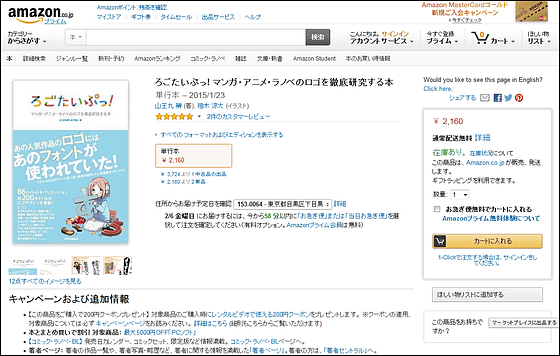
Amazon.co.jp: Coolest Puppy! Books that thoroughly study the logo of manga, animation, and Ranobet: Sanamaru Sakaki, Yuzuki Ryota: Books
http://www.amazon.co.jp/dp/4845625598/
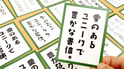
This is "A book to thoroughly study the logo of manga, animation, Ranube!" DoujinshiYuzuyaIt is this book that I revised and revised and revised and revised the articles of volunteers 4 - 13 of Doujinshi "Font Style Studies" published by Yuzuya Official Blog and published this issue.
When I remove the band, it looks something like this, a big "font body moe" stamp is pressed.
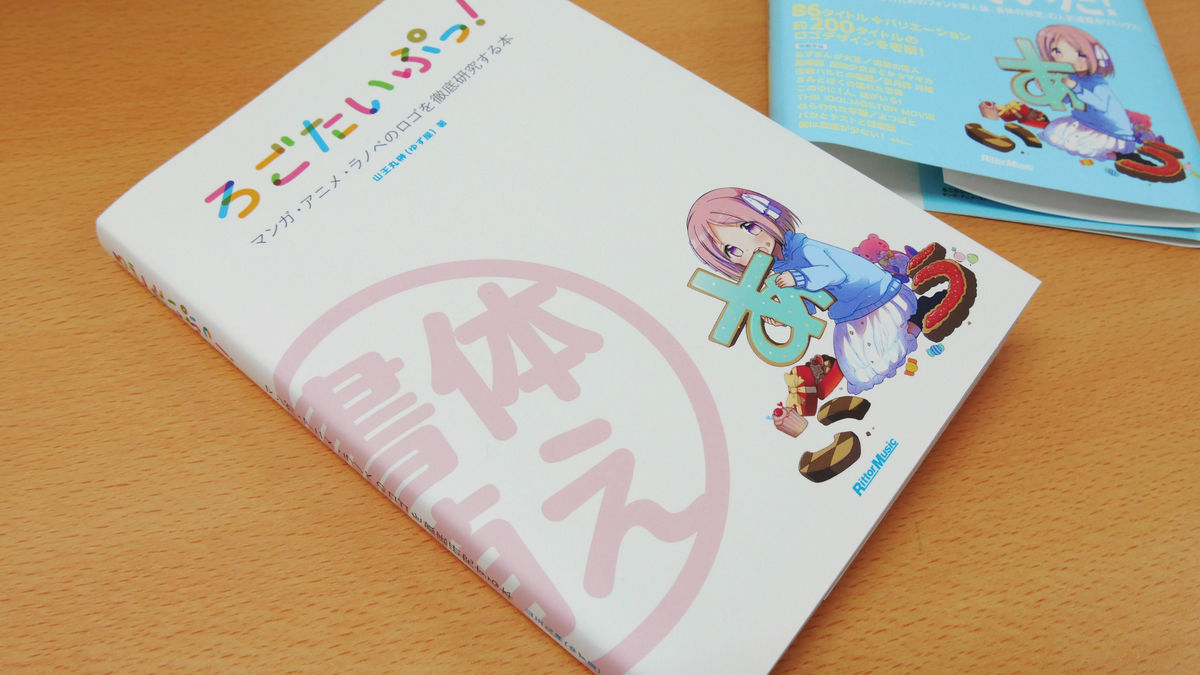
Also remove the cover and this way.
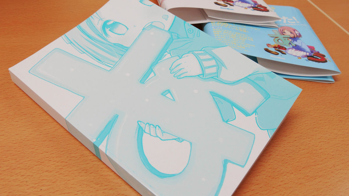
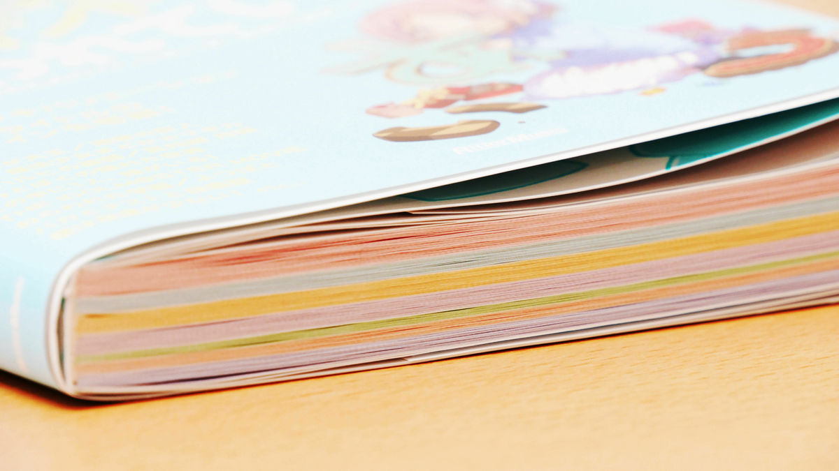
Thickness is color-coded for each chapter with such feeling, 248 pages of all 7 chapters.
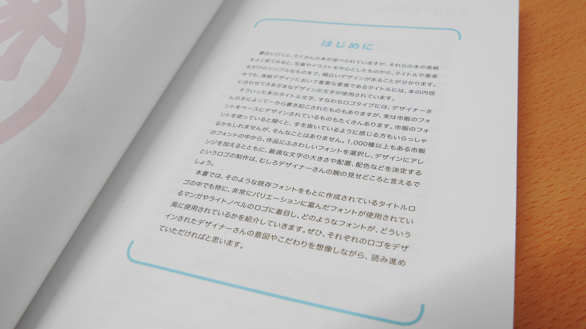
When you turn over the page, you will find the page "Introduction" before the table of contents. According to this, the title of the book, "logo" is written on the front cover, but various characters are used for this, some are produced by the designer from scratch, others are commercially available fonts It seems that there are many things that are based on. In this book, among logos created based on such existing fonts, we pick up logos such as manga, animation, lanobe, etc. that have various variations, and what kind of font is used and what type of font is used That's why I can introduce you.
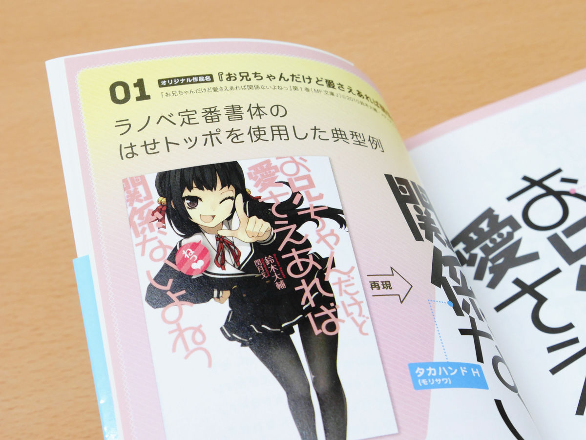
◆Haze topo
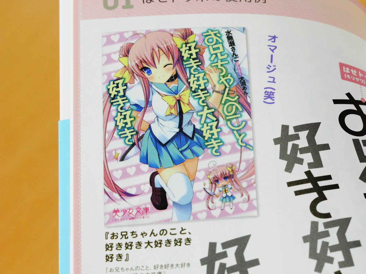
"Lotto Toppo" is introduced as a standard typeface of Ranobet, and as an example of using it, the cover of "It is Older but I do not care if there is love" is being introduced. The author says "This is an illustration of a cute girl on a white background, a redundant and bruised title, and a fancy horse topo", which is the typical cover design of Ranobet.
It is like this when reproducing the logo by actually using "haze topo". However, "logo topo" is not used for all of the logo, but "kanji"TakahandIt seems to be using.
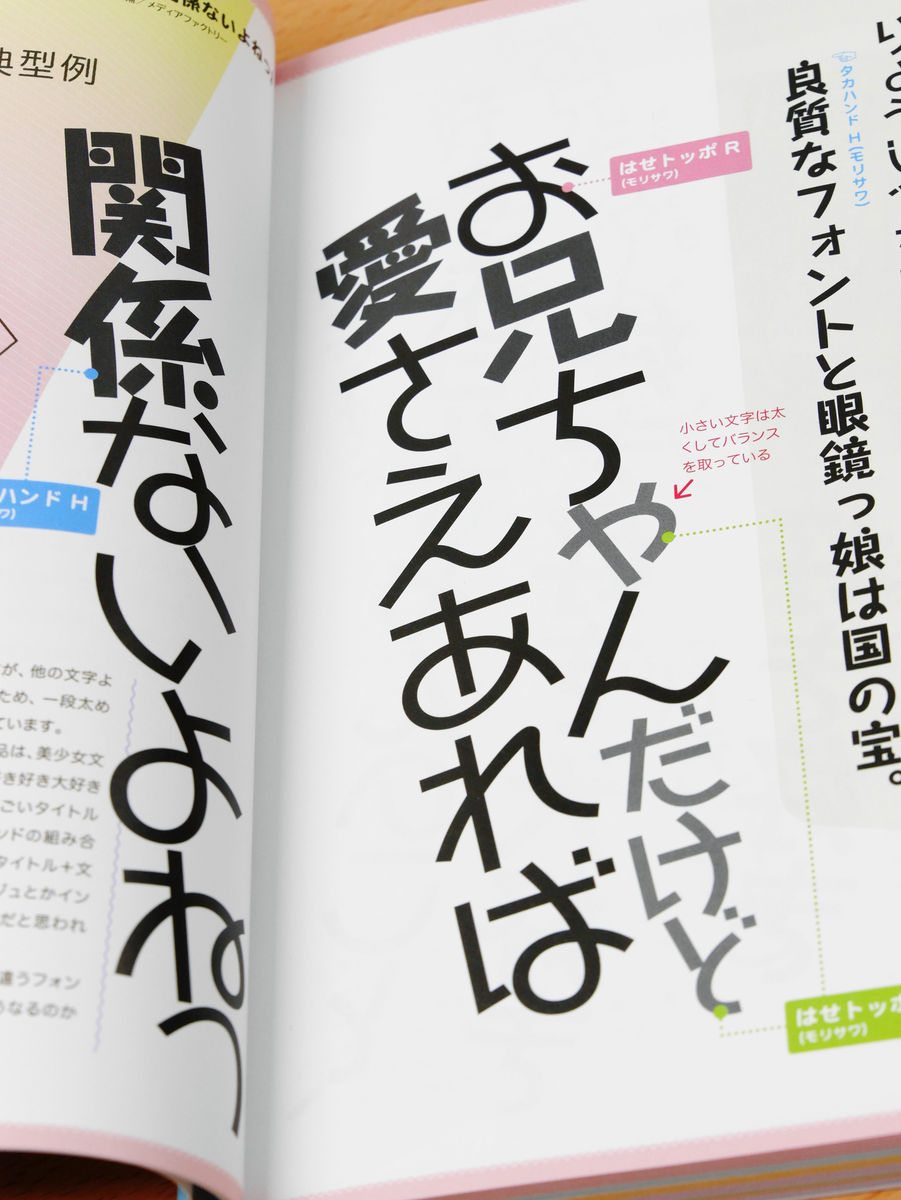
Also, small letters like "ka" are balancing the whole by making the line thick.
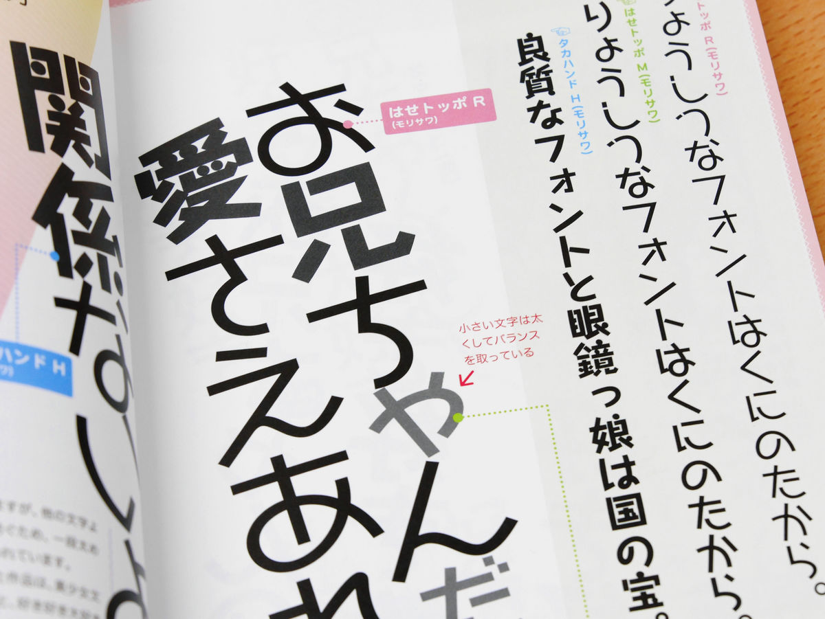
In addition, like "the elder brother, if there is love, it does not matter if it is love" logo, "Hajimeppo" for hiragana and "Takahando" for kanji is "I like your older brother, I love you like it matter of taste". When you see the letter "O", you can see immediately that the same font is used.
◆Takahand
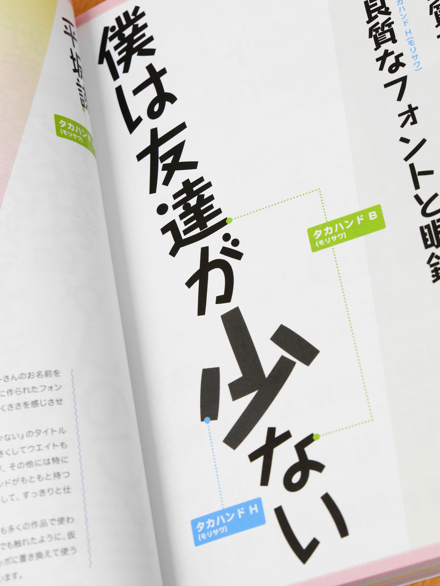
"Takahando" that is frequently used for the logo of Ranube as well as the above "Haze Toppo". The logo of "I have few friends" that was also animated seems to be a simple logo designed using this "Takahand".
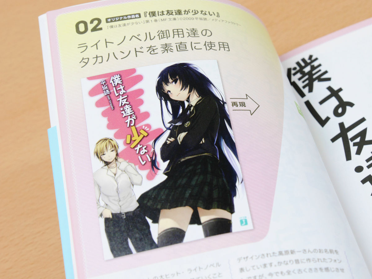
When I actually reproduce the logo it looks like this. The size of "little" is increased, but the others are the same size and it is clearly understood that the rustic atmosphere of "Takahand" is utilized.
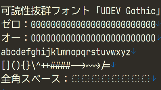
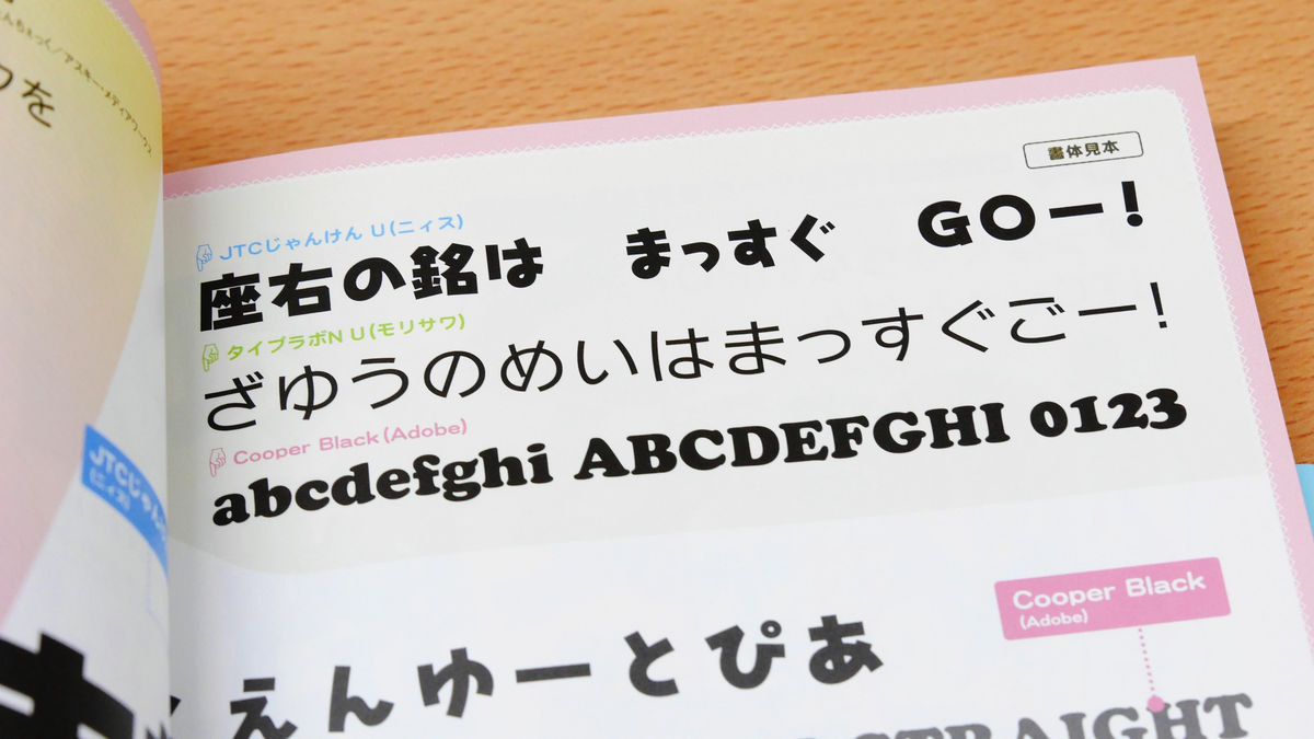
◆New Type Laboratory Gothic
Ufotable"Original work"Gakuen Yu Pia A Manabi Straight!"New lease gothic" is used for the "Manabi Straight!" Part of the logo.
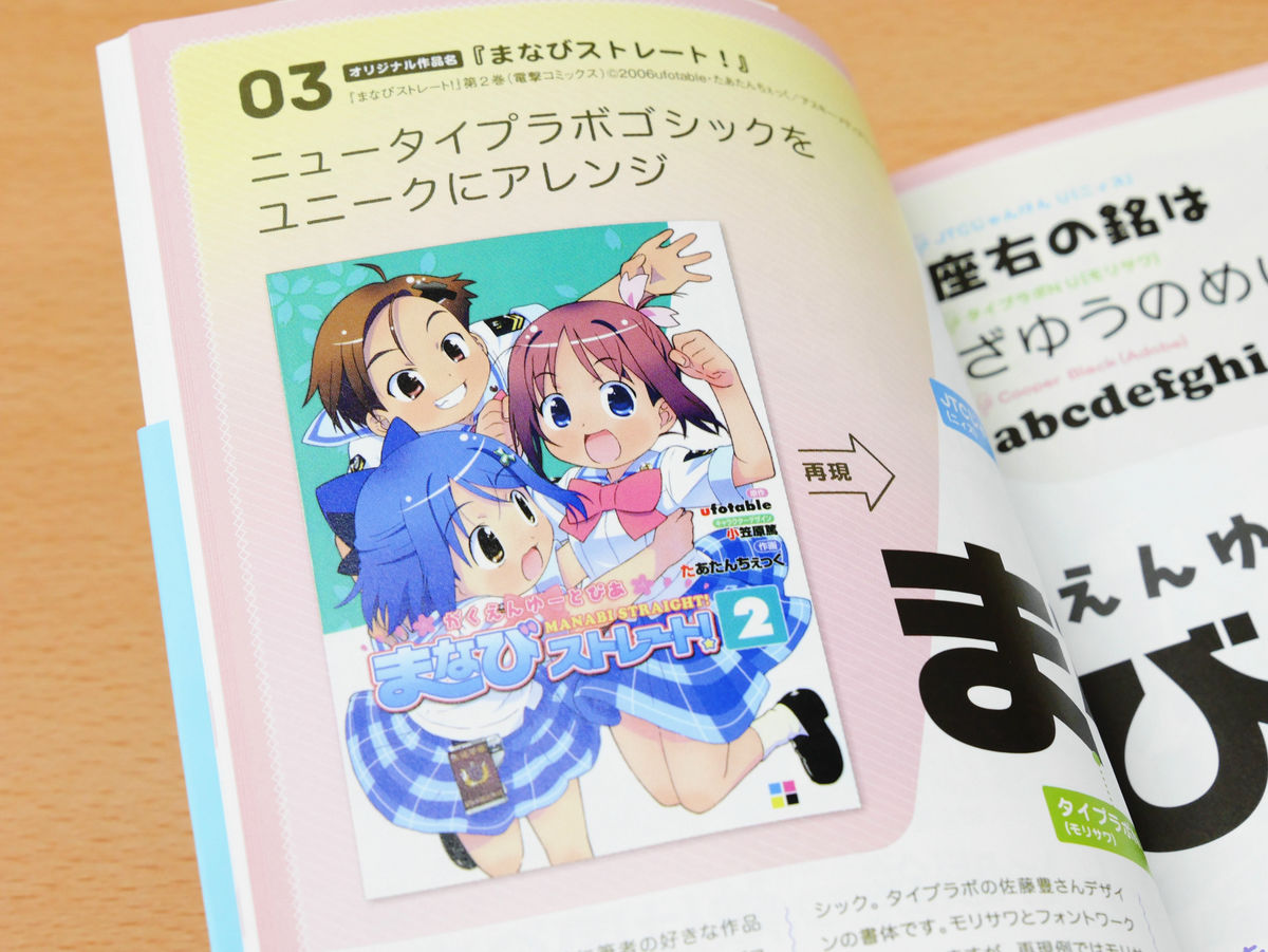
When you reproduce the logo using "New Type Laboratory Gothic" like this. When it is colored, it becomes more like a real logo, but in the actual logo it is necessary to extend the last line of "Ma", arrange the shape of "─" or "!" I realize that it has been added a further time.
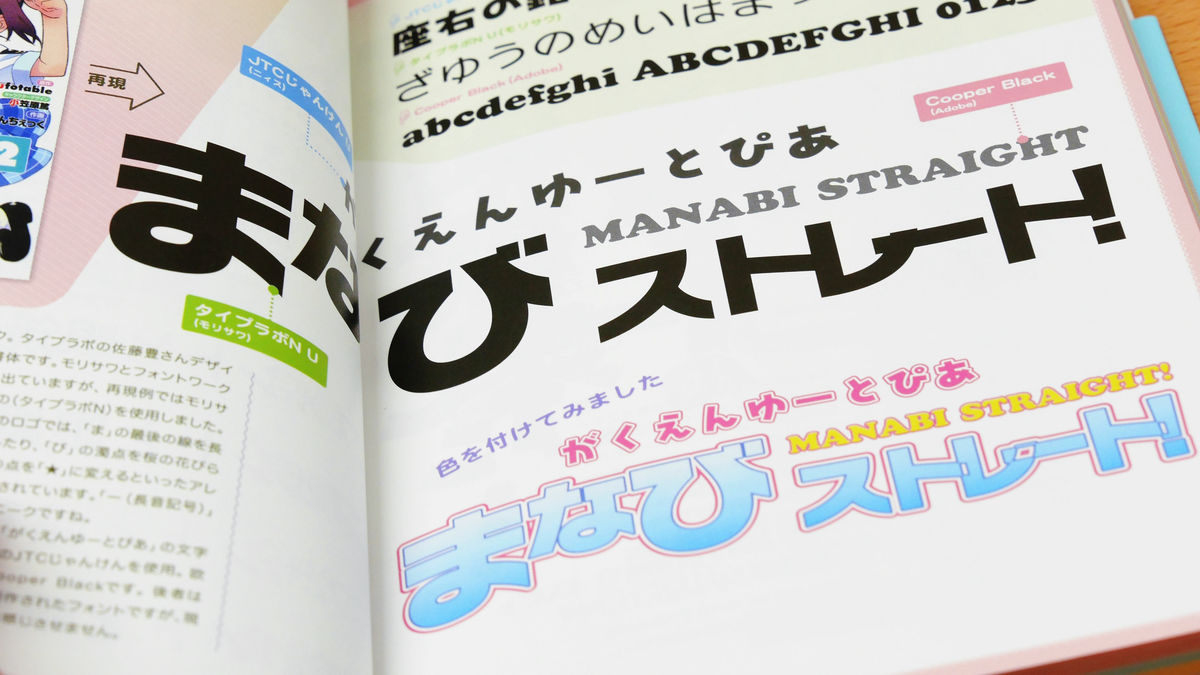
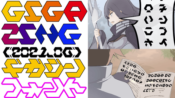
What is used in the logo is not only "New Type Laboratory Gothic", but the one used in the "Gakuen Yu Pia" part is "JTC Janken UIn "MANABI STRAIGHT" part is used is "Cooper Black". In the image below, letters written in "JTC Janken U", "New Type Laboratory Gothic", "Cooper Black" are lined up from the top, so that the impressions of each font can be visually observed and compared I will.
◆Grape&Chikushi A Marugotachiku
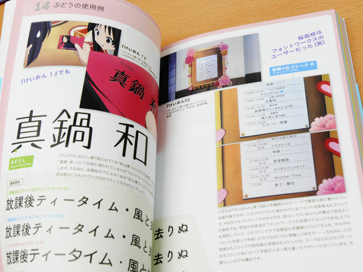
"A book that thoroughly studies the logo of manga, animation, Ranaobe" is not just about introducing the font used for the logo. For example, in anime "K-ON!" Font production companyFont worksIt is revealed that the font has appeared more than once, Fontworks 'grape' appears in the Akiyama Mio fan club membership card that appeared in the seventh episode, on the guide board appearing in episode 19 of the second term It is revealed that "Chikushi A Maru Gothic" of the same fontworks is used.
◆QoocRoman KT
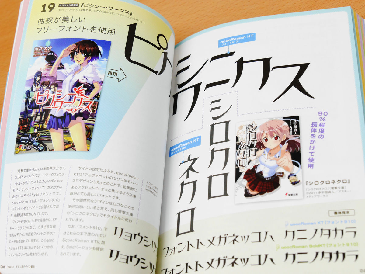
Commercially available free fonts are sometimes used for logos. "QoocRoman KT" isFont 910Is a free and open font, with a refreshing appearance and accent of the brush strokes characteristic. This font is used for "Pixie Works" or "Cyclocross Necro" logo.
◆To hang
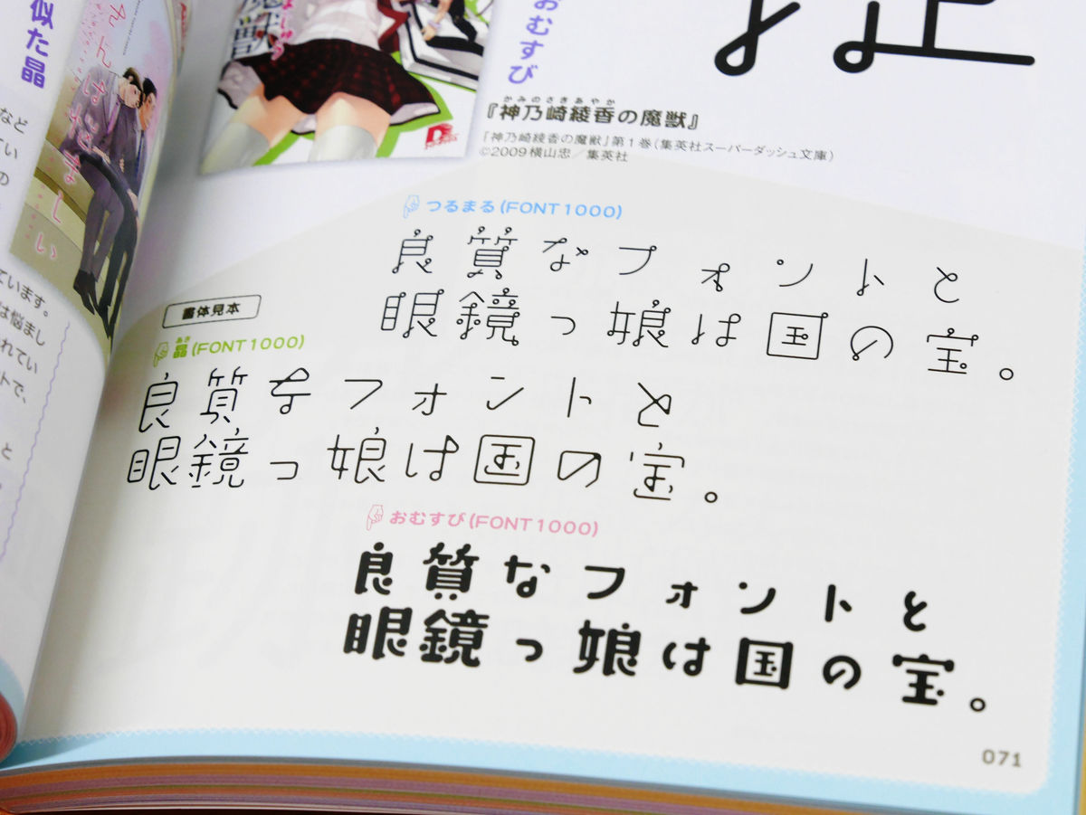
The unique font which expresses the corners and points of the line with circles and loops is "hanging". It seems to be a logo designed originally from letters because it is too individualistic, but if you use "tsurumaru" you can easily create a mysterious logo.
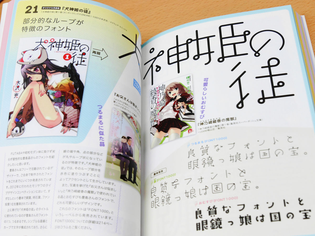
He is the author of "Tsuru Maru"Toshima AkiraHe also said that "Crystal"Or"Muscles"We produce unique fonts such as.
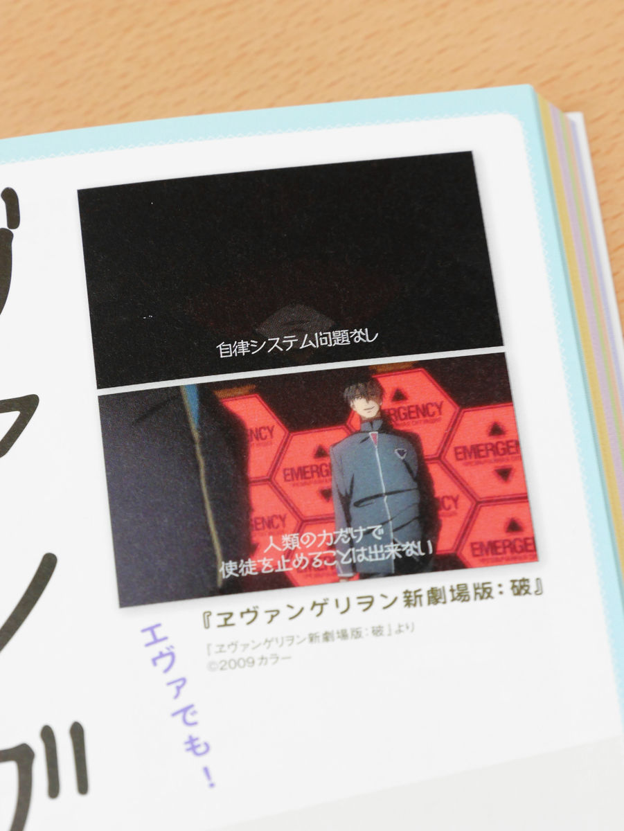
◆New cinema B
"New Cinema B" was used for the subtitle of the scene where the temporary 5 battle battle at the beginning of "Evangelion New Theatrical Version: Destruction".
◆Japanese music
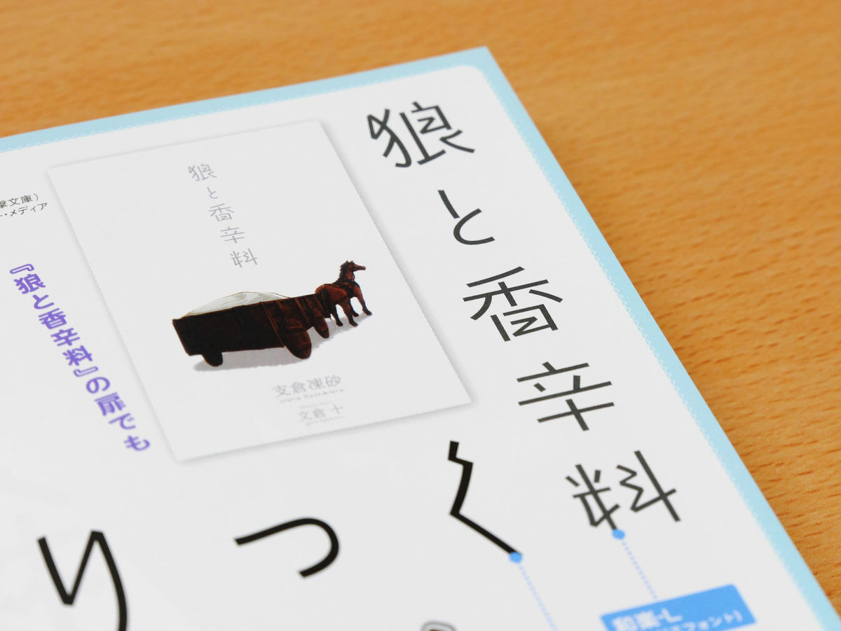
Even if you use the same font, the impression may be different at all. Both "Maria † Hiruru" and "Wolf and Spice" logos are based on the font "Wakaraku", but in "Maria † Hiruru" only Hiragana is used, Furthermore, about 80% of the long body is sprinkled and characters are used.
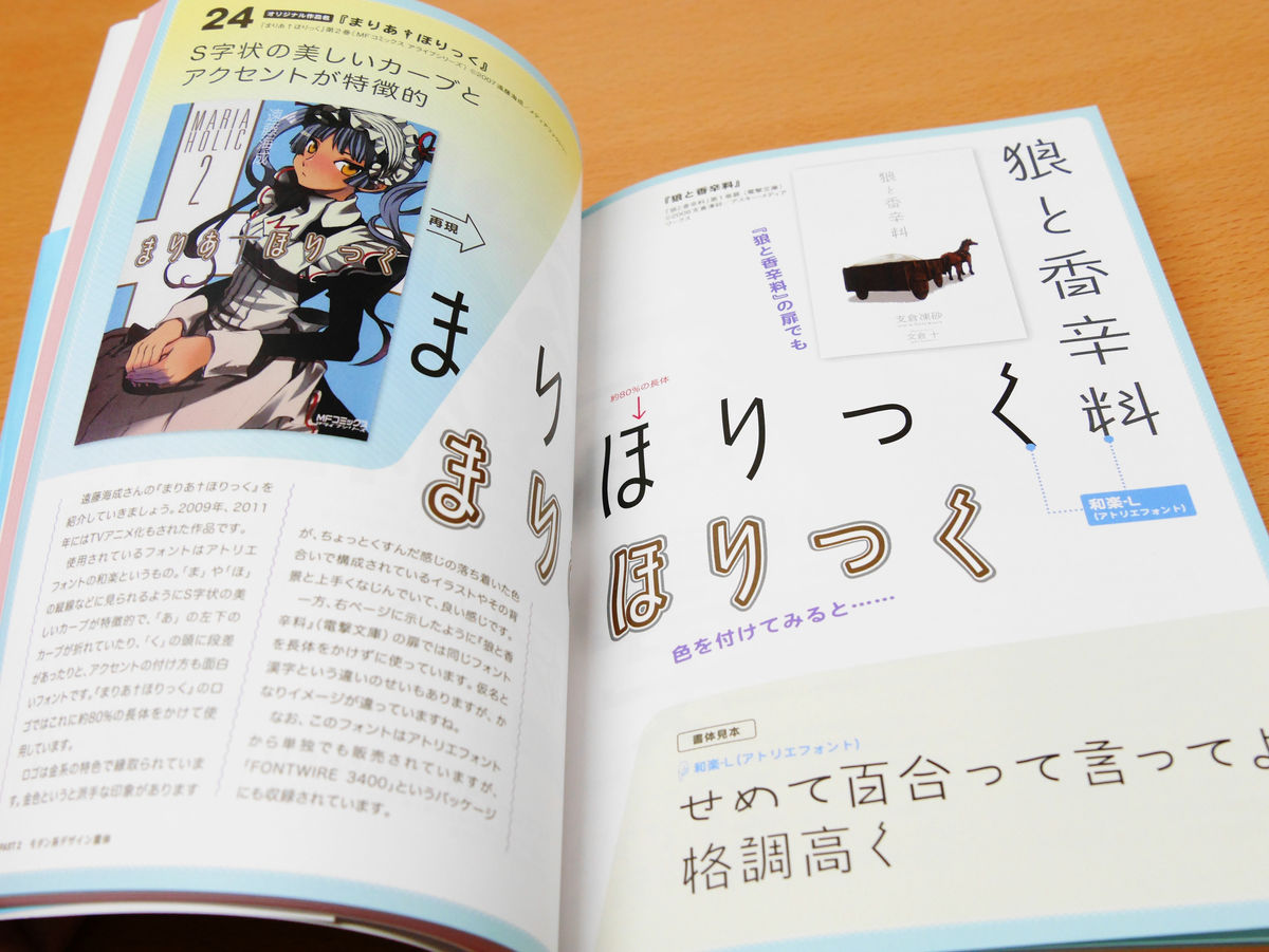
On the other hand, "Wolf and Spice" logo is used as it is "Wakaku", and the impression differs completely from many kanji.
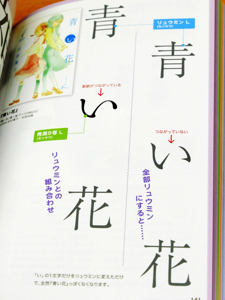
◆Shuhei 5(Morisawa)
The "blue flower" logo has "Ryumin"Is used, but if you use" ryumin "in the hiragana part, it will not look like a blue flower. I am surprised that the whole atmosphere will change at a stretch just by connecting the brush pulse of "i", which is used for "Hiragana" in this hiragana.
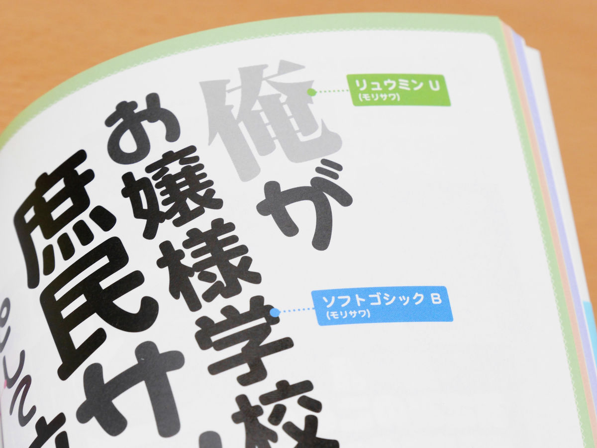
◆Ryumin&Soft Gothic&Lalapop&Maru Apollo
There are multiple logos that use two kinds of fonts together or deform fonts, but on the cover of "The case where I was abducted as a" popular sample "to a girls' school, three kinds of logos are included in the logo, including the author name And four kinds of fonts are used.
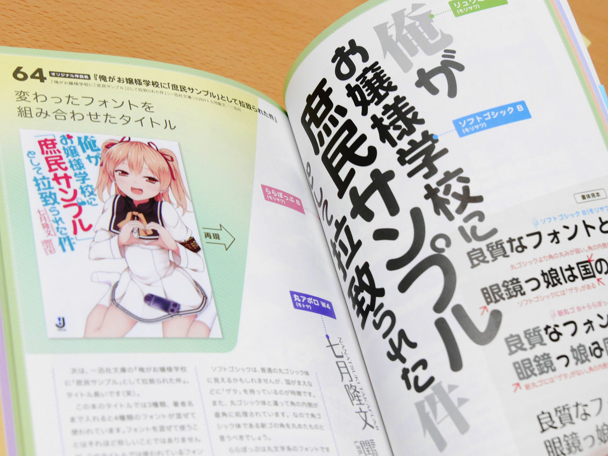
If you look closely at the logo, the impression is quite different for each character, "Ryuumin" with a more impressive impression on "I", "Soft Gothic" with a soft impression on the other Kanji, and Hiragana and Katakana "Rappopupu" of a pretty impression with a round letter is used.
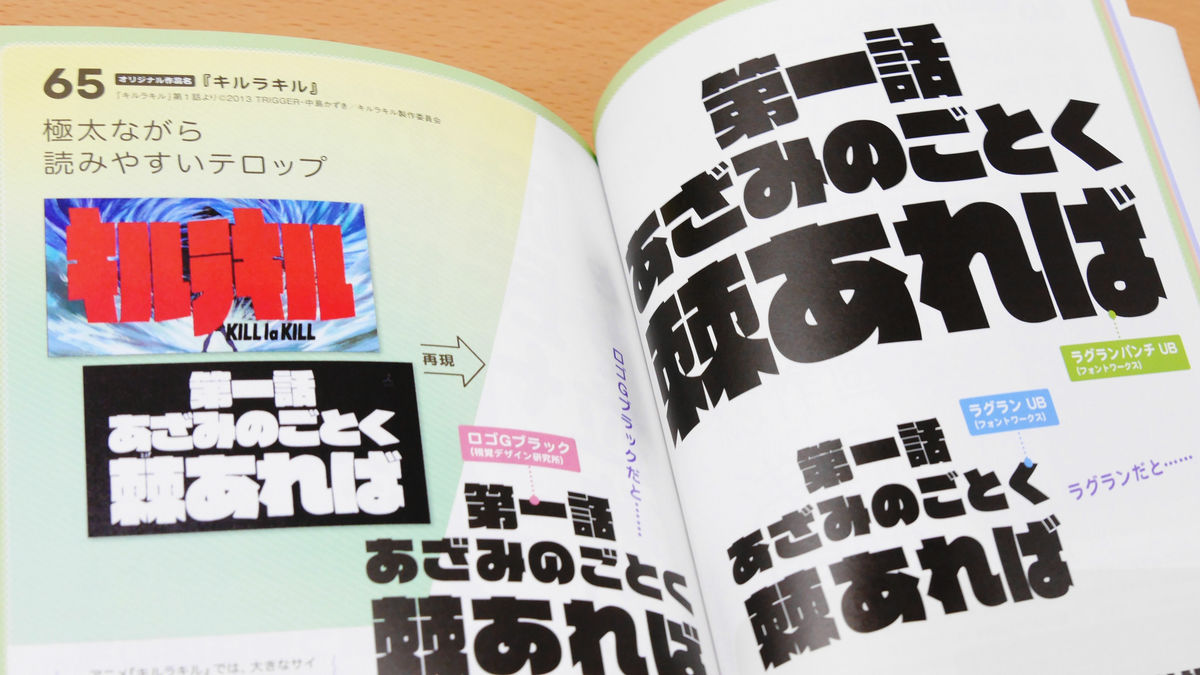
◆Raglan Punch
Fontworks 'Raglan Punch' was used for each story title of Kirakiru. In the upper right corner of the picture below, "Spear like a thorn as the first episode" was written in Raglan Punch. Below this is Fontworks's "raglanIn the lower left is "Logo G BlackThose that used. Every font looks the same way, but Raglan Punch has more white spots between the lines than the other two, especially letters of "spines" to be easily distinguished.
◆New york(Morisawa) &New Rodin
The logo of "Advance giant" is created with Morisawa's "New Go" for a long time.
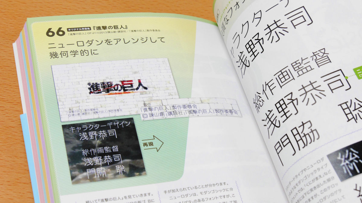
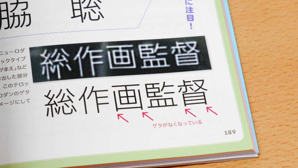
In the telop of the staff name displayed during "The Advance to Freedom" which is the opening theme song of the animation, the characteristic font which the letter extended to Bjyo was used, but this is "New Rodan" Arranged one. "New Rodin" itself is a simple and refreshing font, but the one that stretched the line downward in this way was used in the telop. In addition, it is also characterized as a characteristic that the get of kanji is gone.
◆Lucky
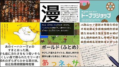
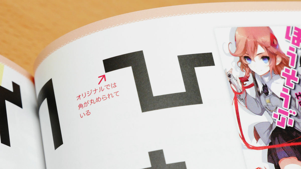
The fancy font that combines straight lines at right angles is "Lucky Kaku", and this font is used for the logo of "Hinata Fade In!" And "Ho-san 2".
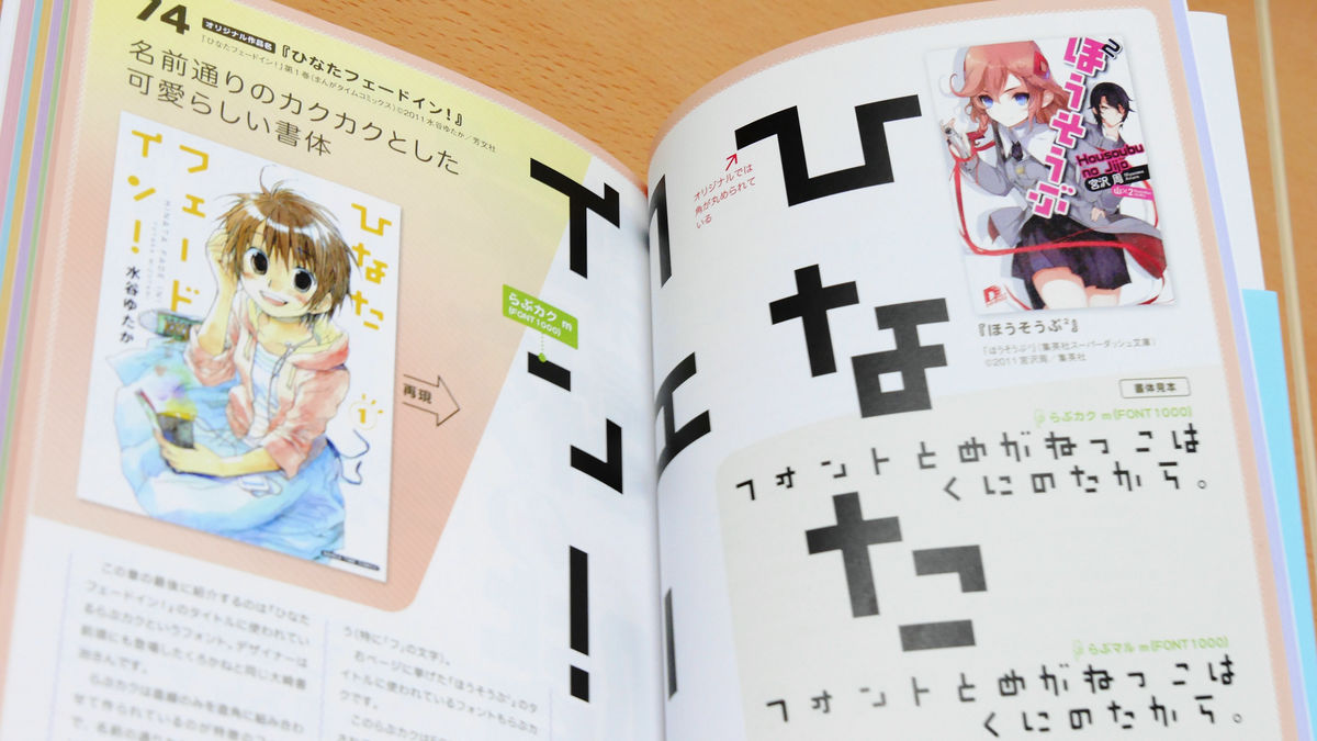
In the "Hinata Fade In!" Logo, the corner of the font is rounded only a little, and the same author as "Lucky Kaku" made "Rabu Maru"It is finished in the image which was more careful than.
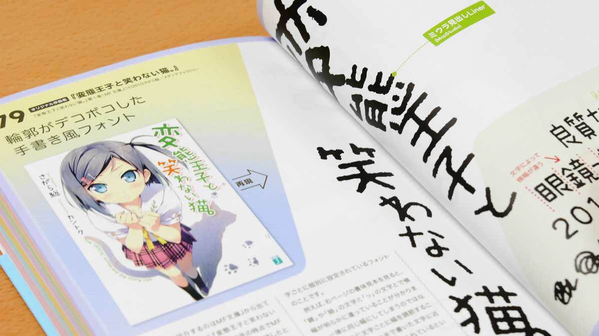
◆Miura headline Liner
The "Miko heading Liner" of the proportional font whose size is individually set but not the fixed width of the character is used for the logo of "Hentai king and cat not laughing."
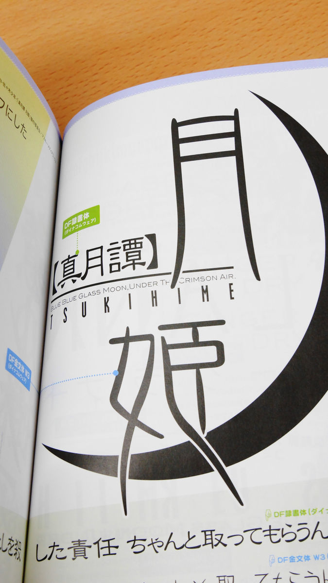
◆DF slave script body&DF gold style body
Two fonts that are used for the logo of "Tsukihime Tsukihime" are "DF slave body" and "DF gold style".
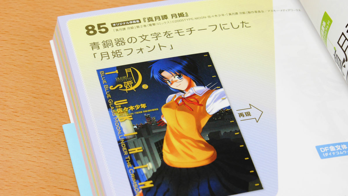
"Dawai Shosetsu" for "Moon Tatan", "DF Gold Style" for "Tsukihime" is used, "DF gold style" is too famous for Moon Princess, Secondary using this font It seems that it is also called "Tsukihime font" because there were many creations.
The table of contents is as follows.
Introduction
PART 1: Popular & standard font
01:I'm an older brother, but I do not care if there is love
02:I do not have many friends
03:Manabi Straight!
04:It became an object to capture Otome Gue ... ....
05:Azumanga Daioh
06:A dealer
07:Yotsubato!
08:Creepy! Nyaruko
09:Sakuraso's pet girl
Ten:Circumstances of 660 yen
11:Nagasarete Inorishima
12:The Melancholy of Haruhi Suzumiya
13:De is a man-made demonic bracelet
14:Misakigaoka ite
15:Jonah walk
16:Boys' Maiko · Chiyoshi Chrysanthemum!
17:My sister Asamiya
18:Whale of the whale
COLUM 1:Types of digital fonts
PART 2: Modern style design typeface
19:Pixie Works
20:Kikutan
twenty one:The members of the Inugami family
twenty two:Miracle of Vandal Gallery Street
twenty three:Brown rice tea lunch box
twenty four:Maria Holic
twenty five:Breath and lightning
26:Girls public corporation apartment
27:Case book in order of Detective Acoustic Noise
28:Alice & Shirley of Floating School
29:Chika-chan wants to know
30:Hang in there! Do not disappear! It is! Dye piglet
31:Reasons to kill the devil
32:There is one younger sister in this!
COLUM 2:How to buy fonts - package
PART 3: Nuance typeface
33:Repetitive world Etrangers
34:Dancing star Fallen Renesikkle
35:Goldfish Sakaue Le
36:Magical girl Isuzu full throttle
37:Tsumugumo
38:Rabbit Costume
39:THE IDOLM @ STER MOVIE
40:Magical Girl Madoka ☆ Magica
41:Rokka's brave
42:Sand and iris
43:Kinross mosaic
44:Pearl star - spica -
45:Yuri Anthology dolce
46:Name victim · Article 1 (kana) case record
47:Adachi and Shimamura
COLUM 3:How to buy fonts - Annual license
PART 4: Heavy system Mincho body
48:None of the saucepan
49:A madder color contour
50:Wandering straw
51:No way! Aitetsuben
52:Are you crying mainly?
53:Tunic tunica
54:Silver Salvation Machine
55:Reikkan living well
56:Cesare
57:Play of "Nanako san"
58:Alice in Wonderland
59:Someday Tenma 's black rabbit
COLUM 4:Use of outline service
PART 5: Various Gothic bodies
60:Date A Live
61:targeted school
62:Petite Profesur
63:Mayo Chiki!
64:The case that I was kidnapped as a "popular sample" at a lady's school
65:Kill rakiru
66:Attack on Titan
67:GOSICK - Gothic -
COLUM 5:To use the Riken font
PART 6: Linear typeface
68:Baka to Test to Shokanju
69:You and me broken world
70:Chu bell's !!
71:Me and my girls and adolescents with delusions
72:Dogs and scissors look good
73:School stairs
74:Hinata Fade In!
COLUM 6:If it is an individual production typeface, FONT 1000
PART 7: Classic design typeface
75:God's notepad
76:34 years old unemployed
77:Flower blooming after life
78:An ordinary girls' student tried doing [ろ こ こ る る].
79:Hentai-prince and a cat not to laugh.
80:Let's pass through goodwill.
81:Kino's journey
82:"Literary girl" and hungry thirsty ghosts
83:All of Etranze
84:Minerva and the tree of wisdom Toshihara
85:Tsukihime Toni Hime
86:Wakaba * girl
Introductory work
in conclusion
Not to mention what kind of font is used for each work, the origins of the used font and derived fonts, the work using the same font, how to arrange fonts and making logos, digital fonts Various things are covered up to the kind of way and how to buy it, and it is content that seems to be able to enjoy a wide range from just fans to those who rely on coterie activities and font maniacs. Even if you are a person who engages in design-related work, other than the person who says "I like 2 dimensions anyway", there may be a new discovery "There was such a font ......". In the table of contents, 86 titles of manga, animation, lanobet are lining up side by side, but since works that use the same font as those appear in more than twice their titles in the book, they are more readable than the table of contents It is a certain content.
In addition, "Book that thoroughly studies the logo of manga, animation, Ranube" is sold at Amazon at 2160 yen including tax.
Amazon.co.jp: Coolest Puppy! Books that thoroughly study the logo of manga, animation, and Ranobet: Sanamaru Sakaki, Yuzuki Ryota: Books
Related Posts: