Four essential rules to make a strong logo
ByArnoKath
It will create an original design logo for freeThere are convenient services, but if you really make a logo that is effective, you want to make it a completely original design that attractively attracted attention to detail. So what is important when making or improving the logo from 1, there were four rules out there.
4 essential rules of effective logo design | Webdesigner Depot
http://www.webdesignerdepot.com/2013/03/4-essential-rules-of-effective-logo-design/
◆ What to ask before starting logo making
Please answer 14 questions about the logo you created the most before you start making logos.
01: Is the logo not tilted?
02: Are there margins in either the horizontal or vertical direction
03: Black and white logo?
04: Will it work on both white and black background without border
05: Whether elements other than characters can be written within 5 seconds
06: Did you purchase a font to make a logo
07: Do you have 2 fonts or less?
08: Are you using more than two colors for your logo
09: Whether an illustration is included in addition to a word mark (a text portion designed) in one logo
10: A clear logo or a logo that is likely to be mistaken for another company
11:Clip artIs it used?
12: Are photos or complex patterns used?
13: Whether the logo is inclined towards a thunder
14: By default fontKerningAre you doing
Subtract the total amount from "08" to "14" from the total amount of points from "01" to "07" with 1 point for "Yes" for each question. If the point finally presented is larger than 0, there is no need to think about changing the logo so far, and if it is 1 to 4 points, the logo can be used in a company that earns more than 5 billion yen per year Good ones. If it is 5 points or more it is hard to say.
When it is 0 point or less, the logo has room for improvement. The thing I would like to keep in mind is that understanding the brands is important for logo creation,Visual IdentityIt is to understand how it differs.
Brand is "One of the most important components of the product, accumulation of all impressions and experiences on the product and company"Refers to. The music that the client listens to when the phone is on hold is also a brand, and the total of all interactions that are born when someone is involved with the organization, such as the state of the parking lot and the front lobby of the company, is the brand.
So what kind of role does the logo you are about to make in the brand play?
Let's compare the following logo marks. The logo of the major company on the left side, the logo of the small company on the right side, the logos of the major companies are all simple and basic composition, while the small company logo has complicated font, design and color It is getting.
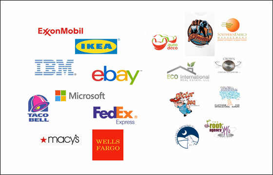
Logos will appear on every occasion, such as websites, business cards, cars and advertisements, but it is not a logo job to talk about all stories. The job of the logo is to have a clear "uniform" for marketing. It is necessary for it to be impressive and implicit, but it never speaks to everything.
So, the four rules necessary to make a logo are from the following.
◆ 01: Understand the brand

ByRupert Ganzer
Let's think about the brand before deciding the logo. We make difficult questions to ourselves and team members, including who their customers are, what customers want from the company, what the company wants from the customer, and the mission that the company should fulfill is Please investigate something.
At that time, be careful to ask questions in the correct way. "Which do you think is important to us, whether to show it professionally using green or to appear fashionable with blue using blue?" Rather than the question "Do you like green or blue?" "When asking the surrounding people, I will proceed in the right direction. Also, it is beyond my expectation to show people the concept of a logo and ask "people like it" or not. Once you can clarify the brand, the completed logo will be able to effectively express your brand.
◆ 02: Simplify

ByLenore Edman
The more you use lines, colors, fonts, and various elements, the logo gets bored. There is no problem as long as it is okay if you do not want to be bored as a brand image, but otherwise it is better to follow the rules. Logos are one unified idea, so do not try to tell everything with a logo alone.
Let's standardize fonts as much as possible. If a catch phrase is included in the logo, it is OK even if there are two types of fonts, but three fonts are incorrect regardless of the font size. When gradation is applied to characters, it looks like an amateur, so do not apply a gradientmonochromaticPlease do the design with.
◆ 03: Target to make the company 10 times larger

ByTruthout.org
If the company making the logo is on the scale of 1 million dollars (about 100 million yen), the logo has the same power as the rival 10 million dollar company (about 1 billion yen) or more You should.
You do not need to think about companies that are deploying on the same scale. Design yourself for the work you want and choose a logo for the company of the future that won 1 billion yen.
◆ 04: Assuming that some people dislike the logo they made

ByEric Havir
Of course there are people who do not like the new logo. For that reason, we should conduct in-house PR activities to notify the major change of the brand such as logo change "Why the logo was changed". Please listen to the voices of people who do not like the logo. Clearly it is better to choose with the opinion of 24 people who are devoted and smart, than the color of the logo chosen by five people is not bad for the remaining 19 members.
Related Posts:
in Design, Posted by darkhorse_log
