How to make a good impression on people by font and layout, and to read sentences favorably
The layout of images and sentences is necessary not only when designing websites but also when preparing materials and posters, but the selection and layout of the correct fonts makes it easier for people to read the sentences It acts on the brain and makes the reader comfortable. That's why we added the article "Web service that automatically calculates the budget for making your idea into an application"How Much Does It Cost To Make An App?Mikael Cho who is the founder of ooomf who provides "How to create effective documents that can be done immediately" is summarized.
The science behind fonts (and how they make you feel) | ooomf blog
https://ooomf.com/blog/the-science-behind-fonts-and-how-they-make-you-feel/
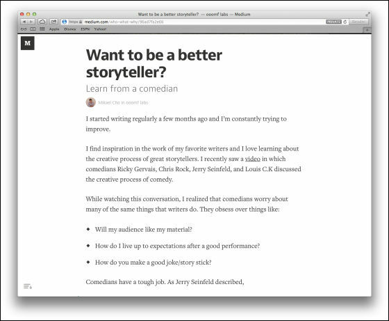
Cho noticed that "the shape of letters and the space between characters affects human emotions" is when reading sentences from various websites. For exampleMediumThe website has a simple layout where sentences are extruded all the way.
nextCracked.comIt's a website.
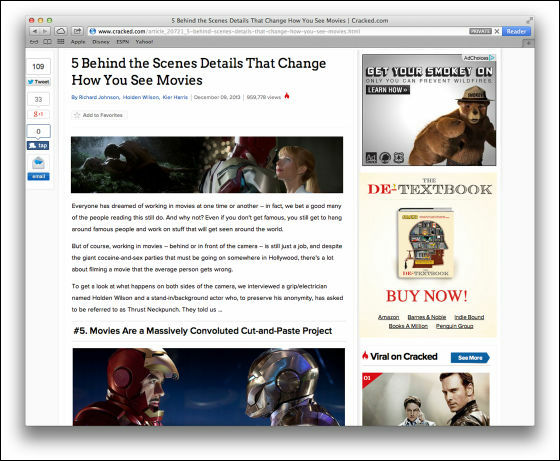
When comparing the layout of the two websites, Cracked.com is cluttered, even if you are reading something, it thinks about what to read next. Medium, on the other hand, has a layout that you can concentrate on reading. Mr. Cho, who noticed that "fonts and layouts that fit the circumstances soften people's feelings and make sentences easier to read" can not be scientifically supported? That is why we have summarized in various blogs as follows for various prior research.
◆ How do we read sentences?
When reading things, we are "Scan pathFollowing the pattern called "repeating" the way to see the words in sentences jumping in rapid succession and gaze. In the following image that visualized it, it reads word one word firmly, recognizes several words collectively, and returns to the previous word.

Eye stops once on the page to process what you read in the brain every 7 to 9 letters. When scanning sentences, visual processing is not done in the brain, it is done when we stop and take in information.
When reading sentences, the above process is performed, so by using fonts and layout based on that, a website that is scientifically easy to read is created.
◆ Correct font and layout make people feel better
Even though there are some scientific elements, the choice of font tends to be thought of as a genre that is almost like art, with a sense of sense.
But how does layout and font affect people's emotions? Kevin Larson, a psychologist who studies that, is doing very interesting experiments on this. He divides 20 volunteers, each of which consists of women and men by two, into two groups, one group giving New Yorker articles with images and fonts properly laid out, another group with images and fonts I showed an article laid out in a mess.
The "insanely designed" and "proper design" mentioned here are as follows. The layout of the left article is hard to see due to the position of the image and how to take space.
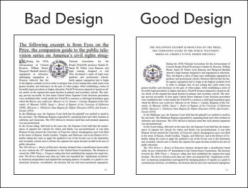
As a result of experiments, those looking at articles with bad layout feel uncomfortable, depending on some people it gave off their faces. When you frown your face, that is, when you wrinkle between the eyebrows,Writhing veinI use the wrinkle toeAmygdalaIt is related to the part related to feelings out of the brain, and it can be said that it is uncomfortable even from a scientific point of view.
On the other hand, good layout articles make readers feel better in a short time. If you read with a good layout, you can concentrate read clear sentences, which is considered to be because there is no psychological stress. In other words, a good layout does not help the reader's understanding, but makes you feel better and makes it easier for the reader to feel stimulated.
◆ Font preference is affected by culture
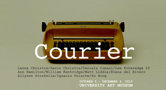
Culture may be involved in fonts preferred by people. For exampleCourierThere is an atmosphere like an old memo written with a typewriter. Also, although it is not familiar in Japan, there are also many people reminiscent of the government by looking at the font called Helvetica, as Helvetica is used for tax return forms.
Such association is not easy to eliminate, so selection of fonts is difficult. For example, the following image is a bank website in the US ... ...
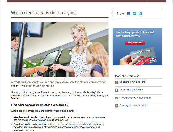
If you use a font with impact like the heading of a newspaper, it will look something like this.

Just by changing the font somehow a popular atmosphere has emerged and it has become a lack of trust.
Since fonts are designed by humans, meaning is usually tied by humans. It is very difficult to choose fonts, as there is the possibility of choosing fonts that have different meanings from what they intend.
◆ How to design content
The quality of the content is most important, but the correct font and layout also has an important role, such as Paul Claudel of French poet "The secret of type is that it speaks".
So, how do you draw positive emotions from people by font and layout? Then, using one of the following techniques is one hand.
01:anchor· Choose a font
Jysica Hische, a type designer, recommends using frequently-used fonts in projects that are working first. Even if you use a different font for heading, you first choose the frequently used fonts as the base.
There are four categories of fonts, "serif font" "sans serif font" "script font" "decorative font". "Serifu font" is a font with a small decoration at the edge of the letter, has a formal atmosphere, oriented for printing fonts. "Sans serif font" refers to things that are not decorated at the edges of the letters as opposed to speech fonts, which is suitable for informal places and casual situations, ideal for digital data.
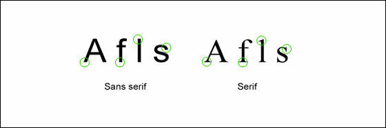
"Script font" is a font similar to handwritten characters and commonly used for formal invitations. It is not suitable for text sentences and headings. And "decorative fonts" are used in informal places when you want to produce originality, because there is impact, it is suitable for use in the headline, not for main sentences.
When reading sentences on the web, it is better to avoid 'script fonts' and 'decorative fonts'. Because it is difficult to read either letter, it slows the reading speed of the reader. When it is difficult to distinguish between "a" and "e", it is said that people spend unnecessary energy to recognize characters. With this you can not get comfortable while reading.
Therefore, it is best to choose serif fonts or sans serif fonts as the font of main sentences. Because the text displayed on the screen has a lower resolution than the physical document, some experts recommend sans serif fonts, but because the resolution of the screen has dramatically improved now, serif fonts are also easy on-line I can read it. Also,MediumIs using serif fonts is thought to give an atmosphere like editorial, but it is also possible to make it a hard atmosphere by serif font like this.
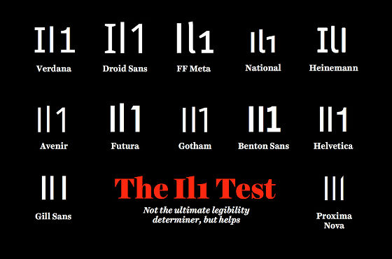
The most important thing in choosing a font is that letters can be easily discriminated, and the reader does not have to spend psychological energy. When Hische checks font appropriateness, it is the test "Il 1". This is to write "I (upper case letters)" "l (lower case letters El)" "1 (Arabic numerals)" side by side, it means that it is easy to read if it is easy to distinguish three, so it is easy to read the font Let's do this method when you want to find out.
02: The character size is 12pt or more
In the research of "sanitation of reading" conducted in 1929, "It is investigated what size of font is most suitable for reading?" As a result of experiments on character sizes of 6pt, 8pt, 10pt, 12pt and 14pt, 10pt was the most suitable result at this time, but the situation has changed dramatically since 1920 . Due to the shift to the digital screen and the improvement of the screen, many researchers claim that "Current 16 pt corresponds to 12 pt at that time". Also, we know that large letters strongly induce human emotions by recent studies.
For example in the website, Medium uses 22pt letters,37signalsHave 22pt characters,ZenhabitsI am using 21pt letters. Although there is no point in using character sizes of 30 pt or more, since many blogs currently use 10 to 12 pt, it is recommended to increase the font size dare. If you are using 12pt characters, try 16pt, if you use 18pt letters try the 22pt letters. You should feel the difference.
03: Pay attention to the length of one line
The most ideal one line length consists of 50 to 75 letters. Why is this the best? That is because the readers are effective lengths for doing scan paths. If the length of one line is too short, the reader frequently needs to move the eyes to the left side, so the reading rhythm collapses, and contrarily if the sentence is too long, it will be hard to find the beginning and the end of the sentence, It will not be able to successfully move.
the studyAccording to the act "to jump to the next sentence" usually increases the energy of the person in the subconscious mind, but if the sentence becomes too long the energy will become small.
How many characters are used by the site mentioned above on a single line? It shows that Medium is 75 characters, 37 Signals is 76 letters, and Zen Habits is 78 letters.
04: Think about the interval
In order to read sentences in a flowing manner, the proper character spacing is an important factor. The narrower the space between letters, the more difficult it is for a reader to recognize characters. For example, which one is easier to read when looking at the following two sentences? If it says, it will be a sentence with a more open interval.
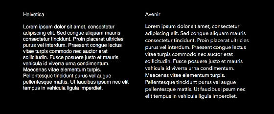
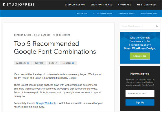
Appropriate blanks make readers feel good, so a combination of Google Web Fonts that makes it easier to read long sentences is also available.
Top 5 Recommended Google Font Combinations
http://www.studiopress.com/design/google-font-combinations.htm
So, using the above techniques to write an email will result in the following. Improved version on the left side with original mail, right side made easier to read with technique.
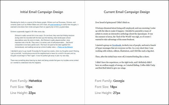
By just changing the font and increasing the size, the text of the e-mail has changed to a more readable and felt one.
It is important to package the content in the right way and it is useful to design a website or physical document to know the point of "Why do you feel good and discomfort when viewing the content?" "If you reward people with a positive emotion, they will forgive the faults, follow you, praise it,"Designing for EmotionThe author of Aarron Walter says. Of course, if the content is bad, designs and layouts will not be useful, but if you have good content and give good influence to the brain by design, you should be able to make websites and documents more effective than ever.
Related Posts:
