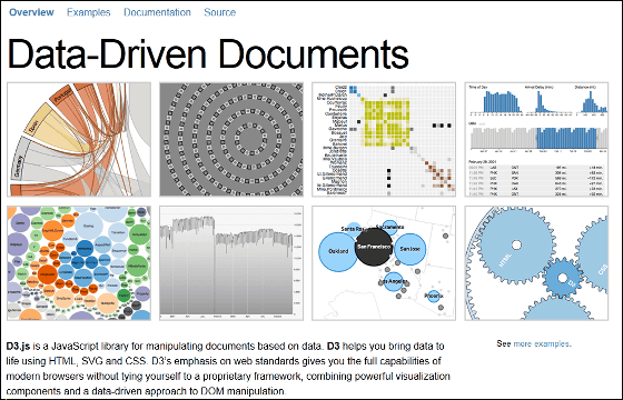
Javascript library "D3.js" that makes data easy to understand and stylishly visualized
No matter how you summarize information, it is a very difficult technique to communicate well to the people who visualize it and see it. In such a case it makes the data stylish and easy-to-see graphs, it's a library that Javascript of various designs can downloadD3.js"is.
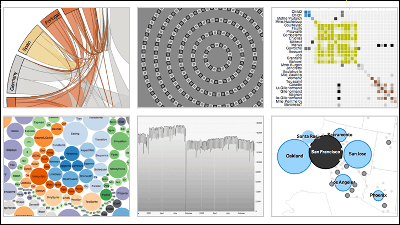
D3.js - Data-Driven Documents
http://d3js.org/
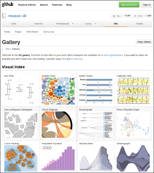
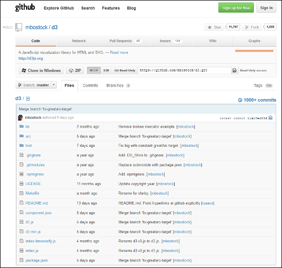
It is possible to see examples of graphs created using D3.js from the official gallery, and the material (source of the script) from which these graphs are based is available at GitHub.
Gallery · mbostock / d 3 Wiki · GitHub
An example of design is from the following.
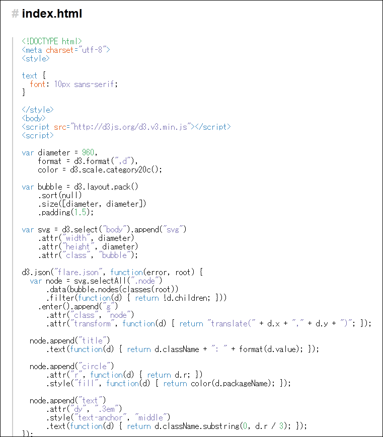
◆:Bubble Chart
Depending on the example of creation, some code may be written directly on the page.
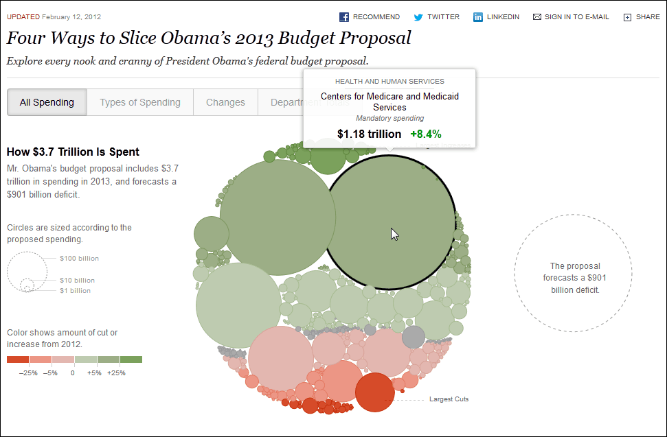
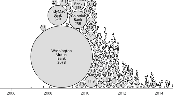
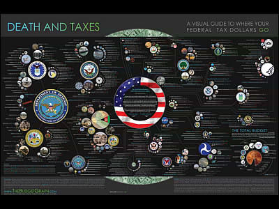
◆:Four Ways to Slice Obama's 2013 Budget Proposal - Interactive Feature
Presented President Obama's 2013 budget plan used in the New York Times. Each small circle that constitutes a large circle points to a budget for one project, and the largest yen is the budget for the medical care center that the amount is $ 1.18 trillion (about 106 trillion yen) I understand.
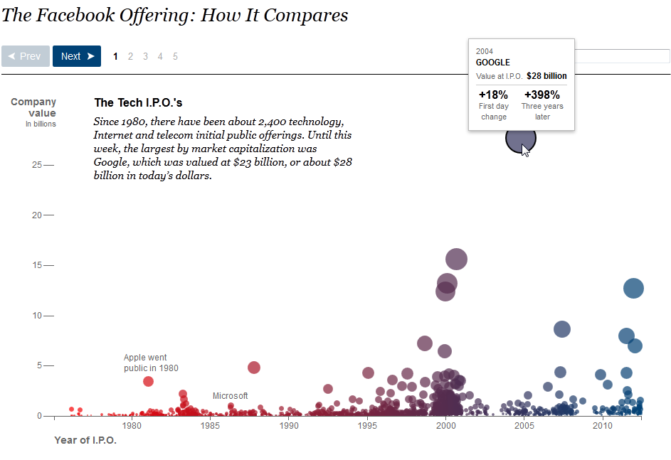
◆:The Facebook Offering: How It Compares
This was also used in the New York Times and represents the stock price when an IT company made initial public offerings.
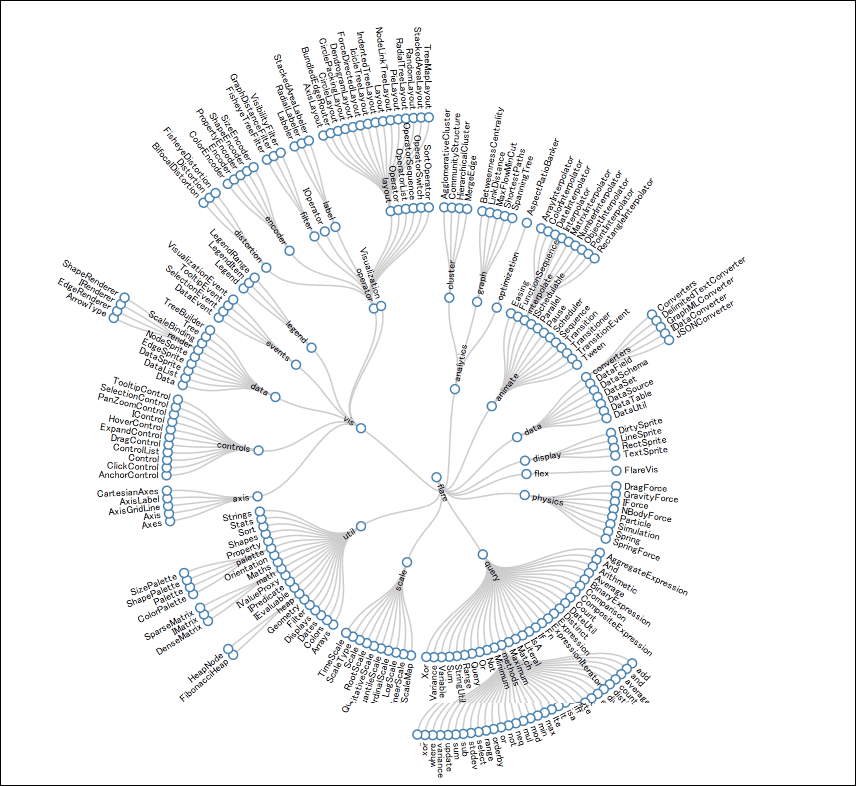
◆:Reingold-Tilford Tree
A graph of a design that branches finer and finer towards the outside.
◆:Where Are House Hunters Searching?
A graph of the design in which circles are interspersed on the map of the United States.
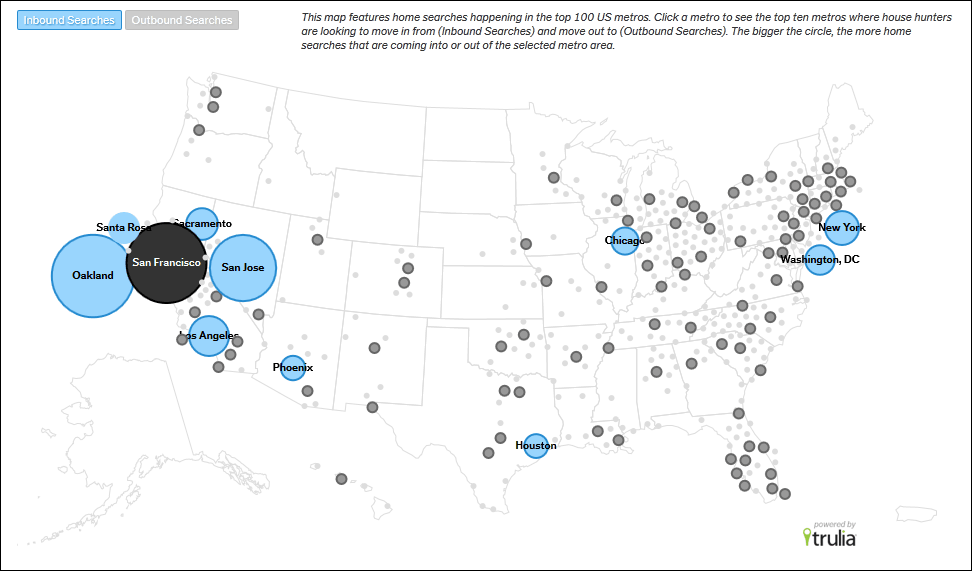
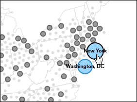
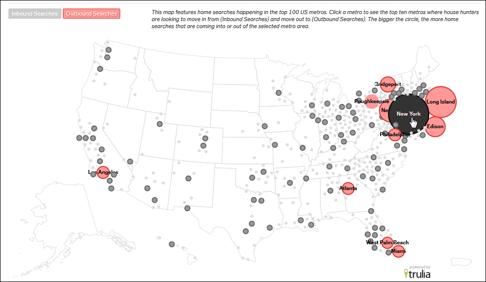
Click New York.
Furthermore, when clicking "Outbound Search" in the upper left, the place where New Yorker escapes New York is displayed with a red circle.
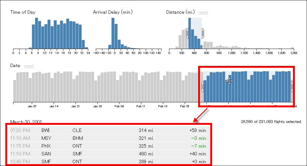
◆:Crossfilter
Below is a graph showing the delay situation of the plane. As you shift the blue part of the date and time graph, the delay situation within that period is displayed in the table below.
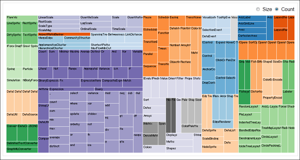
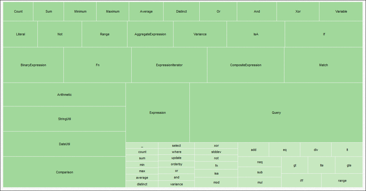
◆:Treemap
Colored boxes are arranged side by side.
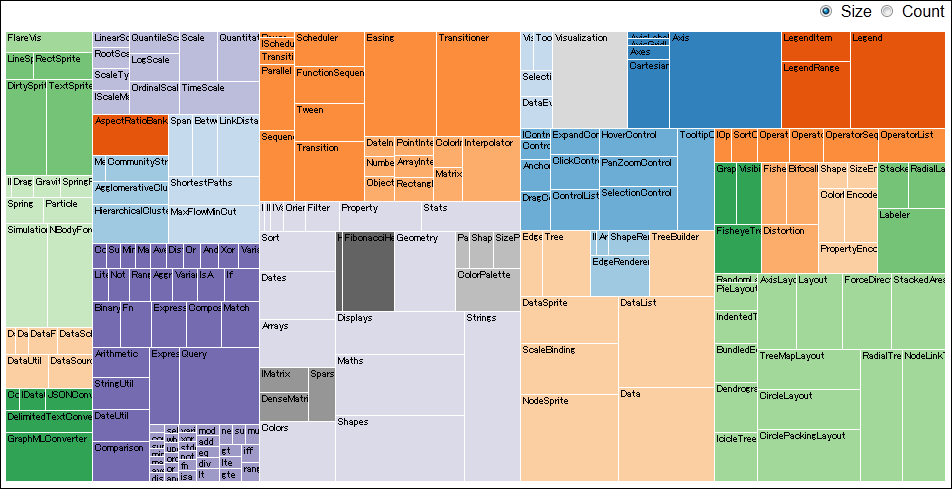
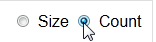
I will check the Count in the upper right of the screen.
Of the ones that were color-coded, the smaller the box, the closer the graph was placed to the upper left, the more the number of boxes changed to come to the left.
In addition, to TreemapZoom functionThere are also ones with.
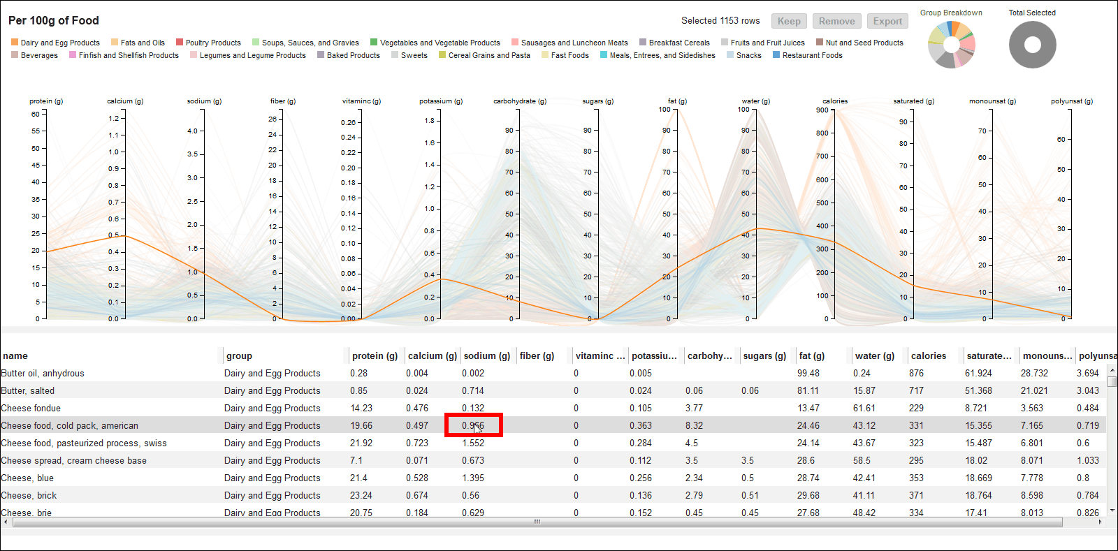
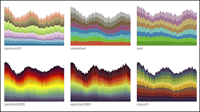
◆:Nutrient Contents
Here is a graph where lines overlap.
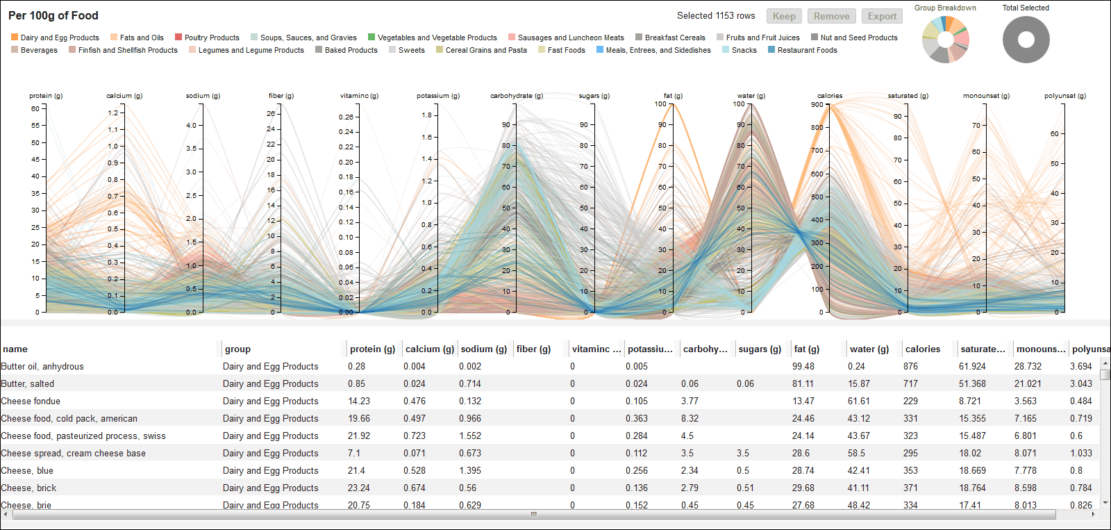
If you click on the one in the table below, only one line graph will be displayed.
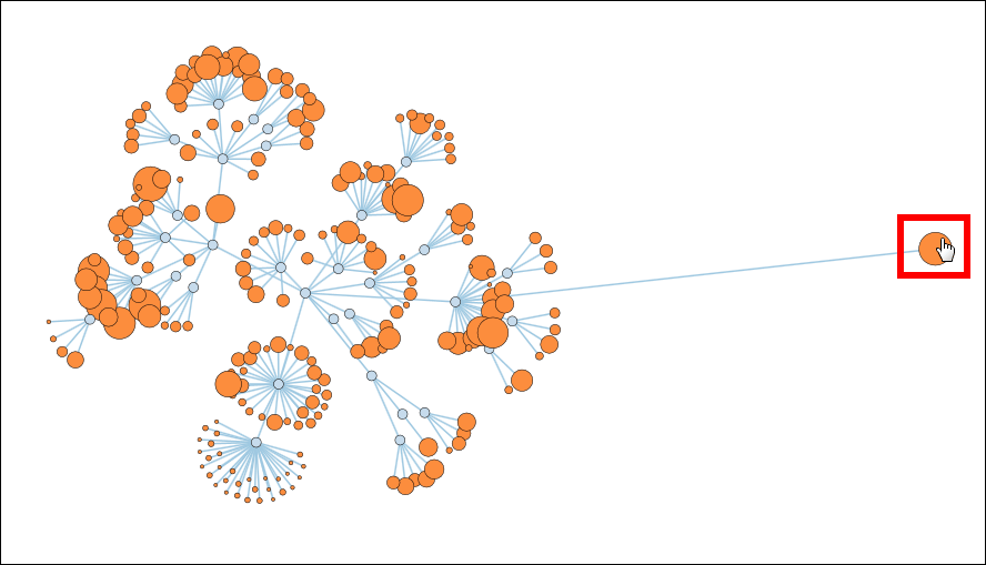
◆:Force Collapsible
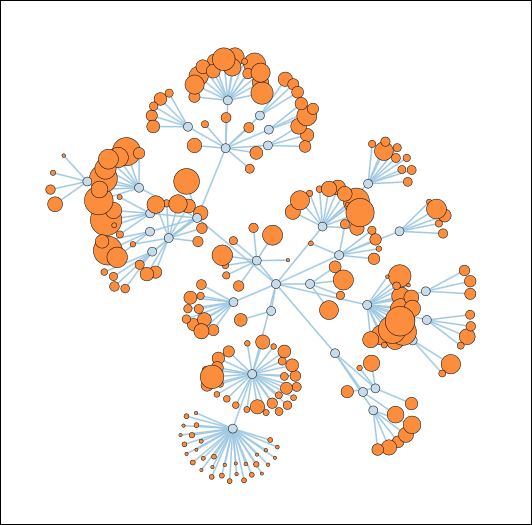
It can be moved by dragging operation.
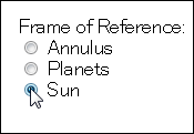
◆:gears
Planetary gear mechanismA script of design using.
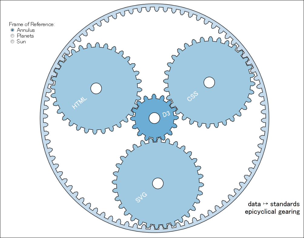
When you select Annulus (Planet), Planet (Sun), Sun (Sun), you can express the rotation when the sun gear, the internal gear, and the planetary gear are fixed, respectively.
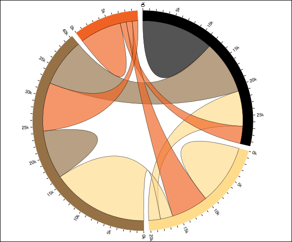
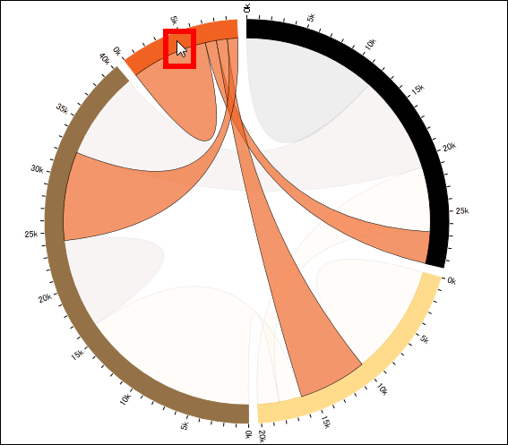
◆:Chord Diagram
When you hover the mouse around the color-coded circle, it will display only the ribbon extending from it.
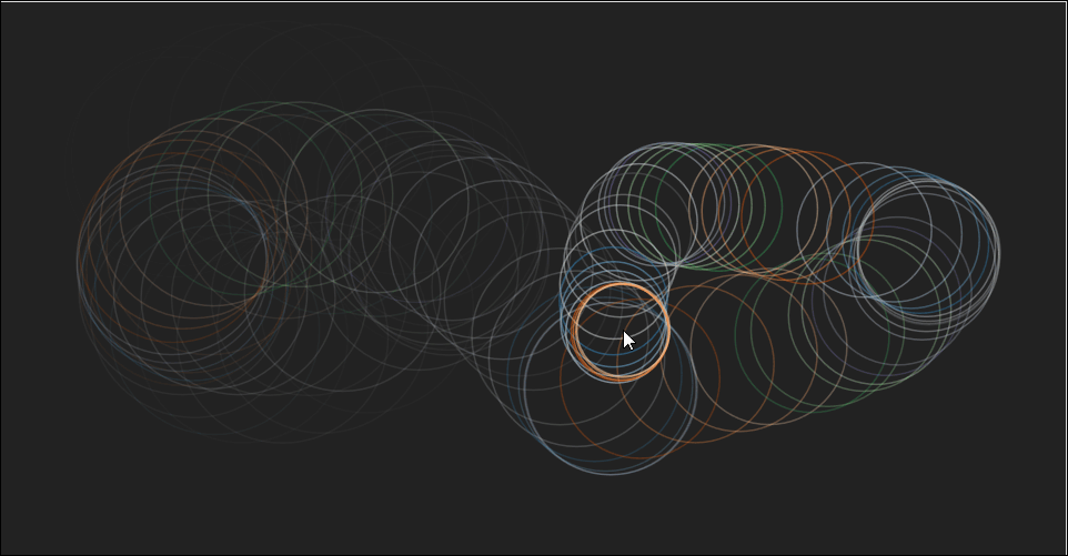
◆:OMG Particles! (D3)
Some examples are not graphs. The ripple spreads as you move the mouse.
◆:Spermatozoa
This is not a graph, but there is also a script with an artistic feeling.

In addition, all the case examples including those in GalleryGitHubDownloadable from.
Related Posts:

in Web Service, Design, Posted by darkhorse_log