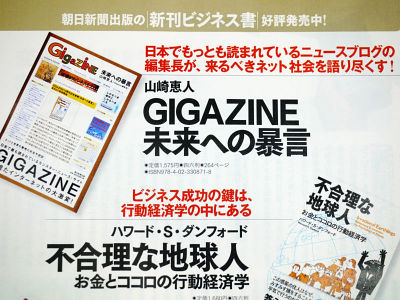
GIGAZINE 10th anniversary commemorative book "Law to the future", released from today
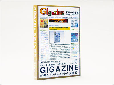
So today, 10th anniversary commemorative book will be released. As the content exactly as its title, "Recommendation for the future" will be "Law of the futureIt is the content which can also be called and it is a news site called GIGAZINE that has been involved for ten years because of its continued involvement, the shape of the world that will come into view when peeking through the "window" GIGAZINE, what changes in the future I am going to focus on what kind of things the individuals, the Internet, the society and the future of the world should be in the future, whether it will occur around the net or not.
The young generation who was born and raised in the world where the Internet exists from the beginning, as well as the active generation who grew up with the heyday of media that exists from old-fashioned media such as newspapers, magazines, and television, and the possibility that a new generation that is not yet seen will follow One of them is here.
Details are as below.
Originally this project went on with the following timeline.
○ 12th May 2010
A consultation saying that I will publish books from the Business Editorial Department of the Asahi Shimbun publication comes to GIGAZINE Editorial Department.
○ 6th June
It was busy at that time, so I reply back this day after 1 month. I decided to repeat the exchange from here via email.
○ June 22
Meet and meet at GIGAZINE editorial department actually.
○ June 29
I decided on this cover design plan and the policies of the content that is rough.
○ July 14
We will draft the table of contents, and from now on we will write everything.
○ October 25
The deadline. Submit the first paper as planned. In addition, I will decide the following items every day, every minute. The following work was personally hard to do than writing the manuscript.
· Lead
The first paragraph at the time of writing the text, that is, the written portion is used basically as it is.
·footnote
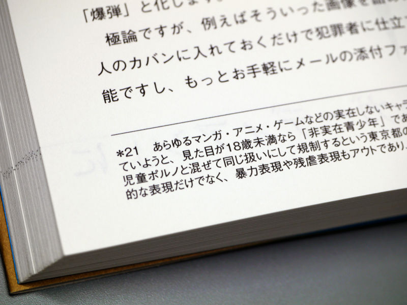
Because there are many terms and event names that may be difficult for unknown people. Initially I thought that it fits in the bottom of the text, but as I wrote it was a mini episode itself, so separate it into separate columns.
Allocate long ones behind the chapters, short ones in the sentences, and shorter ones out of the margins.
· Text design
It is a paper book this time, but on the premise that it will be converted to e-books in the future, textbooks basically written horizontally other than national languages, so I tried writing horizontally. Also, because HTML on the net is basically horizontal writing, it also fits it. Because the body font is GIGAZINE itself is not Mincho type font, it is in Gothic style.
· Noble
About the position of the page number, it is quite a lot of being swayed to the lower right and the lower left, but this time changed to the upper right or the upper left of the page because there was an idea to put footnotes at the bottom of the page. In the upper left is the title and page number of each chapter, the upper right is the chapter number and page number like "layer 01", and so on, the searchability has been improved.
Top left, chapter title and number of pages

Top right, chapter number and number of pages

Initially it was hidden by hand with the lower right or the lower left when I took it by hand, so I thought about the metamorphosis of putting page numbers in "4 lower right, upper right, lower left, upper left" "If you want to make the number of notes stand out, if you want to make it not to be hidden in your hands, how about putting it only on it?"
· GIGAZINE logo data for cover
Delivered in Illustrator format outline. However, as it is said that it can not be opened, ascertained, different version.
· Cover color specification

In order to resemble as much as possible, it is a distant work that puts the color on the actual screen on the color of printing. By the way, I talked about the criteria of the color of each part in the 10th anniversary lecture in April 2010.
· First name of each chapter

At first it was like "# gigazinebook - 01" like a hashtag of Twitter, but looking at the design as a table of contents, it was incongruously long so it did not fit well and changed as layer 01.
· Chapter Door Design
As it was the first design plan, it was a feeling like "?", So it felt like this and it changed it repeatedly and it finally decided at the last minute. I am quite irregular in this part, to spend a lot of inconvenience to every direction ... ... I am sorry.
Since the content of the text of the chapter door design is comparatively aggressive, arrange the composition by constructing a triangle as a motif according to it. To the fancy layout that is more difficult as you go in the second half. For characters, we omit "," from the design convenience, distorted, and changed as appropriate.

By the way, regarding each of the above interactions, the editorial department of the Asahi Shimbun publisher got in between and made adjustments, "What about leads?" "Which footnotes are attached to?", "How do you design body designs?" " "How do you want the position?" "I want logo data to make a cover design plan." "How about the design of the table of contents?" "To design the door of the chapter completely, design office and irregular Negotiation "etc. are carried out.
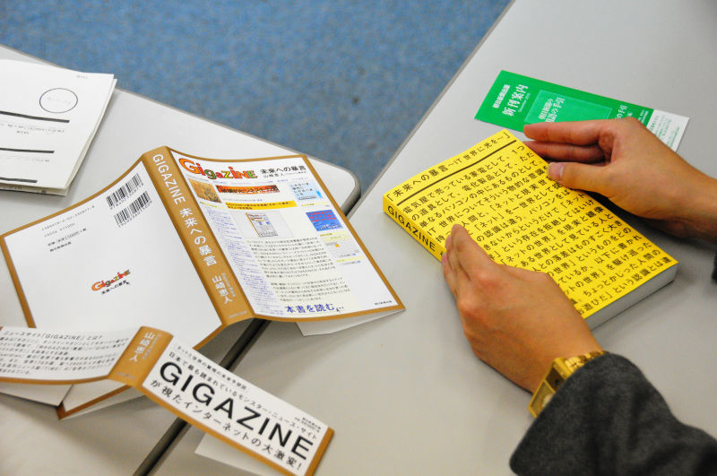
It's easy to imagine "Editing is just receiving the author's manuscript!", But in fact it is a job of doing all such choreographies, that is, doing something rich behind the edge ,about it. Already postedThis articleAs you can see, however, I also checked the cover color and checked the band, and decided where to place the advertisement, where to donate, how to make copies, what to do with the price etc, etc.
○ November 17
Determining first edition copy and list price
○ November 19
Determined booking start date at Amazon
Normally it is a job of editing which does not appear on the table much, but I really decide what is as fine as a mountain.
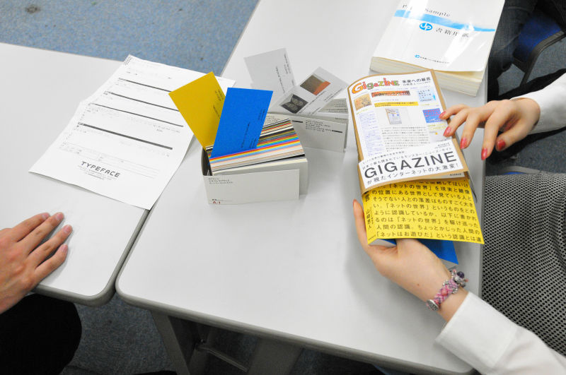
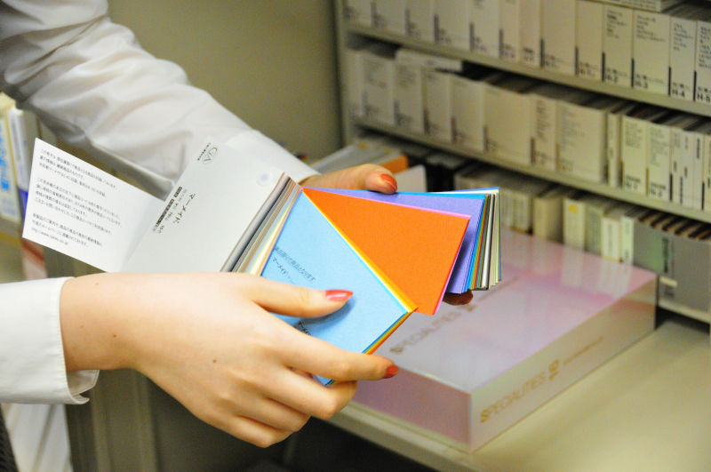
For example, this is deciding the color and material of paper.
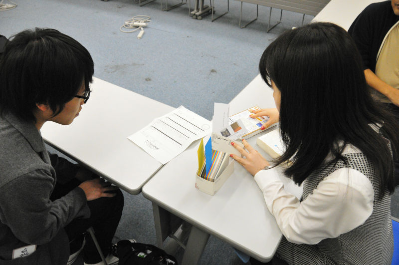
It chooses a suitable image from the color sample book.

This combination this time.
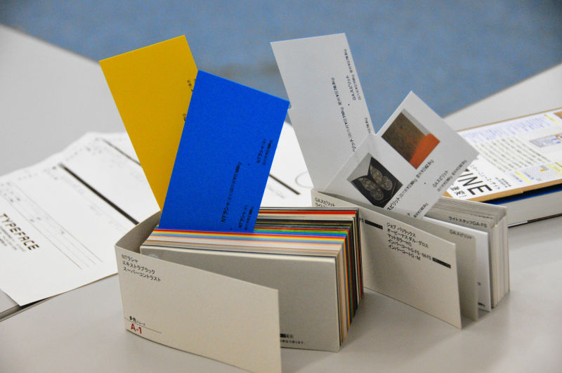
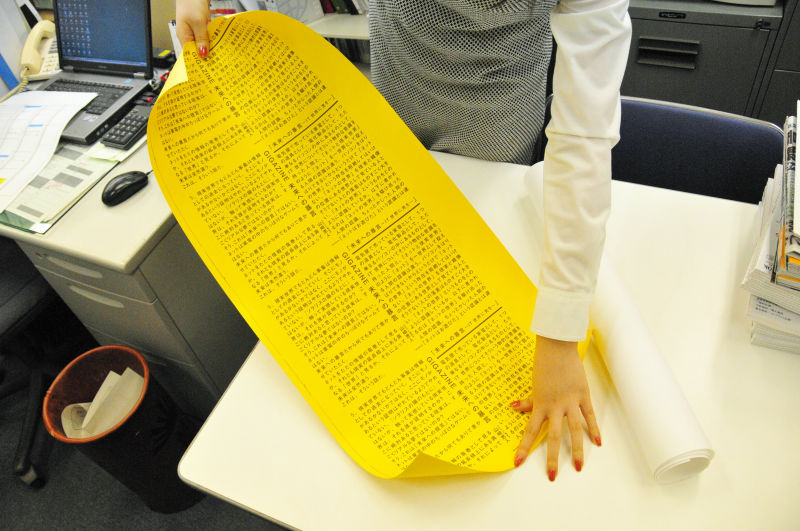
The reverse side of the cover is accented with such a color.

When turning over the cover it appeared like this yellow.
Often you usually choose to look like a cream, but this time you choose Opera White Ultra
Furthermore, since the width of the final book itself will be decided by the thickness of the paper, this is also an important point. We will consult with the budget based on the point that it is not too thick, yet it is not too thin, and will choose it.

The color sample itself is also like a mountain, so you choose from these.
Of course, the more changed colors, materials, and processing, the more it will bounce back to the price of the book.
Check what kind of atmosphere it will print like this
This is a part of the band
I will further detail the details with designers and editors

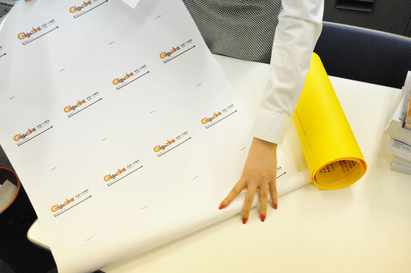
"Since there is something omake manga when turning over the cover if it is a manga book, I want to write something in the same way", so that the message is packed in a surplus on the yellow ground. Since it is horizontal writing, it is important to start from the beginning of the sentence.
Since the thickness is determined by the quality of the paper, I will also decide how to put the title on the back cover. It is designed to be able to read even if it is placed either in portrait or landscape orientation.
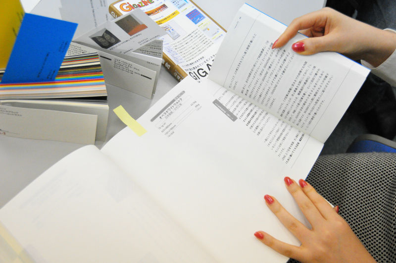
Also check the feel and feel when opening the page.

If it is an attention of a very fine part, for example, at the beginning of the chapter, at the beginning of the chapter, it does not arrive at the edge of the page as described above and the line starts to be drawn to the right in the meaning "starting from here" It is.
It is supposed to be continued if it is on the way and it looks like this from the side. It may seem straight if printing technology is higher.
Well, in this way, we will repeat the examination if it is not a bad day. I have not written here, but also for invisible parts this time I've made a good taste. Someday I pray for someone to notice ... ....
Further schedule continued as follows.
○ November 26
Cover cover cover printing
○ November 29
Notice on book release date and price on GIGAZINE
○ December 2
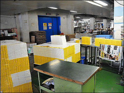
Covering the binding site of Dai Nippon Printing, as well as the Asahi Shimbun
○ December 6
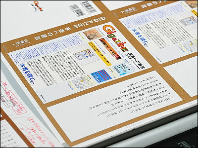
In GIGAZINE, we will make site design the same as book cover for 24 hours only, in short notice that site jacking will be done, and at the same time post cover coverage contents of cover cover printing in the article.
○ December 7
GIGAZINE 10th anniversary commemorative book "Violence to the future" posted the issue of launching today from today (this article)
Looking at these, there are "Dai Nippon Printing Binding Station" and "Asahi Shimbun" as posts that are not posted, but both will be posted soon. Since it is possible to quite a glimpse of the behind-the-scenes of how real books that are not electronic books are made, it can be said that it is easy to say that you want to make e-books a real book quickly, it is difficult to do It should be understood variously.
of course,"Law of the future"We are also allocating pages for electronic books, and the table of contents is as follows.
◆ layer 01: "Knowledge Is Our Power" Knowledge is our strength
◆ layer 02: Professional Baka vs Geek Composition "Do not become a specialized stupid, become a geek"
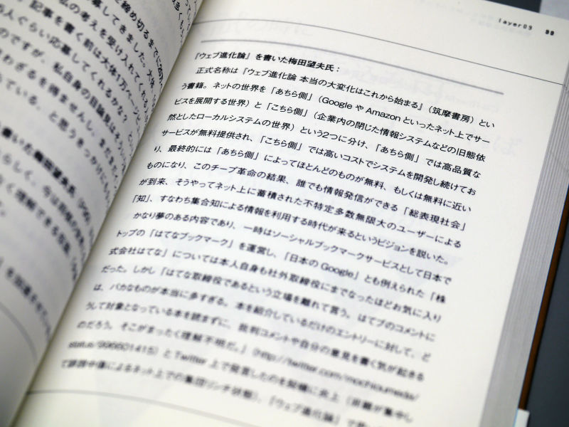
◆ layer 03: Balance of "reason, intelligence, and sensibility"
◆ layer 04: Internet is "Devil's Equipment" or "Angel's Feather"?
◆ layer 05: Only YouTube is a true "destructive business model"
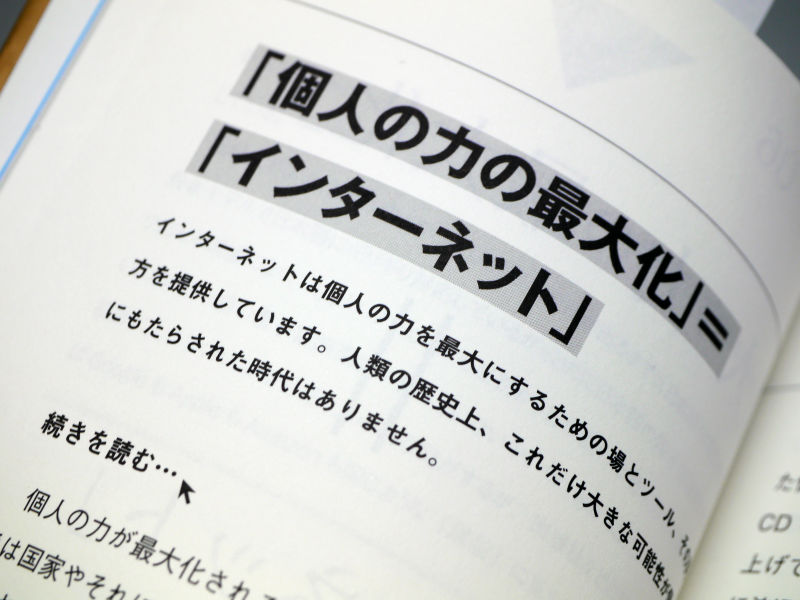
◆ layer 06: "maximizing individual power" = "Internet"
◆ layer 07: Next to "free", next to free strategy
◆ layer 08: a way to establish a "patron model" where fans become patrons
◆ layer 09: optimize occupation selection for suitable people in place
◆ layer10: It is possible to bring in a personal computer at the entrance examination · If it is available on the internet, what kind of problem does the professor at the university make?
◆ layer 11: School to teach "survival in civilized society"
◆ layer 12: The arrival of the era when eating a mess with what you like
◆ layer 13: 9 out of ten people may be hated, so get interested in the remaining one
◆ layer 14: The concept of copyright collapsed, file sharing software in the final phase
◆ layer 15: Quality is born from quantity, it will not be of high quality unless it is massive
◆ layer 16: The ultimate winner who grabbed the ultra-small payment system
◆ layer 17: Thinking about Internet rules is the same as thinking around world rules, world rules
◆ layer 18: It is not "politician" to decide everyone's rule but "silent guardian"
◆ layer 19: "Crash" of the old generation and the new generation's level
◆ layer 20: the form of the nation appearing on the Internet, the area · people, power
◆ layer 21: Conclusion: The age of "paying for what is free"
Related Posts: