Apple's official page, a ten-year transition
IPod has swept the market for portable music players and is continuing to send attractive products such as intel mac to the world, but I tried to follow the transition of its official page. I think the product decorating the top reflects the times.
Details are as follows.1996-2006 - Ten Years of Apple.com w / screenshots
Click on the image to jump to each page saved in Web Archive.
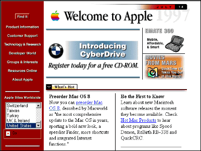
The top page from 1996 to 1998. The design is completely different from now.
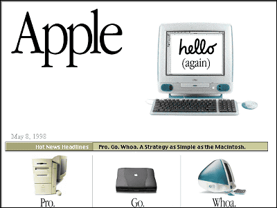
Things in 1998. IMac has appeared. The design has been redesigned.
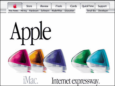
the year of 2000. As with the current official page, the menu was made at the top. In the upper left is a red apple logo. A row of iMacs reminds me of the then iMac boom.
2001. The design does not change very much, but the apple on the upper left becomes blue.
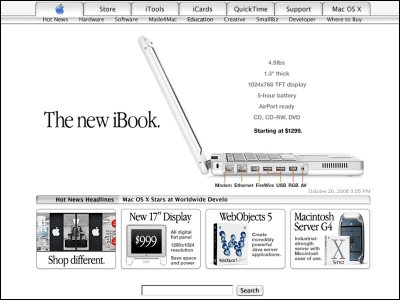
2002. Finally iTunes and iPod appeared on the top page. Did anyone expect that at that time to stand overwhelming advantage like now? From this time the apple logo is now the color.
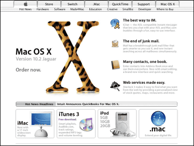
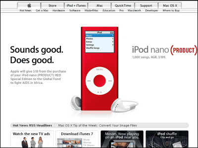
And in 2006. I covered the other dayBright red "iPod nano (PRODUCT) RED"To the top.

Related Posts:


in Design, Posted by darkhorse_log